Facebook split testing is the best way to test ad efficiency. Split testing works by testing multiple iterations of the same ad. It can be a tedious process if you’re unfamiliar with the Facebook Ads platform, but we’ve got your back!
We’ve managed over $636 million in ad spend since AdEspresso started in 2011. Users created over 10 million ads (and counting) using our platform’s advanced split-testing capabilities.
In this complete guide to split-testing, we will go over some of our most insightful experiments. We will also cover testing all aspects of your Facebook campaigns and optimizing for peak ROI.
What is a split test in Facebook ads?
A split test (or A/B test) is a marketing strategy that tests two elements of a marketing campaign against each other to find out which delivers the best results. A good split test can increase ROI by 10x.
Split testing applies to nearly all areas of marketing. Some examples of what you can test are email, landing pages, blog post titles, and Facebook Ads.
Every variable can be tested. You’d be surprised how even the smallest elements of your design or copy can drastically improve marketing performance.
Here are some common split test types:
- Creative: testing different ad images, fonts, copy, calls to action, etc.
- Audience: targeting different audiences and demographics
- Delivery optimization: running campaigns with and without campaign budget optimization
- Placements: testing placement types, e.g. automatic vs specific
- Product set: comparing the performance of different product sets
- Custom variables: testing anything else within your campaign
Here are some examples of how you can put these test types into action:
- Try different colors of key elements like the call to action button
- Test different types of media, e.g. images vs video
- Test different versions of copy, e.g. “Try AdEspresso” vs “Start optimizing your Facebook Ads with AdEspresso”
- Play around with your call to action, e.g. “Sign Up” vs “Count me in!”
- Rearrange the elements of your ad or page, e.g. place the signup form on the left or right side of the page
Does Facebook split testing really work?
The best way to show off the value of Facebook split testing is by example.
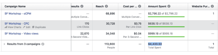
This first example is from Strategyzer, who worked with the AOK Marketing team and our own marketing expert Sarah Sal to increase ticket sales for their event.
For their first Facebook ad campaign, they split tested audiences and different images. The ad looked like this:

This approach cost Strategyzer $4,433.53 in around 3 weeks, and they got only one sale in return.
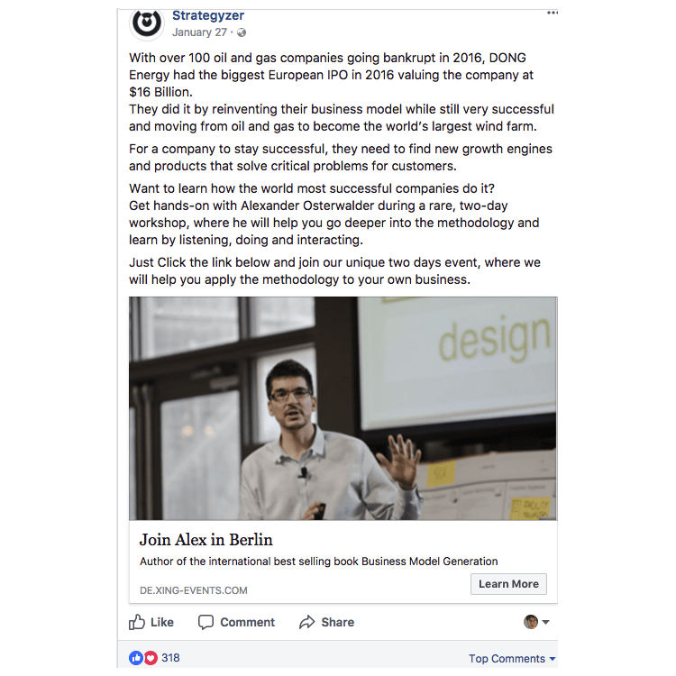
To improve these results, Sarah started studying Strategyzer’s content, including case studies and business stories. She used storytelling to write ads that gave the audience a taste of what they’d learn by attending the event.
Here’s an example of the improved ad:
By changing the tone and length of the ad copy, Sarah was able to achieve some incredible results – and took the event from 1 purchase to 92, with an average CPA of $123.45.
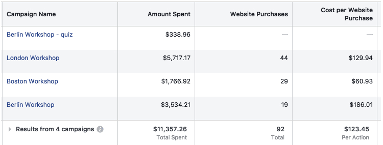
For those of you doing the math, that’s a 96.72% decrease in cost from changing the copy alone.
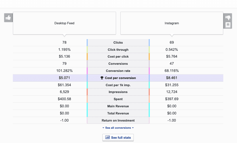
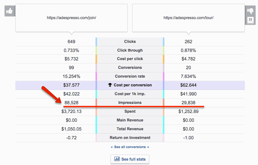
Here’s another example, where AdEspresso split tested two different Facebook Ads images:

Cost per conversion: $2.673

Cost per conversion: $1.036
As you can see, the Ad on the right resulted in a cost per conversion improvement of more than 100%!
Remember that not every split test will improve performance. You might test a new design only to discover that the original was more effective. Don’t let this stop you from testing other variables.
How to create a split test on Facebook
The key to successful split testing for Facebook ads is strategy. You need to test the metrics and variables most relevant to your goals, as this will strongly affect your ROI.
Structure and budget will also heavily impact the results of your split test. If you want to run a successful split testing experiment on Facebook, here’s what you need to know:
What elements of a Facebook Ad should you split test, and how?
“All elements” would be the ideal answer to this question, but that is unrealistic.
A reliable split test requires every ad you test to generate a good amount of data (this could be conversions, clicks, likes, etc.). Testing hundreds of images or demographic audiences at once will likely result in random, untrustworthy data.
Testing multiple elements can quickly get out of hand. Think about this: testing 5 pictures, 5 titles and 5 demographic targets will result in the creation of 125 (5 x 5 x 5) different ads.

A Split Test with 3 Images, 3 titles and 5 Interests
The key to success is prioritizing your tests so that you get reliable results and can optimize your ads accordingly.
But how do you decide your priorities? Based on our analysis, these elements provide the biggest gains:
Ads design
- Image
- Post copy
- Placement (where your ads are displayed)
- Landing page copy and design
- Headlines
Ads targeting
- Country
- Gender
- Interests
- Age
- Custom audiences
- Relationship status
- Purchase behaviors
- Education level
Others:
- Ad type
- Bidding (lowest cost with or without cap)
- Optimization (clicks, conversions, engagement)
This list is general — some elements won’t apply to your business, and you may already know the best course of action for others. To streamline your Facebook split testing process, make a short list of about 4 experiments (relevant to your business) you’d like to start with.
With categories defined, it’s time to start. You should begin with broad experiments, refining as you get results for faster ad optimization.
Let’s look at an example. To promote our Facebook Ads Lead Generation eBook, we first tested two very different designs:
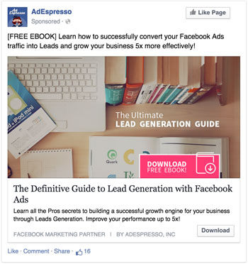

+143% improvement!
Wow, we did not see that coming. We were pretty sure that the photographic ad would have performed better. However, the data didn’t confirm our guess, and numbers never lie.
Once we had this figured out, we started split testing smaller elements of the winning combination:
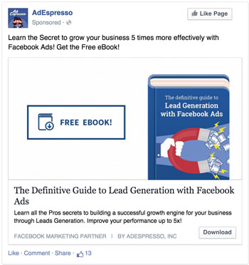

+13% improvement
Had we tested 10 different variations of every ad design we had in mind from day 0, collecting reliable data to optimize the campaign would have taken weeks. By testing broader variations first and then fine-tuning the winner, we were able to boost our performance by 143% in just 4 days and then improve by another 13%.
This approach can be applied to almost every Facebook ad split test you might think of. Rather than testing 10 age ranges right off the bat, start by comparing younger users (13-40) to older users (40-65). Take your results and refine further tests to compare ages within the winning range (i.e. 13-18, 18-25, 25-35, 35-45).
Pick the metrics that will define success or failure
Decide how you’ll define success and failure before creating your first split test.
The number of ad performance metrics Facebook offers might seem overwhelming at first. All of them can be used to measure the success of your campaigns.
Here are a few metrics paid social media specialists usually use to define success:
- Cost per result (CPR)
- Ad impressions
- Ad frequency
- Clicks
- Click-through rates
- Cost per click (CPC)
- Cost per impression (CPM)
- Cost per conversion (CPC or CPCon, also known as cost per action/CPA)
If you aren’t an expert, it’s a good idea to start with a single metric. Testing multiple metrics at once may get overwhelming, and can sometimes produce confusing results.
For example, ads with a great click-through rate can have a high cost per click. Other ads can have a terrible click-through rate and a great cost per action.
Pick the metric that impacts your business growth the most. Cost per conversion is a good starting point, as it has the greatest impact on growth for most businesses.
Advanced advertisers can track revenue generated by each conversion and use the ROI as the key metric.
AdEspresso simplifies this process by highlighting the metric we predict will be most valuable to you:
Ad set and ads: how to structure your test
Now that you have your key metric and a basic framework for testing it, it’s time to organize your split tests within the Facebook ad campaign structure.
As you probably know, Facebook advertising has a 3 layer structure composed of campaigns, ad sets and ads.
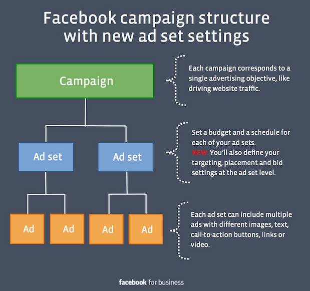
Let’s dig into how (and when) to use them.
Campaigns
Running split tests across multiple campaigns makes data hard to analyze and compare. This technique does come in handy when you’re testing 2 extremely different variations like bidding type or ad type (e.g. a standard news feed ad vs a multi-product ad).
Ad sets
The ad set is where you define budget and audience targeting. This makes ad sets the best place to create audience split tests.
Example: If you have a $10 budget and want to test a male vs female audience, you can create 2 ad sets, each with a $5 budget, one targeting men and the other targeting women.
Ads
Ads contain your designs. This is where you test images, texts, headlines, etc.
If you’d like to split test your Facebook Ads with 5 pictures and 2 genders, the best setup according to Facebook best practices is:
Ad set 1 – Target Men – $5
Image 1
Image 2
Image 3
Image 4
Image 5
Ad set 2 – Target Women – $5
Image 1
Image 2
Image 3
Image 4
Image 5
This setup does come with one drawback. At the ad set level, you can define a budget for every experiment, ensuring each one receives a relatively even number of impressions. This is not possible at the Ad level.
Uneven distribution of the budget often occurs as a result. Some experiments will receive a lot of impressions, consuming most of the budget and leaving other experiments with fewer impressions. Why does this happen? Facebook can be overly aggressive in determining which ad is better, spending the majority of the budget on its ad of choice.
In the example above, one of the images received 3 times more impressions and spent 3 times the budget of the other.
Here’s an alternative ad set level structure that will help you avoid this issue:
Ad set 1 – Target Men – $1
Image 1
Ad set 2 – Target Men – $1
Image 2
Ad set 3 – Target Men – $1
Image 3
Ad set 6 – Target Women – $1
Image 1
Ad set 7 – Target Women – $1
Image 2
Ad set 8 – Target Women – $1
While this structure usually results in more reliable split tests, it can increase overall costs as multiple AdSets compete for the same audience.
It’s important to note here that Facebook now has features that make it unnecessary to test for gender and age. After running an ad set, you can check the performance breakdown by age and gender.
Split testing for this criteria does allow you more control over optimization, though, as you have the power to allocate just 10% of your budget to a certain age or gender.
Set the right budget for your split test
A meaningful split test requires data, and running Facebook Ads does come at a cost.
How do you know when you’ve gathered enough data? Say you’re testing 5 different images. Before choosing a winner, each ad needs to generate 10-20 conversions.
Here’s a calculator for deciding when results are statistically relevant.
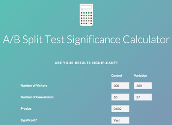
The broader the difference between each variation’s performance, the sooner you’ll reach statistical relevance. Small differences are less accurate and require more validation.
If your average cost per conversion is $1, you’ll require a budget of at least $50 ($1 x 5 images x 10 conversions). Of course, the higher the budget, the better results you’ll get.
If your main metric is clicks, you won’t need such a high budget because they tend to be less expensive. More expensive conversions will require a higher budget.
Remember, it’s important to make sure your budget is properly allocated before you set up your Facebook ads split test. Testing too many variations with too small a budget won’t provide you with reliable data
Struggling to calculate your ad budget? Try using our handy campaign budget calculator.
What can go wrong with split testing?
Be prepared to lose some money A/B testing. It’s all part of the process. Not all experiments will be successful. It’s important that you keep this in mind throughout the process.
Don’t stop a split test after a few hours because one variation seems especially expensive. Things can and will change quickly.
In the span of a few days, the clear loser could become the overwhelming winner. Accept that you might lose some money, and give every experiment time to yield results. It’s worth it.
Split testing is a long game and every experiment, successful or not, brings you closer to understanding your audience.
Keep an eye out for two additional risks:
1. Overtesting your audience can increase your costs
This issue can occur when you test many demographic audiences (for example, 2 genders x 5 interests x 5 age ranges = 50 tests) and end up with many ad sets, each with minimal reach.
While these tests still yield useful information, allocating money to niche audiences can drive costs up as Facebook will try every way possible to reach, for example, the 2,000 users who live in San Francisco, are 18-19 years old, and are interested in Italian folk music.
This hypersegmentation gets expensive. To avoid the issue, make sure your audience size is large enough so that each variation will still target a sizable user base.
2. Design testing can impact virality
Hopefully, the content you promote for Facebook ad split testing will be engaging, but not “viral hit” material.
Split tests for post design can limit the organic impact of your ads. When users see a post with 1,000 likes, the high number can influence them to engage.
However, split testing the design with 10 variations spreads the engagement across 10 different Facebook ads (i.e. posts that get promoted). Rather than with one post with super high engagement, you may end up with 10 posts with average engagement, diminishing the potential amplification.
If your content has high virality potential, try to adopt optimization strategy #3 from our tips below.
How to optimize your Facebook ads based on your split test results
Now that you know how to split test Facebook ads, the work isn’t finished. Your next goal is to optimize your ad campaigns for maximum ROI.
Once your experiments yield reliable data, there are many strategies you can adopt to do so.
Here are our 3 favorites:
Strategy #1: Stop underperforming ads
This is the most common option. Once you have reliable data, pause the underperforming ads and keep the best ones running.
If you’re using AdEspresso, knowing what’s working and what isn’t — and acting accordingly — is a piece of cake. We even provide daily tips you can action with a simple click:

Strategy #2: Redistribute your budget
This might be our favorite strategy. Instead of stopping all of your underperforming ads, redistribute the budget among them.
This allocates most of your money toward your top experiments, leaving the underperforming ones with a small ad set budget of $1 per day.
Why do this? To collect more data, of course. You will be able to continue monitoring your worst experiments to see if anything changes in the future (at a very low cost).
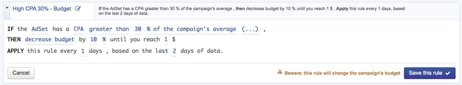
AdEspresso makes this process easy as well. You can even create automated rules that automatically distribute your budget across ad sets based on their performance:
Strategy #3: Test and scale
This strategy is used more for landing pages and emails than for social media advertising, but its effectiveness makes it perfect for Facebook ads split testing.
Run experiments with the lowest possible budget to get reliable data. Once you have a winner for each experiment, spend all your remaining budget creating a new campaign with the winning ads and demographic audiences.
No matter what strategy you choose, keep testing. Whenever you find a winner, try allocating a small portion of your budget to set up a new campaign and further split test your successful Facebook ads. Your target audience is always changing, and your ad strategy should remain flexible.
Split test examples from our Facebook ads
Want to see these strategies in action? Here are some examples from our own experiments.
Click the title of each experiment to view a complete breakdown of targeting, optimization, budget and results.
Square vs landscape

Call to action

Ad copy length
Video thumbnail

Wrapping up
Split testing Facebook ads is one of the most effective ways to drastically improve ad spend ROI.
It can also help you understand who your customers are and what they need most, informing future content creation.
Already started split testing for Facebook Ads? Share your experience and ask questions in the comments!
Hi!
This is a great post! Really enjoyed it.
I have a question in regards to the last paragraph before the Conclusion – can you tell us, please, which ad was more successful? On the right or on the left?
Thank you!
Katya
Hey Katya,
unluckily the last examples are just split tests that I spotted on my newsfeed, they were not conducted by us, so we have no idea which one performed better. The only purpose was to show how big companies use Split testing and provide inspiration for your own tests 🙂
Amazing Post!
Congrats!
Thanks, glad you liked it!
hi, how long do you typically let a campaign run to give it a fair fighting chance i.e for it to be relevant?
thanks
At least a week so we have a sample of each day of the week. 2 weeks is better. But then it really depends on the audience size, the budget, the amount of ads we’re testing.
There’s really no magic number here 🙂
This is a great post, and I agree with a lot of what you’ve said. It saddens me when people dismiss Facebook ads as too expensive when they haven’t take the time to split test. I’ve been doing some optimization recently following a testing period and managed to get my cost per conversion down to $0.50. One of the biggest factors for me in improving that figure was testing several different interests to target.
Thanks for weighing in Lauren, looks like you’re killin it with Facebook Ads, congrats!
I hear this every time! Those who don’t give up immediately and seriously invest time and money in Facebook Ads eventually succeed 99% of the times!
Absolutely! The key isn’t to give up. My first try was shockingly bad – I think I spent about $13 on one conversion at one point. So definitely, yes, keep testing and you’ll get there.
Yes, that’s unluckily a very common problem, small advertisers give up immediately after testing very little and with a small budget and they loose a great long term opportunity 🙁
Is it possible to have somebody else ad account created so we can use your platform? Our current ads account is not active and looking for ways to still advertise on facebook.
Unluckily that’s not possible Mark. Some agencies may do that but the truth is that if your account was blocked because Facebook did not like your ads, their account would be quickly banned as well.
Wow, a super detailed definitive guide to ad split testing – An essential read!
Thanks Clive, glad you liked! What about a mention in one of your next blog post ? 🙂
Cheers,
Max
Great article, Massimo! Thank you.
You write that hyper segmentation is expensive. Please, tell How many ad sets do you recommend creating and how big target group should be to maximixe results? Let’s assume we test 3 ad designs on ad set level.
Hey Aga,
If you only test the design, that’s not a big issue as they’ll have the same audience. Based on your budget and bidding method, anywhere between 50k and 1M is fine.
The problem is when you split test demographic targets, and you could end up creating very small adsets targeting Female, 18-20, interested in fishing and living in SF. That would create a very small audience. Overall I’d try never to go below 20k potential reach for each adset!
Hope this helps!
Max
1. My website has many products and I have to run many ads too. How can I test with many many products?
2. After testing, should I merge the audience (age, interest, location…) which have the good result?
Hey Phuc,
For testing many different products at once, I’d use Multi-Product Ads. There’s a nice auto optimization feature that allows you to insert up to 10 products and let Facebook pick the best ones and decide the order.
Once you’ve tested and you’ve a good idea of best products and target I’d create a new campaign trying to do smaller tests refining what you’ve learned from the previous experiments. For example, start broad and test 18-40 yo Vs. 40-65. Once you have a winner launch a new campaign and refine 18-25 25-30 30-35 35-40
Hope this helps!
Great article, Massimo! Thank you.
Currently we’re facing a problem. As you said “test group A vs group B. Once you have a winner (A) launch a new campaign and refine A1, A2, A3, A4,…”
That’s ok but then we realized we may miss something if the 3 best groups are B2, B4 and A3 (group A has lower cost per conversion in general)
—
Besides, let’s assume our monthly budget is around 10.000$. Based on your experience, how much should we use for testing because there are tons of things that could be tested (especially product images in case of eCommerce sites)? or is there any logical way to calculate the % of budget should we use based on some metrics?
Thank you very much.
Hi
Great article.
I often split test audience, and in the past I could just select the same ad (because it was really just a hidden post) for each ad set.
However after all the changes I can’t quite figure out if this is still possible?!
I would like just one version of each ad (so the social proof builds up) but in multiple ad sets.
Is this a possibility in the power editor?
Thanks.
Hi Massimo,
This blog post is very useful and thanks for sharing it!
I still have one main question though, to really understand how the entire process works.
– When I run A/B Testing on my Ads, should I drive all the traffic to one landing page?
– The best practice says that there has to be consistency between Messages and Images between the Ad and the landing page I’m driving the traffic to, so does that mean I need to split test my Ads together with my landing pages? And so drive traffic from AD1 to Landing1 and from AD2 to Landing2?
Running 2 completely different variations of my AD means using different images and copy: what happens if I use only 1 Landing Page and one of the Ads has very different image and copy than the landing page?
Thanks!
I was wondering if you really need to split test gender and age? Don’t you see how they perform in the statistics provided by facebook? The number of shows / interactions or such? (new to fb ads…) For instance, in the one ad I ran it seemed like women above the age of 35 were much more responsive than men and younger women… simply by looking at the statistics in the one ad.
Yes, when I wrote this post those stats were not fully available, nowadays for stats that are already provided by Facebook it does not make a lot of sense to split test them.
By split testing tho’ you’re allowed more control over optimization. Without a split test you can just edit the targeting and remove women for example. With split test you have adset for each experiment and you could still advertise to women but with just 10% of the budget.
If you use the
Adset 1 – Target Men – $1
Image 1
Adset 2 – Target Men – $1
Image 2
Adset 3 – Target Men – $1
Image 3
etc. setup, don’t you run the risk of the same people seeing different versions of the ad? Perhaps there is a smaller chance if the targeting is broad like in your example, but with a more specific targeting (Men age 25-40 in the state of Maine) wouldn’t that be an issue? And if so, how do you get around that?
Thanks!
Yes, that’s the risk! It’ll likely have a low impact unless your budget is huge or the targeted audience is too small but it’s a risk.
My advice is to use that structure for testing and finding the best creative for you. Then creating a new campaign using the winning image/title/text
Thanks to this post and Facebook Ads A/B Test Guide I finally ran a proper split test campaign. Learned a ton from it and used that new knowledge to update my landing page.
What is statistically significant difference between variant A and B click-through rate to declare a winner?
(my data: 0.9 vs 1.1%; 2.3 vs. 2.1%; 1.29 vs. 1.67%)
Hey Greg, glad the post was useful! To understand statistical significance you also need to take in account the amount of clicks and impressions.
You can find a good calculator here: https://vwo.com/ab-split-test-significance-calculator/
Hi thanks for this! I’ve had 4x ROI bro!
I have a query though. Holding factors constant, I would like to determine how to increase conversions. Currently have unlimited budget but i don’t know whether either daily or lifetime budget will give different results. What’s your experience on this?
Daily or Lifetime budget don’t have any significant impact on performance in my experience is just a matter of how you manage your budget. In lifetime you’re more likely to spend all your budget because if today Facebook only spends 15% of it, in the next days they’ll try to spend more. While with daily budget if today only 15% is spent the rest goes wasted.
Facebook actually changed this recently and now even with a daily budget there’s a certain % of allowance that they may spend more or less daily.
Great guide, thank you.
What do you think of this approach?
1) Test 3 bigger design changes with a broad audience.
2) Select the best one, then test 3 different age groups.
3) Pick the best age group, and then test 3 minor design differences.
Hi Massimo,
The great post!
I’m wondering if there is any kind of a statistical method that says what part (%) of your testing audience is enough relevant to say that the rest of the audience will behave most likely similar to these?
E.g. I want to test 18-20 females interested in marketing and my potential reach is 20,000. What % of these 20,000 would be considered as the representative sample? Would it be 10% or 20% or maybe some another parameter like frequency?
In what moment we should say that the test is relevant?
Thanks!
Super informative, thanks!
Q: do you know how to add the “Like Page” button to the ad cards as shown in The Grid ad?
Thanks!
Very informative blog to read.
To have a conclusion in AB split ad test what is the minimum audience, budget, reach, conversions, time that I should consider? Thanks!
Why test age, gender etc when you can run an ad set and then look at performance break down by age and gender to see which provides best ROI?
For example, why not test 5 different images in 5 different ad sets … choose the winner, and then break down the conversions by age and gender to then optimise further from there … wouldn’t this save you from having to test age and gender in different ad sets at the beginning and save your budget?
So if I am testing two format – one carousell with video and another just normal fb video ads. How should I do it?
Should I do it under two seperate campaign?
Hi Massimo,
Thank you for extremely detailed explanation on split testing with AdEspresso. A lot to learn and I am absorbing rapidly.
One thing I have been somehow confused is that your articles on split testing including this one is that it is now clear how I can continuously test new variations after finding a winner.
I understand that split testing is not one time deal and as Toyota engineers say we need to continuously improve over time.
In this perspective, I have been wondering how I can add a new variation against the winner and start a new test for further improvements.
It appears as if there are no edit function for an existing split test within AdEspresso dashboard. Does that mean I have to start a new campaign to do a split test for that winner?
One idea would be, as you suggested in this article, to have all possible variations and allocate minimum budget for the ones that are not of importance and increase the amount after finding a winner amongst much more allocated important ones for initial testing until finding a winner for further testing.
This sounds very counter productive.
It appears as if I always have some inefficient start with a new campaign until I go through initial 500 or so reach and get relevance score.
Can this be avoided if I can add a new variation to existing campaign with a winner? Please let me know what is the best way to do it.
Thank you in advance.
Kent
Here’s my problem when defining the metric for success. It’s a tough toss up between CTR and CPA (or ROAS if you have access to it).
Ultimately though, I think the job of the ad is to:
1. Warm the user up
2. Deliver traffic to the website
The job of the website is to convert. No one looks at a Facebook ad and says “wow, yeah I’m SOLD. I’m definitely going to buy product XYZ now.”
This is why I think in most cases, CTR should be the metric to look at because a good ad will draw the click and get traffic to the website. It’s the job of the website to then convert that traffic.
It’s only when I see extremely high CPA on certain ads where I might say “yeah okay, this ad clearly isn’t working” (could perhaps just be a disconnect between the ad messaging and what the user sees on the website resulting in a super high CPA).
KEEN TO KNOW YOUR THOUGHTS
I want to split test facebook ads for my book on Amazon. My criteria is ROI or conversion rate to buy book. Can this be done?
I would like to make sure I got this right regarding age targeting:
I want to make the following split tests:
18-34
35-54
55+
Now, when I try to do the break down, for the 55+, I have to put an age limit, I can’t just leave it blank.
If I add 55 to 65, I want to make sure that it will actually target people from 55 to 65+ (and not just people from 55 to 65). The little square next targetings where I see the size of my audience says 65+, but I just want to make extra sure people above 65 will be targeted with those settings
When considering lowest cost of conversion as the determinant of success, isn’t cost affected by the different prices paid for each ad in the data set? If one ad A costs $2.00 and another ad B costs $1.00, and both generate two clicks, then Ad B would come out ahead largely as a function of the bidding that took place.
Hi there ! Thanks for this great article.
I have a question regarding the Split test’s duration.
Should it run until it has reached the 10 to 20 conversions you mentioned in the article ?
Because when it comes to create an AdSet, you can either decide to set a finish date or let it run with no limit. Should I use the latter so I can stop the split-test myself when I notice that the amount of conversions for each variation is significant enough ? Thanks for your help !
Amazing to know the power of split testing. I was quite astonished to see how Sarah managed to get the sales up from 1 to 92 just with adding storytelling element to the copy. I’m gonna try this soon. Thanks for this article.
How is this affected now with CBO?
Split testing with CBO is more complex as you cannot fine tune the budget allocation and reach a statistically significant amount of clicks or conversions to each experiment. Unluckily most advertising networks are becoming more and more a black box 🙁
That said, it still makes sense to split test of course!
Great Stuff!
Love your writing skills,
keep sharing things like this!
Super informative, thanks!
Thanks for sharing this helpful article. I am running various facebook ads and it helps me to add value.
Great stuff,
Thanks for sharing.
Thanks for sharing this helpful article.
Brilliant article. Very rich i must say. I would like to refer to some of your work on my next article. Thanks.