In the last few days, the eyes of a few million people all around the world were focused on Facebook while the social media platform CEO, Mark Zuckerberg, stood more than 10 hours before the line of fire of questions of the U.S. Congress.
Was it a Top or a Flop? Look at the numbers.
Facebook’s stock price on Tuesday rose about 4.5 percent, that boosted Zuckerberg’s net worth by $2.8 billion, according to Bloomberg.
In the last few days, the eyes of our “Top and Flop Facebook ad of the month” Committee were focused on AdEspresso’s Ads Gallery.
The long exam session on hundreds of Facebook ads was not broadcasted live (unlike Zuckerberg’s testimony before the joint hearing of the Commerce and Judiciary Committees on Capitol Hill in Washington), but our Facebook ads experts judgment was as strict.
Were they able to find the Top and Flop Facebook ads of the month?
Yes! But something exceptional happened…
We went through really good as well as disastrous examples this month, to show you how important Engagement and Identification are for your advertising strategy. And we saw a synecdoche 😮🤔 (yeah that’s how the expert called it 🙇)!
We also went through a very complex ad, to show you why having a high score in some elements doesn’t always mean having a Top ad.
And we learned that the quickest way to Facebook ads success is through users’ heart! Yeah, we’ll show you that too!
Just a quick recap.
As we did in the past few months (scroll down for more Top&Flop Facebook ads ), we selected 4 Ads from AdEspresso’s Ads Gallery, an incredible resource for marketers made of 135,046 (and growing) real Facebook and Instagram ads collected by anyone using the AdEspresso ads gallery extension.
We do NOT use our customers’ ads, so we can NOT see any analytics in order to evaluate the performance of the ad. We base our judgment only on the ad elements that each of you can have access to, such as:
- The visual aspect
- The Headline
- The Ad Text
- The Landing Page, Social proof or CTA
We usually select four Facebook ads, two that passed and two that failed our exam. And we give you deep insights on both the strengths and the weak spots of each ad.
But, as we spoilered, this time something exceptional happened… April marks the debut of a new final judgment “DEFERRED”, which is a step in-between being the Top and Flop Facebook ads we saw on social media.
We will apply this new category to the ads with some potential, those that could have been Top if they had a better use of the elements listed above.
And now, let’s take a look at the outcomes of our last Committee Session. Here’re the Top and Flop Facebook ads we saw in March.
#1 – Colorful? Powerful!
Setting up a campaign to promote food can seem really easy, but creating food ads that grab the users’ attention avoiding annoyance and banality, that’s a whole other story. And The Paleo Secret is a damn good storyteller!
| CREATIVITY | 9 | Eye-catching |
| HEADLINE | 8 | Challenging, enticing |
| AD TEXT / COPY | 8 | Short, engaging, promising |
| LANDING PAGE | 7 | Matches the ad |
| SOCIAL PROOFS | 9 | Very high engagement |
| FINAL JUDGMENT | PASS 👍 |
The paleolithic diet requires the consumption of foods that were available also during the Paleolithic era, and this ad really starts from the basics showing a great and colorful bunch of fruits and vegetables. Without dwelling on the psychology behind it, the predominance of color is the first and foremost winning element of this Ad: it’s totally eye-catching and a perfect example of a stand-alone image which could have worked also without the addition of text.
Color matters, but isn’t everything as there are other important elements that could pimp your ad’s image and make it stand out, see here 5 Tricks to improve them.
The creativity is a synecdoche (😮🤔), an engaging and colorful one, the diet introducing the real center of the Ad being actually the 30-day challenge mentioned in the headline.
Even if it doesn’t follow any of the 11 Formulas to Write Irresistible Ad Headlines, the copy challenges the users arousing their curiosity with just a few words. The emoji and the caps lock, even if still a matter of discussion, totally work here involving the user and making a promise of a healthy life that totally matches the diet promoted.
The aim of the Ad was already disclosed and the text only reinforces the concept. It is brief and concise bearing some the components that make a Facebook Ad successful namely: relevance and a strong value proposition in line with the diet promoted.
Relevance, message match, and an outstanding creative are the winning elements of this Ad that shows a very high level of engagement: 2K Likes, 53 Comments, and 420 Shares.
#2 – Engagement is Everything!
What determines an Ad pass or fail? As already mentioned in previous editions, we only going to judge them according to some elements and Social proofs is one of them!
| CREATIVITY | 2 | Unengaging |
| HEADLINE | 1 | Absent |
| AD TEXT / COPY | 3 | Unengaging |
| LANDING PAGE | 2 | Unengaging |
| SOCIAL PROOFS | 1 | (Almost) Absent |
| FINAL JUDGMENT | TOTAL FAIL 👎 |
With 3 Likes and only 1 Comment, we can easily state that Social proof is almost absent here. The reason why shares, likes, and comments are really important is that they can give you an idea of the level of engagement reached with the audience you are targeting and, Engagement matters. A LOT.
From Creativity, through Headline to Text there is a total lack of Engagement here, which indeed determines this Ad to be a (total) FAIL.
Let’s analyze it more in depth:
- Creative: the Dynamic Product Ad they use is a mere catalog of products, no effort is made to grab the user’s attention not even using at least one an image that stands out. Maybe a close study of our Beginner’s Guide to Facebook Advertising could have helped. A lot.
- Headline: Despite its importance in driving clicks, it is totally absent in this Ad and no tentative is made to address the users and introduce them to the advertised products. When the Image fails, the headline can help catching users’ attention and stimulate their curiosity. Wanna nail your headlines every time? Here are a few Formulas and Strategies to make them irresistible.
- Text: the Ad gains some points here because the text is brief, concise and clear, but to create engagement you need something else. It handles upon showing emotions, creating a story, arise curiosity and here are 5 Writing Tricks to Increase the Readers Engagement.
Unfortunately, the Landing Page matches the Ad as in being a total FLOP (that could be much better after the suggested readings!).
Maybe watching AHow to create Always on, Always relevant campaigns with Dynamic Product Ads, one of the Top webinars in the AdEspresso University will help bigsmall.in (and any of you) do a better job next time!
#3 – The Power of Dogs Eyes!
If you look at this dog’s eyes for just a moment, you’ll simply just can’t keep scrolling through your newsfeed like nothing has happened. Empathy is working to its fullest here, showing that emotions are a very powerful tool to grab users attention and create a deep connection.
| CREATIVITY | 10 | Highly Emotional 😞 |
| HEADLINE | 8 | Direct to the point |
| AD TEXT / COPY | 7 | Descriptive |
| LANDING PAGE | 9 | Matches the ad |
| SOCIAL PROOFS | 9 | High engagement |
| FINAL JUDGMENT | PASS 👍 |
According to Psychology Today, ‘empathy’ is defined as the “ability to recognize and share the emotions of another person.”
You can convey empathy in different ways, here definitely both images and words aimed at the same goal. It’s hard to say but, sometimes, negative feelings like sorrow and sadness can take Your Marketing To The Next Level. Without being scared to show the physical signs of human cruelty on animals, the ad image is 100% in line with the message conveyed. A winning strategy!
The headline is clear, concise and provides more info without falling into banality. The caps lock at the beginning, in this case, helps to raise users’ attention.
The text follows most of our Social Media Ad Writing Tips and is a very good example of a text being able to create a context without falling into banality and annoyance. The Tone (solemn, objective, cold) is the thread that puts together Creativity, Headline, and Text, repeating and strengthening the message.
Even if the general suggestion is to avoid long descriptions, examples like this ad, and the incredible case study that we publish here, emphasize the power of a long (but good) copy.
With 1.4K Likes, 165 Comments, and 568 Shares this ad deserves its place on the podium as the Top Facebook ads of this month.
#4 – Message Doesn’t Match, Ad Doesn’t Pass
From the picture composition to the colors, the image of this Ad has nothing to envy to most of the amazing postcards you send to your old auntie from the fabulous places you visit. But will it be enough to pass our test?
| CREATIVITY | 6 | Quality picture |
| HEADLINE | 4 | Less engaging, too long |
| AD TEXT / COPY | 6 | Brief, hilarious |
| LANDING PAGE | 5 | Mismatch |
| SOCIAL PROOFS | 6 | Engaging |
| FINAL JUDGMENT | DEFERRED ✋ |
No words needed to define the magic of the scenario, enhanced by the pastel color scale. Smart choice!
Light blue, lilac, and pink help creating a sense of nostalgia that deeply engages the user. No doubts that the creative works in this Ad (and maybe the found this pic browsing through the suggestions we give in Best Places to Find Free Pictures for Facebook), but… there’s a big mistake too.
The use of a Buyer Persona would have definitely enhanced the user-target identification and lead to more sales (see here how People-based targeting can affect and enhance your campaign). #HHWT won’t lose points for this reason but if you would like to enhance the power of images in your campaigns, developing a Buyer Personas for Facebook Ads could be a good way to start with 😉
While the conciseness of the Text (with a vein of hilarity in the whispered CTA) makes it pass our strict examination, the Headline is a total fail: it’s too long and lacks engagement, it misses the epoint of arousing interest and curiosity. Storytelling is the secret sauce when your Facebook ads campaing counts on users’ engagement!
The different tone used in the Ad and in the Landing Page is the element that made us decide to mark this ad as “postponed”. Message mismatching is one of the 10 Brain Dead Facebook Ad Mistakes that marketers make, but there’s a way to fix them)!
Wrapping it up: this ad isn’t a fail but there are definitely areas that could be improved to make it rock! If, by any chance, the authors are reading this… let us know if you implement any of our suggestions and how it goes!
Didn’t like our judgments? Any suggestion? Tell us in the Comments -we would be more than happy to chat! And, if you are interested in being part of this, sign up here and get started collecting Facebook ads for your own inspiration right away.
Top & Flop Ads We Saw in February
The month of February came with tons of amazing examples to choose from for our monthly Top and Flop Facebook ads. From promoting Valentine’s Day to the Olympic games, we analyzed hundreds of ads to find out which ones are worthy of being called inspirational and which ones only inspire us to avoid.
Not all Facebook ads are created equally. A great ad requires attention to detail, clear and effective messaging, a smooth transition from the ad to your URL, and creates a connection with its audience. Who nailed it and who failed it? We’re going to reveal it here.
You may be wondering how we have so many ads available to critique. The answer lies in our Facebook Ads Gallery! If you are interested, you can sign up here and get started collecting Facebook ads for your own inspiration right away.
Looking for specific ads in the gallery? We also developed a chrome extension called the AdEspresso ads gallery extension. With this browser extension installed, you can have ads collected that you see in your own personal Facebook newsfeed.
The ads are being judged based on visual elements alone. This includes the:
- Ad creative
- Headline
- Ad Text
- Landing Page, Social proof or CTA
We won’t use our customer’s ads so we won’t rely on analytical data for our “verdict”. And if now you’re thinking…
We also greatly value feedback and conversation around our selected ads, so if you find yourself disagreeing, please sound off in the comments and let us know your opinion!
Without further ado, let’s find out the Tops and Flop Facebook ads we saw in February.
#1 – Consistency and valuable content, the perfect pair
The shade of green used for this Facebook ad might not be the best choice, but it is attractive, consistent and leaves no mystery as to where the user will end up once they click on the ad.
| CREATIVITY | 7 | Consistent with landing page |
| HEADLINE | 7 | Straightforward |
| AD TEXT / COPY | 8 | Engaging, clear intent |
| LANDING PAGE | 10 | Matches the ad, provides value |
| SOCIAL PROOFS | 5 | very low |
| FINAL JUDGEMENT | PASS 👍 |
DashThis ad creative may be a little bit on the boring side, but the soft green stands out against the white background of your newsfeed. The friendly use of emoji helps describe the initial product, then the ad copy goes on to describe the landing page: an article outlining a few tips on making dashboards look beautiful.
The ad copy starts with a question, which is a great way to trick the reader into mentally answering. It only gets better when we click on the link and find that the ad design is completely consistent with the landing page. This is a great example of an effective message match.
The winning element here is how perfectly aligned the ad is with the landing page, from the colors to the style of writing. Anyone that might click on it will not be misled or taken to a landing page they were not expecting. The blog post has some useful and relevant tips on how to beautify reports, just like the ad copy promises.
The headline is short, sweet, and to the point which is always a good thing when we are talking about Facebook ads, where attention spans are short and you need to showcase the value of your content quickly. Overall, we consider this ad to be a winner.
#2 – Context is key (and this ad is locked out!)
This ad lacks any clue about what it could be promoting and inspires confusion amongst its audience. The ad creative seems to be a stock photo and doesn’t make sense based on the very brief ad headline.
| CREATIVITY | 1 | Ad creative leaves no context |
| HEADLINE | 4 | Headline is ok but not connected to the ad |
| AD TEXT / COPY | 2 | Confusing |
| LANDING PAGE | 1 | Url does not appear to make sense for the ad context |
| SOCIAL PROOFS | 5 | There is some engagement but the comments are negative |
| FINAL JUDGEMENT | FAIL 👎 |
Taking a good and long look at this ad, I am unsure what it is promoting. The link does not direct us to anything relevant to the ad at all, and to top it off the ad copy even indicates it is an ad with a “#ad”. I guess Facebook’s “Sponsored Post” on all ads was not enough?
The ad creative features what could be a dehumidifier, but we don’t really know. There is nothing in the ad copy that explains what the object in the creative is.
The Facebook ad is associated with a magazine, the display link does not match the name of the magazine at all and the link of the ad doesn’t match the display link. Overall, this ad is quite the mess and definitely qualifies as a “Flop” in our book!
This advertisement is a reminder to always check your work, especially when it comes to Facebook advertising. None of the elements match or even make sense with each other, which causes a lot of confusion to the Facebook users targeted by this ad.
When looking at this ad, you would expect the landing page to be a list of 5 tips to protect your skin from harsh winter weather, right? Think again! The landing page for this ad is actually a link to log in to an advertising platform called Nativo. Why? We don’t really know. The comments indicate that the audience being targeted with the ad is just as confused about this as we are.
The CTA is “Learn More”, and not “Read More” which might make sense for an article. Nothing about this ad seems to be consistent or make any sense.
There is no message match, very little social proof, and generally contains none of the good stuff and all of the bad stuff.
Are there any surprises that we consider this ad to be an outstanding example of a flop for the month? We don’t think so!
#3 – Use testimonials for a great ad copy
The testimonial speaks volumes, and the combination of white and orange is a perfect example of using branded colors.
| CREATIVITY | 7 | Visual contrast, consistent with landing page |
| HEADLINE | 7 | Headline is brief and includes a strong social proof |
| AD TEXT / COPY | 9 | Uses a testimonial |
| LANDING PAGE | 8 | Landing page matches the ad creative |
| SOCIAL PROOFS | 7 | Good engagement |
| FINAL JUDGEMENT | PASS 👍 |
Bokksu is a subscription box for Japanese snacks. That is clear just by looking at this ad. The ad contains a lot of bright orange, which stands out in the Facebook newsfeed. They also employed one of our favorite headline writing hacks for improving CTR: the testimonial!
While Bokksu didn’t explicitly say what their product is in the headline, they did not need to because they made sure it was mentioned in the testimonial they used for the copy. Good thinking, guys!
What I really enjoy about this ad is the use of the color orange. Orange calls to mind feelings of excitement, enthusiasm, and warmth. Orange is often used to draw attention, such as in traffic signs and advertising, making it an ideal color to use for a Facebook ad. The contrast between “Facebook blue” and this orange is excellent and will definitely draw attention away from whatever else may be on the newsfeed competing for the attention of your audience.
When you click on the ad, the landing page is the Bokksu website which visually matches the ad creative elements perfectly, creating a consistent experience for the audience.
#4 – Youtube as a landing page? Not a good idea
This Facebook ad is a mess. From the too small ad image to the seemingly random Facebook page attached to the ad all the way down to the spammy Youtube video for a landing page.
| CREATIVITY | 2 | Very poor |
| HEADLINE | 1 | Illogical, no attention to detail |
| AD TEXT / COPY | 2 | Too brief |
| LANDING PAGE | 1 | Unrelated to the Facebook page |
| SOCIAL PROOFS | 0 | Absent |
| FINAL JUDGEMENT | FAIL 👎 |
At first glance, we can tell already that this ad is not maximizing the amount of ad space it can take up. The ad creative is too small and is coming from a Facebook page called “K-NO Boricua”. When we look at the ad, we don’t see any information about what K-No Boricua is or how it relates to selling products. The headline seems spammy. There is no CTA, no social proof, and no attempt to connect with the human audience.
When we click on the link, things only get worse.
The ad is driving traffic to a Youtube video that is coming from a channel that appears to be unrelated to the Facebook page. It is a generic “Passive Income Course” which makes no attempt to stand out in the sea of “Passive Income Courses” that are constantly being promoted on Facebook and elsewhere on the internet. The ad makes no attempt to connect with the target audience, provide any clear value, and has zero consistency between the ad and the landing page.
As we wrote in our 9 Secret Tips to Perfect Ad Design, consistency will reduce friction and help your users complete the desired action. Inconsistently will do the opposite, increasing friction and confusing your users on what action they should take next, which more often than not will simply result in them leaving your landing page and forgetting your ad.
For a video discussing the 4 P’s of selling products online, it really makes us wonder why these rules weren’t applied to the Facebook campaign.
- Promise – hook them in the first 5 seconds
- Picture – Pitch emotions not logic. Paint the emotional picture.
- Proof – Show them don’t tell them. Show them the emotions. E.g. share an emotional story.
- Pitch – Call to action/Ask – Ask them to do what you want – Make it simple one call to action.
Overall, this ad is a definite flop. We were not hooked upon viewing the ad, there were no attempts to paint any sort of “emotional picture”. The connection with the audience is primarily a “take” with no give. The “4 P’s” don’t work if you are only focusing on the last “P”- the pitch, which is all this Ad seemed to be. And it wasn’t even a good pitch.
Conclusion
This Month’s episode of Top and Flop ads has seen some truly disastrous ads on Facebook as well as some inspiring ones that provide a great example of how to create a beautiful ad.
From mismatched landing pages to a complete lack of editing on the mixture of creative, the flops this month were impressively bad. We hope that you have learned a few things about how we perceive bad ads and how you can avoid your own ads being assessed as a flop. We also hope you found some inspiration in our top ads for this month!
Did you disagree with our selection of top ads this month, or even the flops? Let us know why or why not in the comments!
Top & Flop Ads We Saw in January
During the whole month of January, the skilled experts of our Customer Success Team have examined hundreds of examples from our Ads Gallery and selected the two Facebook ads worth mentioning, and the two that didn’t pass the merciless -but fair- exam!
Creating the perfect ad is like mixing a good cocktail, you need the right amount of outstanding creative, engaging headline, stimulating CTA, and a copy short and to the point. A pinch of your very own creative genius is the secret ingredient that will make your Facebook ads stand out from the crowd!
Be careful though, because the wrong cocktail can get you nasty drunk, and the wrong Facebook ad can turn into an epic fail. That’s why we created this monthly post, so you can copy from the best and stay away from the mistakes (the others made).
As we explained in our first article (that you’ll find scrolling down), each month we are going to select 4 ads that appeared in our newsfeed or… in yours. Yes, yours.
The source of all the examples that we will examine, in fact, is our Ad Gallery, the unique archive of real Facebook ads that only AdEspresso offers.
It’s an incredible inspirational tool for marketers that, as of this moment, has a count of 100,404 Facebook Ad Examples in the free section (available to everyone) plus 100,392 more Facebook Ad Examples available for our newsletter subscribers only (you can sign up here).
Almost 300K examples (and the number grows every day) collected thanks to your cooperation, too. The gallery, in fact, is populated by capturing the Facebook ads that show up in the newsfeed of those who added the AdEspresso ads gallery extension for Chrome.
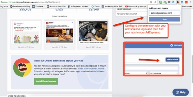
If you are an AdEspresso user there’s even more functionality for you. Download our Chrome extension, connect it to your AdEspresso account, and within a few hours, you’ll start seeing the ads screen-capped from your newsfeed pop-up in your very own Ads Gallery directly in your AdEspresso dashboard.
Now that you know how the gallery works, let’s make it also clear how we evaluate the ads in this monthly series.
We will NOT use our customers’ ads, so we will NOT evaluate the performance of the ad. We will only examine the ad elements that each of you can have access to:
- The visual aspect
- The Headline
- The Ad Text
- The Landing Page, Social proof or CTA
Those who know us well know that, even without hard data to back up our evaluation, we take our job of helping you maximize the results of your advertising efforts on Facebook very seriously. We do it with our guides, with the webinars in the University section of AdEspresso, running experiments (and investing money so you don’t have to) and posting new articles every day on this blog!
So, yes, the evaluations in this post are objectively subjective, but our “subjects” are considered amongst the top experts on Facebook advertising and social media marketing. That said, we will be more than happy to discuss our opinions with you in the comments!
And now it’s about time to discover the Top & Flop Facebook ads we spotted in January 2018.
#1 – People based marketing, FOMO and a stunning image: a Win-Win-Win formula
It’s easy to grab the user’s attention with a great pic of a stunning landscape, but engaging with the desired target and making them actually perform an action is quite another story – and United knows how to tell it!
| CREATIVITY | 8 | Quality picture, engaging |
| HEADLINE | 8 | Straightforward, arouses curiosity |
| AD TEXT / COPY | 8 | Good use of FOMO (creates a sense of urgency) |
| LANDING PAGE | 7 | Match |
| SOCIAL PROOFS | 8 | Good engagement |
| FINAL JUDGEMENT | PASS 👍 |
The win-win-win element of this ad is its creative. A stunning sunset on the Monument Valley can be considered a little too generic, but in this case, it is a win because it totally matches with the brand goal: becoming the first U.S. airline for both Americans and international travelers.
If the iconic landscape is the first win, the smart use of the human element is the second. This Facebook ad shows a couple whose relationship can’t be clearly defined, they might be friends, siblings, lovers, casual travel mates; we can’t even be sure of their gender. All these details are not clearly perceivable at a glance, but they definitely help the user’s identification (following the golden rule of People-Based Marketing).
Third win: the colors of the image convey a sense of nostalgia and a deep desire to come back. A powerful marketing trick to use in your Ads!
The headline is very short and it works, because the image does all the talking. The promise of beautiful landscapes is held, there’s a strong connection between the copy and the ad, the brand’s purpose (to make people fly around the country) is clearly expressed, and a command word is used. This ad headline leaves no loose ends!
The text is brief and points directly to a shared common ground, the best weapon to persuade the reader. Establishing an emotional connection with the user is necessary to leverage that sense of urgency that makes people hurry up not to miss the chance to get your offer.
We cannot be sure that this campaign successfully led to real sales, as here we don’t examine any performance or KPI, but 841 Likes, 91 Comments, and 32 Shares can be considered a positive signal, and this Facebook ad by United deserves a thumb up.
#2 – Communication and target matter!
Information about the features and the pricing of your product are definitely unnecessary if your user isn’t interested in it yet. Knowing your target and the stage of the funnel you’re at is the very first step to creating a successful campaign.
| CREATIVITY | 5 | poor, unengaging |
| HEADLINE | 4 | informative, unengaging |
| AD TEXT / COPY | 4 | informative, promotional |
| LANDING PAGE | 2 | generic |
| SOCIAL PROOFS | 2 | very poor |
| FINAL JUDGEMENT | FAIL 👎 |
I’m a big fan of this tea brand and their tasty products, but this ad made me stick to my espresso. 😎 Let’s assume you never heard about Kusmi Tea and stumble upon this ad, does it make you think about tea?
Red and purple are a good choice and the contrast makes both the Russian nesting doll and the company logo stand out from the background (you don’t need to know The Secrets the Pros Use to Create Great Facebook Ad Designs to nail this), but that’s all.
If you’ve never seen it trust me: Kusmi packaging is outstanding compared to the common tea you can find at the store. So why did they hide it inside a doll?
The packaging could have been a winning element, as it adds value to the product and creates curiosity by conveying the relatively new idea of tea as an exclusive beverage for gourmet. But hiding their fancy tins inside the doll vanished the power of a potential “selling” feature.
It doesn’t go better with the textual element. The headline gives info about the company’s history and the text only focus on the cost of the advertised set: definitely not engaging info. In order to grab the audience attention, a good Facebook ad has to address both the rational and emotional side of the user, as “our emotional-self doesn’t care about features, that part of us wants benefits”.
Let’s say you are interested in the deal (or just in the doll set) and click the link, you’ll be redirected to the main page of Kusmi website, and you’ll have to start the search from the beginning because, at a glance, there’s no evidence of the promotion advertised. How long it takes before you quit and go to Starbucks?
Advertising on Social Media has its rules and timing. You only have a very limited time to catch the user’s attention and even less time to make them perform a specific action. This is the reason why setting up a funnel and precisely target the user with a specific message at each stage of the sale funnel is Facebook ad rule # 1.
The quite unhappy end of the story is only 55 Likes and 1 Comment. This could also be related to a problem with communication and reaching the Target Audience. Remember: finding the right and precise targeting enables you to find the best way to address them.
#3 – More video and fewer words to fight the language barrier
True love needs gesture more than words, and diamonds, aka the most classic symbol of eternal love (and any girl’s best friend), have no voice. This universal idea of love is the emotional core of this Ad.
| CREATIVITY | 10 | deeply emotional, refined |
| HEADLINE | 10 | Short, straight to the point |
| AD TEXT / COPY | / | / |
| LANDING PAGE | 8 | good match |
| SOCIAL PROOFS | 8 | high engagement |
| FINAL JUDGEMENT | PASS 👍 |
This is an example of a company that goes “all in” on the visual impact.
The textual element is unnecessary, the repetition of the easiest and at the same time most intimate love gesture: holding hands, does the trick.
Focusing the video on a series of images showing two hands intertwining matches Tiffany’s DNA (selling special jewels that last forever) and allows to showcase a wide selection of engagement rings without giving a salesy feeling. Creativity here completely matches the brand’s philosophy and the use of black and white give a sense of timeless elegance. Plus, there’s no color to distract the viewer whose attention is captured only by the sparkling diamonds.
The hashtag #BelieveinLove says it all and makes the textual element almost unnecessary. Check out our Definitive Guide if you would like to know more about Hashtags on Facebook.
Tiffany decided to fight the battle for users’ attention using only high impact creatives as weapons, and with 2.4k Likes, 269 comments, and 103 shares, it has definitely won! Takeaway: always learn from the bests!
#4 – “Less is more” is not always right
A light blue desk with laptop, a notebook, a pen and a cup of coffee; besides being used and abused in social media ads, it doesn’t provide any specific info about the service Taboola is promoting.
| CREATIVITY | 5 | common, unfocused |
| HEADLINE | 2 | long, unfocused |
| AD TEXT / COPY | 2 | brief, unanswered |
| LANDING PAGE | / | / |
| SOCIAL PROOFS | 0 | absent |
| FINAL JUDGEMENT | FAIL 👎 |
This photo is wrong for many reasons, first of all, it does not show the advertised service at a glance. The laconic description “grow your business” at the very top doesn’t add much.
Even if using stock photos is wrong by default, the image isn’t totally a fail as it is chromatically build to drive the user’s attention to the Company’s core business.
The mind behind this ad might not have had a clear idea of the buyer persona to target; moreover, the presence of disturbing and unimportant elements (such as the trumpet and other points of the list) make this creative a total fail in gaining the user’s attention.
The headline is too short, and the unanswered question creates doubts and moves the user away instead of stimulating curiosity and the need for information.
The text, on the other side, is so long that it doesn’t fit in the provided space. This is listed as error Nr. 7 in our list of Brain Dead Facebook Ad Mistakes. The user is asked to click for more info, but to entice someone to know more they should at least give some hints on the service promoted.
The lack of social proofs is the only possible outcome of an ad that missed to stress the valuable key points of the advertised service.
Wrapping it up
What do you think of our selection? Did we give you some great ideas to use in your next ad? And, most importantly, did you learn from the mistakes we’ve shown you?
I hope you did, and these tests will be helpful. We’ll keep scrutinizing ad after ad and next month we’ll present you a new selection of Top and Flop ads.
If you want to suggest us your favorite ads, or simply want us to examine one of your competitors, just send us the link in the comments!
The Top & Flop Ads We Saw On Social Media
(in December 2017)
Advertising on social media is a scientific formula, or a kitchen recipe if you prefer. If you follow the procedures, select the best ingredients and mix them correctly, you can’t fail.
Do you want to be the Gordon Ramsay of Facebook ads? We have the best Social Media ads “menu” online, our Ads Gallery, and we’ll give you plenty of recipes.
Let’s start with the basics. To bake the perfect Facebook ads you need only four ingredients:
- High-impact creatives
- Engaging headlines
- Brief texts
- Stimulating call-to-actions!
Easy right? Easier said than done 🙁 since there are so many bad ads out there!
Knowing the right elements of an ad that converts and the dos and don’ts of advertising on Facebook doesn’t mean nailing the perfect combo. So how can you turn yourself into a social media ads Masterchef? You need good teachers, clear explanations and a lot of examples to copy (included your competitors’ ones, so you can do better!).
We give you all of that! For the first time, we decided to put the skills of AdEspresso’s Facebook ads experts at your service (for free). Each month they will, in turn, explore for you the incredible resource that is our Ad Gallery and select the best and worst ads, giving you a deep analysis of each.
For those two or three out there that still haven’t discovered our Ads Gallery, it’s a collection of Ads that each user can catch simply downloading the AdEspresso ads gallery for chrome plugin. It’s a massive database composed of ads in 36 different languages, at the moment it counts 1,026,136 Facebook Ads and 64,993 Twitter Ads, and Every day hundreds of new Facebook Ads, Twitter Ads and Landing Pages are added!
Plus, it is YOURS: With our Chrome extension, you’ll automatically get your own ad swipe file pulled from YOUR Facebook feed and added automatically to your personal AdEspresso dashboard, which is your precious tool for study or inspiration. Each AdEspresso user can access two different Ads Galleries: the first one is that mentioned above, the other one can be found in the University section. This is our complete Ads Gallery composed of both Ads that we selected from all the social media platforms, plus the ones selected and shared by our users. This second one is available for all AdEspresso users although trial users can only enjoy a limited version of it (up to 20 searches).
Top and Flop Facebook Ads of the month: how it works
Each chosen ad of this article would be taken from the Ads gallery and investigated through a series of given parameters that will determine if it’s a Top ad (and passed the test) or a Flop (and it failed).
We are going to address ads as they appeared in the FB newsfeed and investigate them paying attention to 4 elements:
- The Visual aspect (both still images or video), because this is the first element to grab the user’s attention;
- The Headline, because it contributes to arousing the users’ curiosity and tempts them to know more about the advertised product or service;
- We will also analyze the Ad text, and give you precious tips on how to make it perfect;
- Last but not least, we’ll consider other important elements of an ad: the landing page, the social proof or the CTA.
To avoid any suspicion of impartiality, we won’t examine our customer’s campaigns.
Clear enough? Let’s start then!
#1 – Curiosity is always a good choice!
From the engaging headline to the perfect picture, this Ad has everything it needs to touch the user’s heart and gain his curiosity.
| CREATIVITY | 9 | high emotional impact |
| HEADLINE | 9 | engaging, hilarious |
| AD TEXT / COPY | 8 | short and to the point |
| LANDING PAGE | 8 | good match |
| SOCIAL PROOFS | 9 | high engagement |
| FINAL JUDGEMENT | PASS 👍 |
Using cute puppies always works, but what makes the difference here is the way the story is told and the high impact of the video used. Videos are one of the best four ways to engage the Audience with Visual Storytelling on Facebook, but what makes this ad a Top Ad is how well they mastered the art of storytelling. The dog, the forest and the final jump in the suitcase blow , the user’s mind up with questions and curiosity reaches its peak.
The headline explains the mystery and awakens the users’ interest promising an escape from everyday-life and “Monday blues”. It is at the same time easy-to-read, relatively brief and clear with no space for doubts left. Text and Landing Page reinforce the message without overloading it: here every word is carefully selected.
The Landing Page closely resembles the Ad both in style and colors (the light blue of the suitcase can also be traced in the company’s logo). The likeness between the company’s payoff “STA Travel: START THE ADVENTURE” and the Ad’s message, is also a good example of a successful match, and we now that Message Match really makes the Ad’s cost decrease.
This Ad has everything it needs to perform really well, and its Social Proof (451 Likes, 161 Comments and 47 shares) confirm our judgment on this being a Top ad.
Think out of the frame!
“Think out of the frame” isn’t only a revolutionary motto but also the best weapon to fight people’s 8-seconds attention span . Unfortunately, being too much “out” is one of this Ad’s weaknesses.
| CREATIVITY | 6 | common |
| HEADLINE | 4 | impersonal |
| AD TEXT / COPY | 3 | extremely long, cut |
| LANDING PAGE | 7 | match |
| SOCIAL PROOFS | 4 | few |
| FINAL JUDGEMENT | FAIL 👎 |
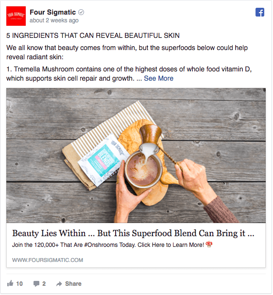
The image is a stock photo that we can see used for a lot of food ads: hands pouring something milkish in a mug with a rustic wood background isn’t exactly the outstanding image of superfood that will grab the user’s attention. Finding the right image is not easy (inless you have your own amazing design team like we do) but there’s plenty of ways to improve your images, choosing the right picture or avoiding copyright issues, just click on the links to have all the tips and tricks your ads need!
The headline is a bit too long and impersonal, a more conversational and personal approach is usually suggested in order to make people engage with the product and the brand. If you need inspiration, you can check our Formulas and Strategies to write irresistible Ad Headline.
The capital letters in the Ad text can sound authoritative plus it is extremely long and it gets cut. One of the key elements of a good Facebook ad is a text that focuses on few relevant points leaving out all the unimportant stuff. “Less is more” should become your new mantra when creating your Facebook ads!
From UVP, through chat and to CTA, the Ad’s Landing Page has all the Crucial Elements that a good Landing Page is expected to have, so positive note at this round is worth!
As stated before, Social Proofs are the most effective KPI to track an ad’s performance and they constitute an impartial judgment. Few likes, poor comments, and no shares are the results of an Ad that hasn’t touch the User in depth. It matches with our school report that shows a Fail.
#3 Sweet moments of happy love
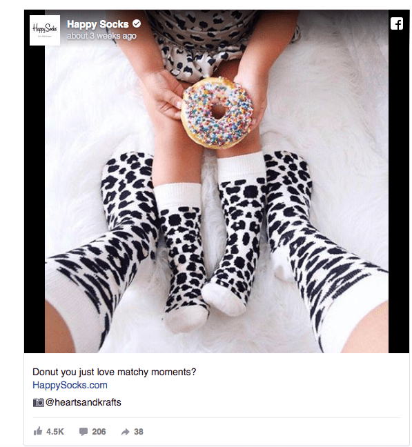
Eye-catching creatives, deep emotion, and natural humor are the reasons for the success of this Ad; it directly points to the right side of the brain striking users emotional intelligence.
| CREATIVITY | 9 | funny, eye-catching, emotional |
| HEADLINE | 9 | brief, engaging, hilarious |
| AD TEXT / COPY | / | / |
| LANDING PAGE | 9 | good match |
| SOCIAL PROOFS | 10 | Extremely high engagement |
| FINAL JUDGEMENT | PASS 👍 |
Here the creative isn’t build up to tell a story, but to catch a sweet and intimate moment that everyone can relate to. No gender matters here, as the advertised socks fit both men, women, and babies. The subject has been chosen to create a deep emotional connection with the users -who hasn’t snuggled with their kids or enjoyed cuddling with mom or dad as a child? Empathy is the secret sauce here, the only emotion able to establish a deep and lasting relationship between the brand and the user.
The User’s attention is grabbed also by the use of Dalmatian spots, a really good example of creativity that stands out and doesn’t mind to dare! The usage of words follows the same concept of the visual: in the image, the black and white of the socks is counterbalanced by a rainbow-colored donut while, in the text, the high emotional tone of the image coexists with the hilarious headline.
The headline is a successful example of a brief message that says everything using a few simple words: the message is emphasized, the hilarity of the brand conveyed and the User directly engaged with a request. Even if using question marks in the headlines is still an open debate, in this case, the language pun is only used to stress the visual message which remains the core of this ad. What matters here is the moment captured in the image, this could also be the reason why no text is added.
With 4.5K Likes, 205 Comments, and 38 Shares, users have shown to appreciate the ad, and the use of UGC (by quoting the user who posted the photo) is proper of a brand that cares about its customers and takes their content and ideas into consideration. They really deserve their spot among the Top Ad of our gallery!
Not going far without empathy
The most effective way to catch users attention definitely involves creating emotions. Apparently, Desjardins creatives didn’t know.
| CREATIVITY | 2 | un-personal, unengaging |
| HEADLINE | 4 | unengaging |
| AD TEXT / COPY | / | / |
| LANDING PAGE | 0 | absent |
| SOCIAL PROOFS | 2 | less |
| FINAL JUDGEMENT | FAIL 👎 |
A successful ad addresses the user directly, talks to him and makes him identify with a given situation. It’s only through emotions that a common ground is set and the seed of a real and steady business relationship is planted. Does this happen in this Ad? Definitely not and due to a bunch of different reasons, let’s see them in detail!
The video is poor and the lack of real-life examples or ad-hoc Buyer Personas discourages the user’s identification with the brand. Emojis can be funny and might work but, in this case, they prevent the user’s identification and engagement -how is that possible to be interested in a product or service that doesn’t talk to you directly? Detail targeting is the real feature that makes the difference when advertising on Facebook – eager to make the most out of it? Check out this guide!
The headline is meant to be hilarious and should help the user identification with a real-case situation, but this doesn’t actually happen here 🙁 This headline is unengaging and doesn’t arise user’s curiosity, it doesn’t make you want to click and find out more about the advertised product or service.
But let’s assume that someone is triggered by the video and would like to know more about the travel insurance offered. The worst fail of this ad is that there’s no link to a landing page! Few Likes and even fewer comments are the only possible outcome of an Ad that hasn’t been able to address the user’s rational and emotional side. A total Flop!
What do you think? Do you agree with the figures on our report cards? Which kind of ads would you see scrutinized? Let us know in the comments below!






Hey Monica, I’m looking to smash Facebook Ads this year so thank you for this article as this will save me tons of money and time! I created my Facebook ad and it did not too bad though it can be better.. Hey, quick question – I’m sure you would of heard of Joel Kellman before since he is pretty well known in the Facebook Ads industry. Anyway, he has an online FB Ads course and I was reading about it on this guys review http://facebookadsmadeeasy.co.uk/2017/12/01/my-facebook-ads-essential-review-heres-what-i-really-think/ apparently they grew their company by 427%. I just thought to ask you since you seem to know what you’re talking about and would love your thoughts on Joel and his course? Thanks heaps again for the tips, hope you can reply soon!
Hi Monica, we ran this ad in the New Year: https://www.facebook.com/433249880025365/posts/2051853451498325
Would love your feedback!
I like it, the image really stands out and the copy is clean and to the point. It looks like you got a good engagement as well. Nicely done!
Awesome post! I never seen this kind of post, I a’m fan of your blog. this information really useful for all. Thanks for sharing wonderful details. give details of Facebook Page Management services.
It’s good to look at whats working and whats not working. I launched an FB ad that didn’t do too well, so I need to focus more on ad copy and image.
Would be good to have a top 10 of the best FB ads of 2017 or something like that.
Keep up the good work
check this out https://adespresso.com/blog/best-facebook-ad-campaigns/ 🙂
there are a lot of factors that determine that performance of Facebook ads. It not always about Ad copy and image. Have a look into the reports in detail, it would you give you some suggestions on what is working and what is not working.
facebook is considered the best selling opportunity. Therefore, we need to utilize and promote the strengths of our plan.
Looking to fine tune our ads and collection new ideas. Outstanding analysis of what to do and what to avoid.
Also a great reminder of what people need to see in an ad. Bookmarked this. Thanks!
facebook has become best platform to advertise our company, as they have billion of the users to they so it place to advertise also at the very cheap price.
Thanks for sharing a nice post.
keep it up 🙂
Check out this post for more tips on ad creation on Facebook.
this article nice and I would really like to thank for your article it’s really helpful. Regards
Superb article with nice information and I would really like to thank for the article as it is very helpful. Regards
Superb information from this article and I have to tell you, your blog giving the best and awesome information. And I would like to thanks for this information that I had been looking for. Regards
Wonderful information and please keep up the good work, thanks a lot for sharing kind of information.
Regards
I really love that #4 example which you gave. It is a false myth that many marketers follow. We need to have some text and a good headline for the ad. Else the whole Ad would appear not meaningful just as in the case of taboola.