If you want to drive traffic and sales online, there are few methods as effective as Google Display Ads.
According to Google, their display ads reach more than 90% of all internet users.
So, whether you are wanting to create a simple text ad, a Youtube ad, or draw with a slide show ad, Google Display has you covered.
In this article, we’ll give you 10 real-world Google Display Ad examples to inspire your business to success and growth through advertising. Let’s get started.
Unlike Ads that show up in Google’s search network (ads are triggered based on searches), display ads show up on different websites based on targeting options the advertiser can control.
Previously called Google Adwords, these multi-format ads show up on websites across the internet in the form of banner ads, native ads, and video ads.
What Are The Benefits of Google Display Ad?
For starters, display ads have a massive reach, allowing you to target web users on thousands of websites across the internet, including YouTube, news sites, and niche blogs alike.
For example, here’s what a Google display ad looks like on the CNN website:

Using a responsive display ad can also help reach users on mobile devices and even in their email inbox with Gmail ads.
Google Display Ads are also an incredibly cost-effective method for reaching prospective customers or leads, with the average company making $2 in revenue for every $1 they spend on Google Display Ads.
Google Display Ad Examples to Inspire Your Next Campaign
Google Display Ads have a high ROI — when you use them correctly.
But what actually works?
Let’s take a look at 10 different Google Display Ad examples, including why they work and how you can leverage the same strategies to attract attention and clicks.
Example 1: Adroll’s Banner Display Ad on The Weather Channel
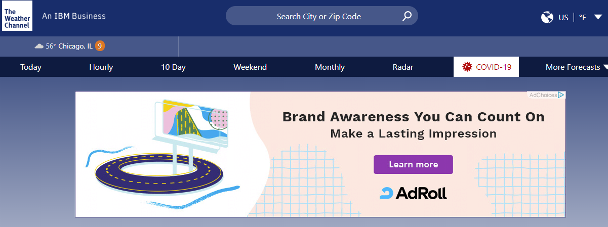
Adroll, an AI-driven marketing software solution, is promoting brand awareness on The Weather Channel (and many other websites) using this Google Ad:
The ad shows up at the top of The Weather Channel’s site but below the navbar, making it far more visible than a banner ad right below the URL bar — which many website users are blind to.
Why it works: Design, Repetition, Retargeting
The white spaces in the ad help it stand apart from the rest of The Weather Channel’s page. The grid pattern breaks around the button, drawing the users attention to the “Learn More” CTA. And, the prominent Ad Roll logo helps increase brand awareness.
Keep in mind that most users will need to see your ad at least seven times before taking action, so improving brand awareness is critical. This is probably a retargeted Google Display ad, as it followed me to nearly a dozen different sites as I was looking for examples, including The Balance and CNN.
Example 2: Constant Contact Video Ad
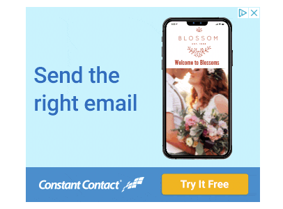
Constant Contact, an email and marketing platform primarily for small businesses, promotes their email marketing tool with this Google ad example:
The ad was a carousel ad and flipped to several other images touting the benefits of their email marketing solution.
Why it works: Design, Free Offer, Repetition
Although the ad is pretty simple, several features help it stand out. Notice how the button is orange, while the rest of the ad is blue. This draws the user’s eye directly to where they want you to click — on that “Try It Free” button.
The free trial offer is also tempting — the user knows they won’t have to make a purchase to start creating the right emails.
This also wasn’t a single ad — a matching ad showed up in the sidebar and as a bottom banner ad. That repetition helps Constant Contact reach the required effective frequency to drive actual clicks.
Example 3: 1800 Contacts Video Ad (and banner ad)
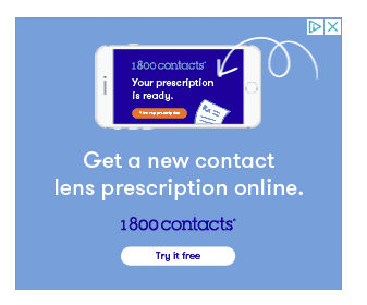
This ad for 1800 Contacts is likely also a retargeting ad, as I was searching for contacts a few days ago. To draw me in, they hit me with this animated ad:
It’s a simple ad, but it also covers a ton of information — it tells you not only that you can get contacts, but that you can get a new contact prescription, which is often costly.
They stayed on brand by using their trademark colors and logo several times, and used a “Try it Free” button to encourage clicks.
The ad showed several slides, including this final one with an offer to save 10% off the first order.
The ad showed up repeatedly on the same website, both embedded in the content and in the right sidebar. A video ad like this could also be used as a YouTube ad, which would help capture the 2 billion YouTube users.
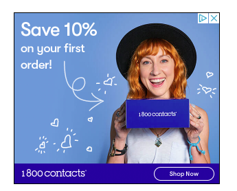
Then at the bottom of the page, they used this banner ad to remind me of their 10% offer. Just in case the previous three or four ads didn’t quite do the trick.
Why it works: Repetition, Movement, Discount Offer
Showing the ad over and over again, and using a different ad size, ensures users will see it. It also helps make sure 1800 Contacts hits that effective frequency, which drives web users to actually click.
The video component also helped ensure users saw the ad. Finally, the discount offer is a powerful traffic driver — but at 10%, it is unlikely to impact the bottom line too much.
Example 4: Rival IQ Social Snapshot Reports
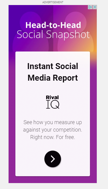
Rival IQ, a social media analytics platform, is looking to drive sign-ups for their tool with this Google Display Ad promoting a free social media report for users:
The ad sends users to a landing page where they can select from three social media reports, including Twitter, Instagram, and Facebook.
Unlike ads that seek to drive conversions, this one is gathering leads the brand can then work to convert.
Why it works: Design, Free Offer, Short Copy
Like several other Google ad examples, this ad uses white space and color to draw the user’s eye to their offer. The arrow button is surrounded by open space, making it easier to see. They also offer something for free — which helps increase clicks.
What really stands out in this ad, however, is the copy. It is short but also agitates the user a bit by suggesting they will learn how to gain a competitive edge in their industry — which is the core goal of many business owners.
Example 5: Salesforce Crisis Solution Ads
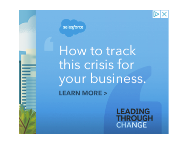
The next Google Display Ad example on the list comes from Salesforce, a software solution focusing on customer relationships. Salesforce knows that many business owners are struggling to navigate the COVID-19 crisis, so they delivered this sidebar ad:
At the bottom of the page, they also delivered this ad:
Both ads were well branded — there’s no question this ad is for Salesforce — and offered timely information for challenges that business owners are facing.
Why it Works: Repetition, Timely Offer, Different Colors
Repetition is one of the most effective ways to increase ad CTR, which is why we see it repeatedly in these examples. In addition to delivering several ads, Salesforce provides timely information designed to help business leaders navigate the COVID-19 crisis.
They also use different colors for ads on the same page — the soothing blue for an ad about how to navigate the crisis, and the orange ad further down the page.
This change in color helps draw the eye, especially when your ad shows up on thousands of different sites with different color schemes.
Example 6: MailChimp Sign Up Display Ad
I write a lot about digital marketing, which means I also do a ton of research on different marketing platforms, analytic tools, and — obviously — email marketing tools. Which explains why there’s another email marketing tool example.
This one is from MailChimp, the email marketing tool, and platform.
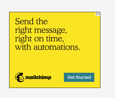
This bright yellow ad on The Food Network uses multiple images, bright colors, and prominent branding.
Why it works: Color and Branding
The bright yellow color of this ad made it stand out from the rest of the page — and helped highlight the bright blue CTA button. They kept the message simple and relied on their branding to drive action — they are betting I already know who they are ( I do) and just need a little nudge to sign up.
Example 7: Noracora Clothing Ad
This massive ad is from Noracora, an online fashion platform offering boho-style clothing, shoes, and accessories from a range of independent designers.
The ad was in the right sidebar and moved down as I scrolled the website.
Why it works: Professional Photography and Discount Offer
Professional photographs help highlight the wide variety of items the site sells, including shirts, dresses, and shoes. Style-wise, the photographs mimic the feed of an Instagram Influencer, making the ad feel more authentic and a bit less sales-y.
Finally, like many other ads, they wrap up the ad with a discount offer. While you should be careful offering large discounts, small discounts like this one can help give viewers a little nudge towards conversion.
Example 8: Insperity’s HR Mistakes Display Ad
Insperity, an human resource management solution, used this ad to promote their new ebook about common HR mistakes. The ad used a bright orange button to attract attention and included branding, which helps with brand awareness.
Unlike clothing companies, who have impulse buys going for them, or SaaS solutions that can offer a free trial, Insperity has a much more complex product. They offer full-service HR and ad-hoc solutions for business recruiting, insurance, and bookkeeping.
The customers who purchase these solutions are likely to need quite a bit of education about the benefits and may need to pitch the product to other decision-makers at their company. A quick buy isn’t likely to happen, which is why Insperity uses their Google Ads to gather leads rather than attempting to drive sales.
Clicking on the ad above takes the user to a landing page to download their ebook in exchange for the user’s name, role, and email address.
Why it works: Bright colors, Intriguing Copy,
Lead Generation Rather Than Sales
In addition to the bright colors, which attract attention, the ad also uses a solution-based approach to copy. Rather than saying, “Hey, we can make your HR easier!”, they offer solutions for an issue the user is likely facing in the form of education.
Driving leads can help businesses with higher-end products or services get users into their sales funnel and is often more effective than pushing sales.
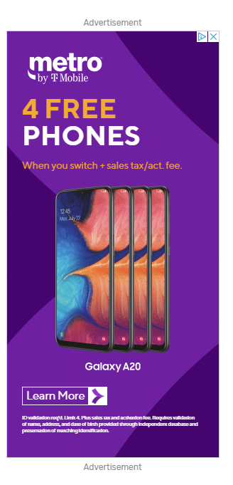
Example 9: Metro by T Mobile Free Phone Ad
This bold ad for Metro by T Mobile showed up on a blog post about buying a new house.
The bold colors and offers are likely to draw attention. Who doesn’t want 4 free phones?
Why It Works: Bold Colors, Clear CTA, Careful Targeting
The bright colors of this ad stood out on a mostly white page. The clearly-worded CTA tells users exactly what to expect and how to take the next step.
The ad was also extremely well-targeted — it showed up on a blog about buying and selling a home, which is a time when many people are likely to be looking for ways to save money.
Example 10: Pact Clothing
Pact Clothing, an organic clothing brand, offered this timely carousel ad promoting its brand in the weeks surrounding Earth Day.
The first image ad used bold colors that grabbed the eye, while the second image ad showed several different styles they offer, including underwear, shirts, and kids’ clothing.
Why it works: Bold Color, On-Brand Timely Offer, Movement
The bright colors are eye-catching, while the timely offer is in line with their brand, which promotes the use of organic cotton and sweatshop-free manufacturing.
Also, the slideshow’s movement is likely to catch users’ eyes as they scroll down the page.
Finally, showing several different styles helps attract a broader range of customers — including parents and those looking for lounge-type wear.
Will Your Ad Make our Next Google Display Ad Examples Top 10?
When it comes to Google Display Ads, you have a ton of flexibility for design, format, and copy.
Plus, there is nearly an unlimited amount of Google Display Ad targeting options, which means you can target users based on demographics, interests, or even actions they take on your website through retargeting.
Simply create a different ad group, and see what ads drive more traffic or conversions.
All that flexibility, however, can get a bit overwhelming.
Should you use dynamic ads, video ads, or retargeting? What about budgeting — should you automate it or take a hands-on approach? Do you need to create separate mobile ads, or can you use a responsive ad?
The only way to know is to test what works. Hopefully, the Google Display Ad examples above will inspire you to get you started.






informative article, thanks for sharing
I’m also currently running a display ad campaign for a brand. I too feel that creating responsive ads is a better thing. This can increase the reach, impressions, and clicks for the campaign.
And I was quite impressed by the T Mobile example ad which you shared in your blog post. It was interesting to learn that a mobile brand can get great results by focusing on Ad design, color, CTA, and choose perfect targeting.
Very unique and informative! I can always trust you guys with valuable tips and techniques!