Facebook Lead Ads are so simple. When the ad appears on your feed, you fill in your contact information without ever leaving Facebook.
In contrast, with Landing Pages, you have to go to a separate website where load times, intimidating forms, and distractions potentially take you off course from providing your contact info.
Thus, I hastily made a conclusion when setting up our company’s re-targeting campaigns: Lead Ads were the best type of ad to run!
I enthusiastically told my boss, our CEO. His face was expressionless. He disagreed.
“No,” he said. “We don’t know that. Here’s 2,000 dollars. Run an experiment.”
The Experiment Set Up
While we’ve been quiet about it at AdEspresso, our experiments happen in a special place called the AdEspresso University.
The University is a members-only space – filled with video courses, webinars, and a private Facebook community – but feel free to check it out after you see what I did with my boss’ money 😉
For this experiment, I created two “evergreen” Facebook Ad campaigns targeting our website visitors.
The mission of the campaigns was to get a website visitor (warm traffic audience) to download one of our eBooks (provide their email address so we could then offer them more eBooks, and eventually a Free Trial of AdEspresso).
If the user didn’t re-visit our website or download an eBook after being shown a series of eBook ads after18 days, they would be excluded from seeing any more ads.
Campaign Set Up:
The first campaign to run was the Landing Pages campaign. A few days after it finished, I ran the Lead Ads campaign.
The campaign was based on timeframes of website custom audiences. I also excluded anyone that had downloaded an eBook before, had a Free Trial before, or were/had been a Customer.
We wanted to attract new leads only.
The only difference between the campaigns was that one went to a landing page to fill out a form to get the eBook, and the other allowed the user to fill out their information in a form without leaving Facebook via a Lead Ad.
Budget:
Daily budget of 60 dollars per day, with a total spending cap of 1000 dollars per campaign. So 2,000 dollars total.
Landing Page Ad Example:
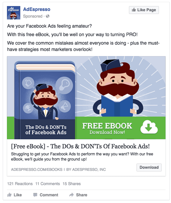
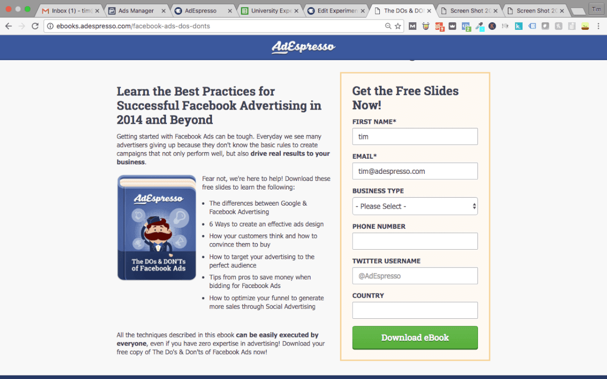
Once they clicked “Download” they were taken to this page:
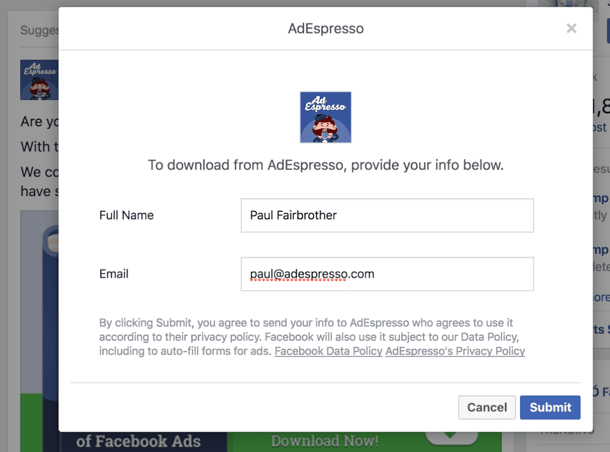
Lead Ad Example:
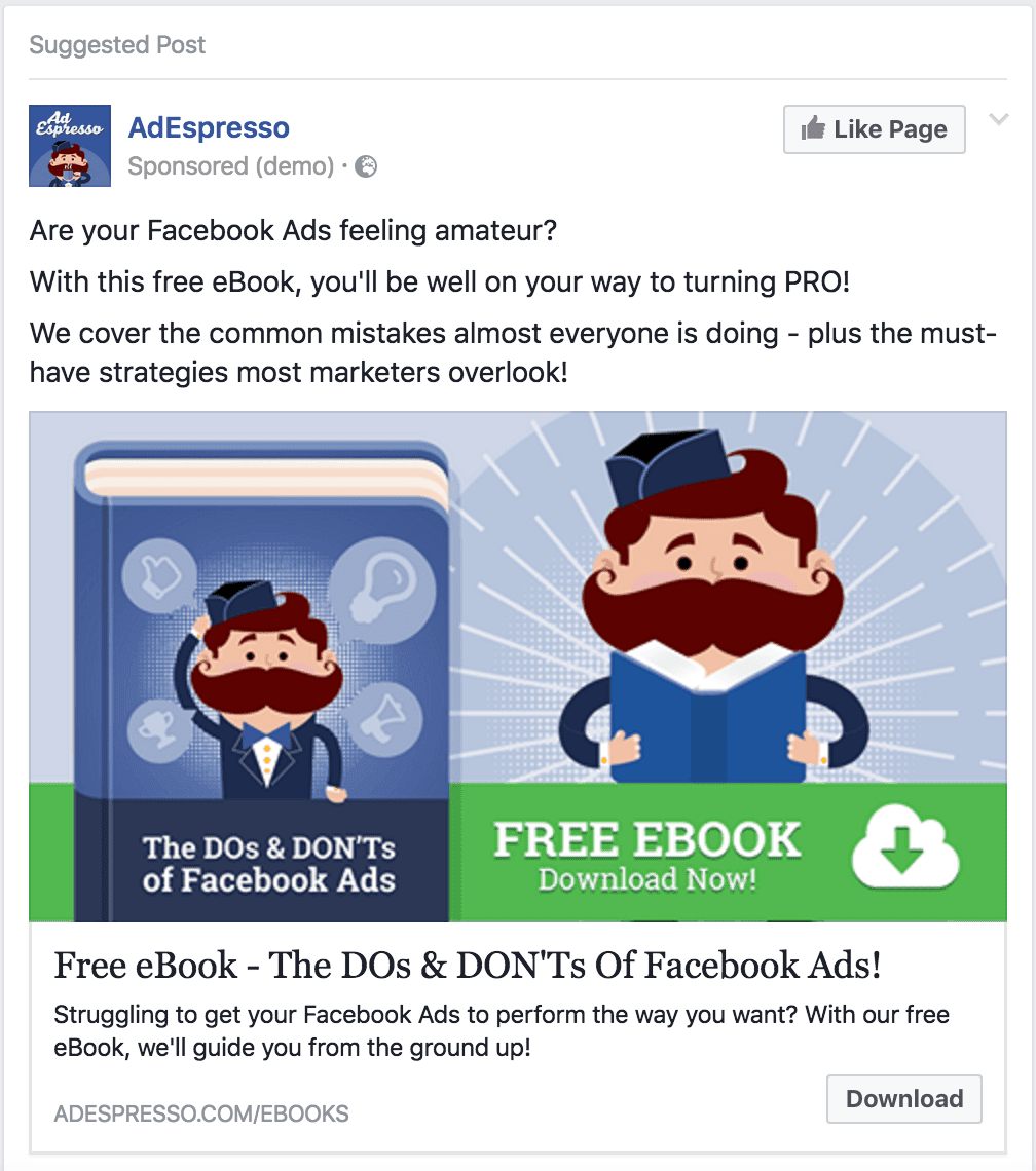
Notice that it looks identical to the landing page ad. Except once they clicked Download, this form popped up so they didn’t have to leave Facebook:
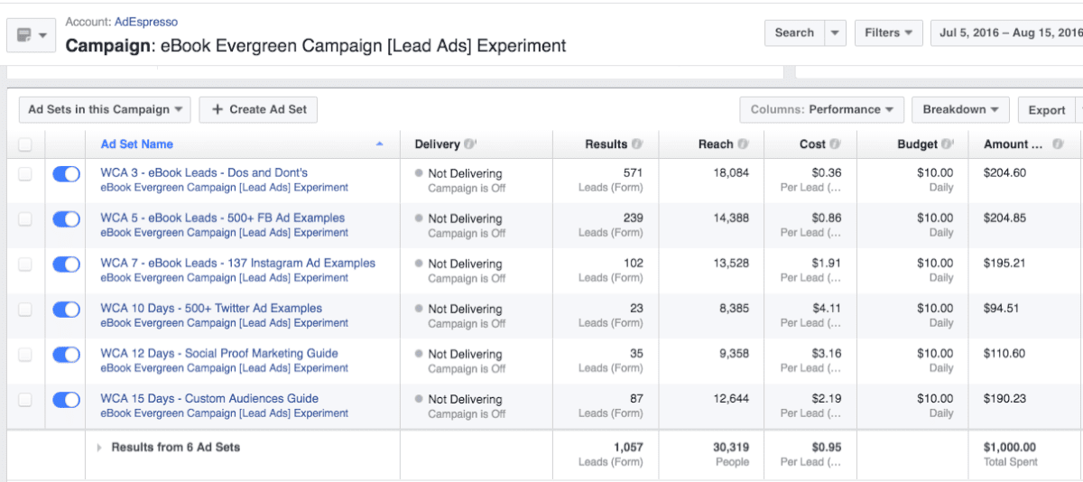
Ad Set Structure:
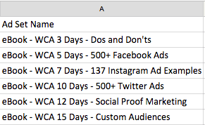
Each ad set contains only one ad – for a specific eBook – and this ad was served to a website visitor based on the timeframe they visited the site. WCA stands for “Website Custom Audience.” As soon as someone visits the site, they would enter the campaign(except for the excluded audiences previously mentioned), and begin seeing an ad for an eBook – “Do’s and Dont’s of Facebook Ads.”
- Day 0 (initial visit) – Day 3 since website visit: Dos and Don’t eBook
- Day 3 – Day 5 since website visit : 500+ Facebook Ads eBook
- Day 5 – Day 7 since website visit : 137 Instagram Ad Examples eBook
- Day 7 – Day 10 since website visit: 500+ Twitter Ads eBook
- Day 10 – Day 12 since website visit : Social Proof Marketing eBook
- Day 12 – Day 15 since website visit: Facebook Custom Audiences eBook
As you can see, each ad lasted about 2-3 days.
I also set it up so that if the user clicked on the ad, they would no longer see that particular ad anymore, even if they re-visited the website (I’ll explain how I did this later).
And of course, once the user downloaded an eBook, or if they started a Free Trial without downloading an eBook, they would exit the campaign and not see any more eBook ads at all.
Placements:
- For Landing Pages, the ads would appear on Desktop, Mobile, and Right-Column.
- For Lead Ads, the ads would appear on Desktop and Mobile.
Excluded Audiences:
- Those that downloaded an eBook before, or during, the campaign
- Previous and current customers
- Any website custom audience that wasn’t in the ad set’s timeframe (over 15 days since their last visit)
Also, as mentioned earlier, if someone clicked on an ad to go the Landing Page or start the Lead Ad submission process, they were then excluded from seeing that specific ad anymore.
For example: If someone clicked on the ad for the Do’s and Don’ts eBook, but didn’t give us their email for that eBook, they would be excluded from seeing that specific ad for the “Do’s and Dont’s” eBook. However, they wouldn’t exit the campaign itself. After 5 days, they would then be shown the ad for the “500+ Facebook Ad examples” eBook…(still confused? ask a comment!)
I accomplished this by creating unique Facebook Custom Audiences of “those that clicked [eBook’s name]’s ad” with Google’s UTM codes.
What were the results?
Here’s a Google Sheet with the results. You can also see the images below.
Landing Pages:
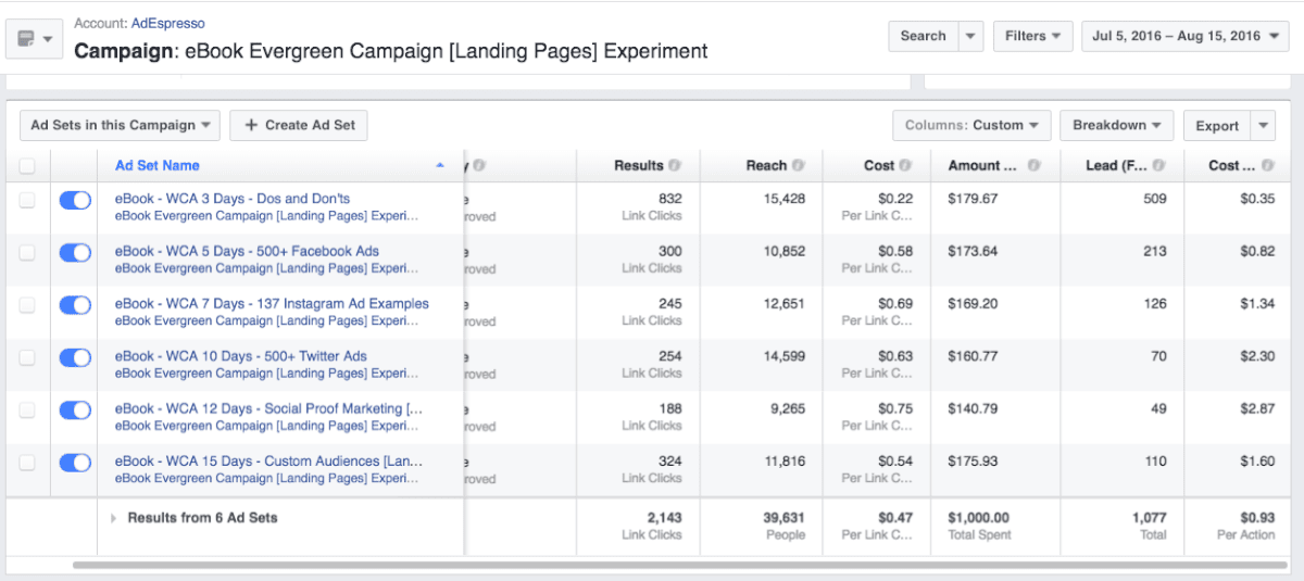
Notice that the “Cost Per Action – Lead” (far right column), dramatically increases after 7 days.
Placement:
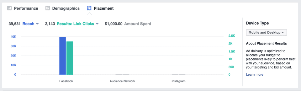
Desktop had more link clicks for the landing pages!
We had more clicks and leads via Desktop!
Overall Landing Page results:

Of those that came to the landing page, we had 1,077 become leads. This was a conversion rate of 50%.
Lead Ads:
Similar to the Landing Pages campaign, the cost per lead dramatically increased after 7 days.
Placement:
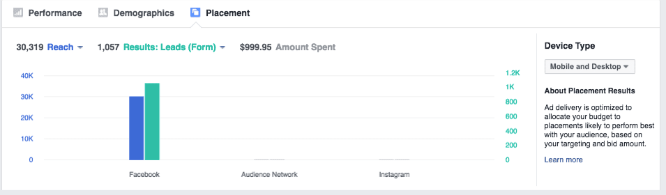
In this case, we had more Leads from Mobile than Desktop.
There were 1,569 clicks on the Lead Ad Form, and 1,057 people completed the Lead Form. So a conversion rate of 67%. Nice!
Overall Lead Ad results:

So who won?
Technically, from a cost-per-lead perspective, Landing Pages. But just barely! You can hardly call it a “winner.” It had a slightly lower cost per lead at 93 cents (.93 USD), while Lead Ads had a slightly higher cost per lead at .95 (95 cents). It is worth noting though, the Lead Ads cost-per-lead dramatically spiked after 7 days relative to how the Landing Pages cost-per-lead performed in the same time-frame.
However, Lead Ads performed better than the Landing Pages on mobile placements, while Landing Pages performed better than Lead Ads on Desktop.
This brings us to the key takeaway in this experiment:
When re-targeting website visitors, Lead Ads are more likely to win on mobile, while Landing Pages are more likely to win on Desktop.
Landing Pages might also have a further edge since it took more effort to fill out the form to get the eBook. So they might be higher qualified leads. Nonetheless, everyone who saw the ads already knew AdEspresso (website visitors), so in a sense, all were pre-qualified.
For cold traffic campaigns, there’s a hypothesis floating around that Landing Pages blow the socks off of Lead Ads, since Lead Ads only required a “name” and “email” (very little commitment). I’ve seen this happen in previous campaigns I’ve created, and that’s why I didn’t test it in this experiment.
Right now, based on the results of this experiment, I’m adapting our Lead Ad campaigns to run on Mobile-only, and Landing Page campaigns to run on Desktop-only. Stay tuned for an update at some point in the future as to how this turns out along with the quality of these leads.
As mentioned, with Lead Ad Engagement Custom Audiences, I can also re-target those who engaged with the Lead Ads Forms, but didn’t submit their contact info (approximately 33% of people). In the same fashion, I can re-target those who visited a Landing Page during the campaign, but didn’t submit (approximately 50% of the people). Gotta love re-targeting!
Other insights:
In both campaigns, the Social Proof Marketing eBook performed very poorly as a lead magnet. The Twitter Ads eBook also performed poorly – with a cost of 4.11 USD per lead in the the Lead Ads campaign. I am going to replace these with different eBook offers to see if I can have a better fit for our audience.
Additionally, in both campaigns, the frequency of the later ad sets went over 5 (on average, the user saw the ad 5 times or more per ad set). This means that, by the end of 15 days, some users may have seen AdEspresso eBook ads for upwards of 25 times – offering an explanation to the higher cost per leads as the campaign went on. For future ads, I would lower the budgets for the ad sets later in the campaign.
Any errors in the Experiment?
If someone re-visited the website, and hadn’t downloaded an eBook, they re-entered the campaign at the beginning. However, if they re-visited because they clicked through on a landing page ad – and were of the 50% that didn’t download the book on the spot – they were then re-entered into the campaign, but excluded from seeing that specific ad again.
I still don’t know how to prevent those who didn’t click any of the ads, but revisited the website, from re-entering the funnel at the beginning and seeing all the same ads again.
Final Word
Want to see these types of experiments first-hand? Members of our University gain access to our experiments one month before we publicly share it on our blog. Starting in 2017, University members also get to choose what to do with our CEO’s money – every month – with a community-wide vote.
Yup, you’ll get to decide where the money goes!
Without joining our University, you’ll still get to see the results of the experiment…it’ll just be a month after everybody else. So if you want early access to the experiments – as well as membership to our private Facebook group, webinars, and courses – I highly suggest looking into becoming a member.
 Any comments on this experiment? Criticisms? Let us know in the comments!
Great read, Tim. Was just curious why you included right column ads for desktop, since lead ads on can only be seen on the feed. So you’d have 3 placements for the lead page vs 2 for the lead ads.
Or did the right column ads give you similar reach to lead ads on the target group, so that you’d be having around the same amount of targetable people?
Simon, sorry for the delay in reply. Actually, that was straight up a mistake. I shouldn’t have included right-column in the landing page ads, but I ran that campaign first (before Lead Ads).
Reach was actually lower for Lead Ads as a result – 30,000 people (compared to 39,000 for Landing Pages). This is definitely a discrepancy, although the results were not based on total counts (but rather CPA), however it’s more ideal to get the sample size fully equal.
Good eye Simon. Thanks for the comment!
Great post! And the good part about it is that I got to see it because a friend liked it. So you didn’t even pay for my click 😉
Hahaha, our auto-post promotion ad of the post didn’t get ya? 😉
Glad you liked the post 🙂 – the plan is to publish one experiment per month on our blog going forward! Watch this space! 😀
Cool article 🙂
Got a question about the sequencing effect of the ads.
Am I right that you’re using the ‘people who haven’t visited in a certain amount of time’ feature to achieve this?
If so, then I’m thinking about a potential issue when someone clicks but doesn’t convert deeper into the sequence.
E.g. If someone clicked the Instagram ebook ad but didn’t convert, then the time-since-last-visit clock would reset. This would send them back to the start and they’d see the Dos and Don’ts ad again (as they didn’t click it). The repetition continues until the Instagram one which is now silenced. And only after that will they start seeing a new phase of the sequence.
If they do a non-converting click again on the next ad – the Twitter eBook – then the process starts again!
I think you can prevent the repetition by adding exclusions to each adset for content further along in the sequence, as well as itself. The downside is that now there can be several days of silence before the next viable ad kicks in (and your results show it’s best to retarget swiftly).
Is there a good way to prevent the repetition whilst also avoiding several days of silence?
The ideal I’m imagining is if someone does a non-converting click, the sequence continues immediately but at the NEXT ad along, instead of the beginning again.
Greg! What a fantastic comment, thanks for digging so deep into how I set it up. That IS an issue, and what I saw as an unfortunate (but seemingly unavoidable) flaw with most evergreen/split-day “website visitor” campaigns, as you duly noted. Like you said, if someone doesn’t click on any of the ads, but gets to the 5th ad (the last in the sequence), then clicks (and doesn’t convert) – boom, they are back to the beginning, seeing the ads they already saw before but weren’t interested in, and advertising dollars get wasted (again).
The ideal WOULD be a type of exclusion, perhaps a unique “ad set audience” so that you could exclude “those who viewed the ad.” Does this exist? “Daily Unique Reach” makes it so the person only sees the ad ONCE per day, but I’m unaware of a way to create a “Viewed Ad Audience.”
I did some poking around pre-experiment, and wasn’t met with any answers. Because if there is a way to do “Viewed Ad” Audience, doing the whole framework of 3-days, 5-days, etc. wouldn’t be necessary. I’ll reply back to this comment if I find out – but so far I’ve just been told “No”. Even if it is “no” now, Facebook is always updating…
Thanks again Greg
Hi Tim, its been quite some time since the article now, but I may know a way to exclude users which saw an ad from seeing other/more ads.
There is an article in German language from September 2016 about frequency capping by utilizing the “view tags” feature from Power Editor. You can use that to get a facebook pixel hit on every ad view and thus exclude these users via custom audiences from further viewing.
However, I wasn’t able to find that viewtag feature in any of my accounts. Either its a feature restricted to eligible accounts or it has been removed in the meantime.
Here is the original article, hope it helps despite the German language: https://www.christian-penseler.de/how-to-frequency-capping-bei-facebook-werbeanzeigen/
Hi Tim,
I’m missing one key factor that we’ve noticed across Lead Ads, unlike Landing Pages campaigns, due to the simple and quick form submission the actual quality of the leads is significantly lower. People seem to press the submit in the Lead Ads but soon forget and even get mad when they get a callback.
Hi Shavit, I’m actually studying our leads down the funnel to try to get more exact data on exactly that: did those leads from the Lead Form convert better or worse? I’d ASSUME worse – just like you experienced. However, I’m implementing tracking and distinguishing our leads from their sources to get accurate ‘down-the-funnel’ conversion data. Hoping to report back soon with my findings! Thanks for reading and your comment 🙂
Hi Tim,
thanks for the insights. Always great to be able to learn from your research!
In this case I’m not sure if you can compare the results, though, because you mentioned “The first campaign to run was the Landing Pages campaign. A few days after it finished, I ran the Lead Ads campaign.”
Is this the right way to do this kind of comparison? Why didn’t you run them at once and eliminate seasonal/daily/weather-dependent/… factors?
Thanks,
Florian
Hi Florian!
I didn’t run them all at once because the same user would be seeing BOTH campaigns (and the frequency would be double – instead of each user seeing each ad a max of 5 times, they would see it 10 times). I could not figure out a way that would eliminate a website visitor from seeing one of the campaigns (while seeing the other).
In my view, the two week delay (with almost everything else on our marketing being consistent), was a better choice.
To give an example, if I ran them at the same time, person A might see the Landing Pages ad two or three times…then on the 4th time, they see the Lead Ads ad and think (“hmm, you know what, I’ll go ahead and go for it”). I wanted to remove that possibility. All for other ideas of how to not make that happen for further experiments though!
Thanks for comment and insights!
Nice lead magnet
Interesting experiment – but you should have asked for the same information in both forms to do a fair comparison. You ask for quite a lot on the landing page and especially phone number and Twitter handle make people think they’ll get spammed.
Hey Niels, good observation on the difference in forms. The Landing Page conversion rate was 50%, perhaps if it only asked for a Name and Email, it’d be a lot higher. I definitely didn’t think adding more to the Lead Form would be a good choice, as one of our writers came to the conclusion that people would be LESS likely to fill it out ( https://adespresso.com/academy/blog/3-questions-ask-lead-ad-forms/). In further experiments, I’ll make a note to ensure the form submissions are equal in nature, as the possibility of that giving the landing pages a larger margin may present itself.
any updates on your second experiment, i.e. targeting mobile devices using lead ads?
Hey Brian! We never did a full on second experiment, but on the 28 day window, the conversion metrics to a free trial were actually almost identical…so it seems that despite the leads SEEMING more qualified for the landing pages (as it took more work), the trial results seem to indicate that the ease of form didn’t lead to lower quality leads. Not exactly what I was expecting, but this might be unique to B2B.
Thanks for sharing this with the FB ad community, Tim.
I think the most fruitful discovery was the desktop vs mobile performance. It kind of makes sense considering peoples’ mindset on each device but yes overall the results are in the lead-to-subscriber conversions.
You’re welcome Aaron. And yes, I’ve since used Lead Ads for almost all of my mobile lead gen!
Hi and thanks for the great blog post,
I know this post is a bit old by now, but if you still monitor it could you give some more insights on how you did this:
“However, they wouldn’t exit the campaign itself. After 5 days, they would then be shown the ad for the “500+ Facebook Ad examples” eBook…(still confused? ask a comment!)
I accomplished this by creating unique Facebook Custom Audiences of “those that clicked [eBook’s name]’s ad” with Google’s UTM codes.”
Hey Sebastian, you can create website custom audiences of anyone who visits a SPECIFIC URL, so I made an entire audience of all those who visited the SPECIFIC URL for EACH eBook’s landing page. All of these SPECIFIC URL audiences (for each eBook landing page) were EXCLUDED from the campaign’s targeting for the SPECIFIC eBook landing page they already visited.
In other words, by creating Facebook Website Custom Audiences of landing page visitors, you can exclude people from being advertised a landing page that they already visited.
If my long-winded reply confused you more than help, I suggest this post by Jon Loomer – https://www.jonloomer.com/2017/03/30/basic-evergreen-facebook-ad-campaign/
Cool thanks for getting back to me
Hey Tim,
I’m considering using this lead ads strategy because I’m noticing only 30% of my link clicks lead to landing page views. Do you know what a standard conversion percent should be for link click –> landing page view?
Hey David, are you using audience network? That could distort your link click -> landing page view. I am not aware of a “standard” figure, but 30 percent is VERY low! I do wonder if certain countries still suffer from click bots too – are you targeting worldwide? When I’m targeting the USA or Europe, without audience network, the link click -> landing page view ratio is very strong.
One thing confused, why using Traffic → Link Click for landing page test instead of Conversion → Leads?
I believe AdEspresso have already proofed that Conversion is WAY more powerful than Traffic? Unpuzzle me please.
thanks for sharing a great information
Hey tһere! Do youu ҝnoᴡ if thеy make аny pluugins to sfeguard aɡainst
hackers? Ӏ’m kiunda paranoid about losing еverything
I’ᴠe worked haгd on. Аny recommendations?
But for clients quality is more important than quality so I guess leads from Landing pages is more qualitative as compare to Facebook Leads.
“Interesting experiment – but you should have asked for the same information in both forms to do a fair comparison. You ask for quite a lot on the landing page and especially phone number and Twitter handle make people think they’ll get spammed.” I agree with Neils, treating with cellphones and social network accounts it’s a delicate subject, besides that, I enjoyed it. Thank you!!
I always preferred using landing pages, just a few times used FB lead, it works but landing pages, for me, are a little bit more professionals. Thanks for the article by the way.
great to know about your ebook lead ad campaign stats and insights. I too had this experience in which the cost per lead went higher after a few days of running the Facebook lead ad campaign.