
A call to action can make or break the success of your social media campaign. If you use the right words, your CTA will inspire your audience to take action — click on your ad, download your ebook, add an item to cart… you name it. On the other hand, if your CTA isn’t catchy and persuasive, your audience will simply scroll past without noticing it.
Keep reading to learn everything you need to know about social media calls to action: what they are, what makes a CTA successful, and how to craft a persuasive CTA for your next campaign. We’ve also included 17 call to action examples (from social media and beyond) to get you inspired. That’s right: we’ve also included great examples from email campaigns and landing pages — because a good CTA is a good CTA, regardless of where it’s placed.
Let’s jump in!
What is a call to action (CTA)?
A call to action (or CTA) is a text prompt designed to inspire the target audience of a marketing campaign to take a desired action. For example, a call to action can encourage people to click on a link, leave a social media comment, visit an online store, make a purchase, etc.
A call to action can take up different forms:
- Text link
- Button
- Plain text with no link
“Buy Now” or “Download Now” are typical examples of simple calls to action.
But a CTA can run longer, too, such as “Subscribe today so you’ll never miss a post.” The possibilities are endless.
Call to action examples from AdEspresso
A good CTA can help with decision fatigue and give meaning to your content. Even if it’s just a two-word phrase, users need some direction to know what to do next.
CTAs that create a sense of urgency will also help increase conversions.
As long as it encourages potential customers to stay engaged on your site, then your call to action has done its job.
Note that having one CTA highlighted is the most common way. At the same time, some marketers use both primary and secondary call to actions in their marketing. We’ll review some best practices of this later on.
How to write an effective CTA for social media (and beyond)
Social media is all about getting users to click on your posts and ads and engage. However, it’s no longer as easy as it sounds. 22.3% of people using ad blockers say there are “too many ads.”
It’s tough out there.
To combat this, increase your conversions and engagement with a compelling call to action on your ads and elsewhere on the web. Let’s see how you can achieve this.
Use strong action words
Writing short and strong CTAs is not only more persuasive, but it’s also necessary due to the character limits on ads. Start with a verb (“buy”) and follow with an adverb (“now”) or a subject (“ebook”) or both.
Here are two call to action examples to the above statement: “Buy Now” or “Download this ebook now.”
Below are some of the most common call to action verbs broken down by intention. Simply pair them with the offering of your business.
| Most Common Purpose | CTAs |
| Ecommerce | Buy, Shop, Order, Reserve, Save, Add to Cart, Pick, View |
| SaaS conversion | Try, Get Started, Subscribe, Sign Up |
| Non-profit conversion | Donate, Commit, Volunteer, Adopt, Give, Support |
| Newsletter or community | Subscribe, Join, Sign Up, Refer, |
| Freebie giveaway | Download, Get, Grab, Claim, Take advantage of |
| General | Learn More, See More, See How, Start, Find Out, Check it Out, Click here, Continue, Swipe Up, |
Tip: check your call to action against the LIFT Model (see below).
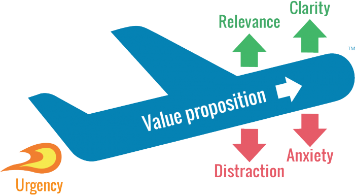
If we took our example from above, it would look something like this:
Download = relevance
this ebook = clarity
now = urgency
Download this ebook = value proposition
Use the text surrounding your call to action to:
- Reduce distractions (i.e., remove unnecessary links, images, etc.)
- Ease anxiety (e.g., add the disclaimer “no credit card required”)
Provoke emotion or enthusiasm
If you want to evoke an emotional response in your users, opt for a longer CTA. You’ll need to incorporate more modifiers in this case to get the desired effect.
Here are some examples:
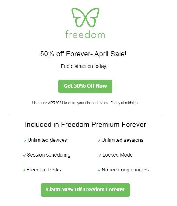
- Add numbers: “Buy now and get 50% off!”
- Add adjectives: “Find your dream home with us!”
- Make a promise: “Lose weight in just 6 weeks!”
- Influence their FOMO: “Limited time offer. Get free shipping!”
- Play up your USP: “Order a hand-made soap now!”
Think up your own
You don’t need to stick to the good old examples, though. Get creative and make up your own call to actions.
First, verbalize to yourself what your company does for its customers (or simply look at your mission statement). For example, I run a spa where people get facial treatments.
Next, transform the verbs and modifiers into a 2-5 word call to action. Add relevant information where necessary → “Get a free mud mask” or “Treat yourself today!”
Example:
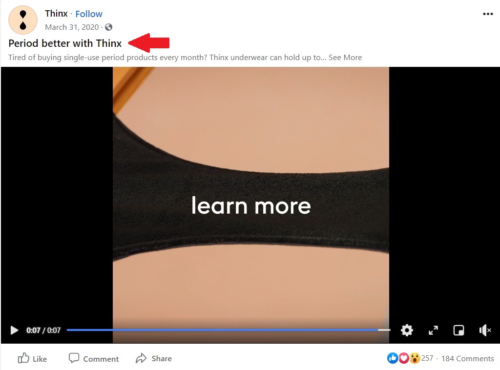
“Period better” – Thinx opted for the unique use of the word “period” as a verb in their CTA.
Tip: nobody gets their CTAs right the first time. Run at least one A/B test (but preferably more) on your ad to evaluate the strength of your call to action.
13 of the Best Call to Action Examples for 2022
In the following section, you’ll see what the techniques mentioned above look like in practice. Steal and customize the best CTA examples for your campaigns!
Facebook Ad CTAs
We’ll examine some Facebook ads with classic call to action examples. They may seem simple at first, but there’s more to uncover than what you see on the surface.
1. ClickUp
This ad from ClickUp is likely part of a retargeting campaign. Even if you don’t watch the video, the ad copy offers plenty of calls to action on its own.
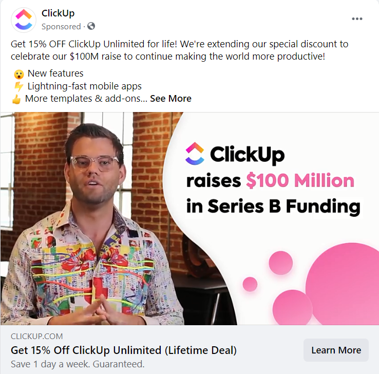
Why it works
- Same CTA in the headline and the first sentence of the ad = the offer is clear (“Get 15% off”)
- The CTA is supported by objection-handling statements, such as “save 1 day a week”, “guaranteed,” and a list of features
- The “Learn More” call to action button assures the audience that they’ll get more info before committing
2. Shaw Academy
Can you spot all the call to actions in this Facebook ad? Hint: there are at least seven. Every element is coordinated here to instill a sense of urgency in the audience. Take note of the exploding colors, the alarm emoji, the many exclamation marks, and the multiple CTAs.
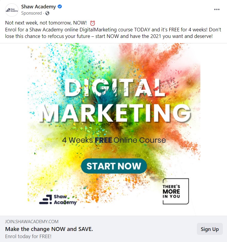
Why it works
- Beautiful, contrasting colors with a CTA that stands out
- Multiple call to actions
- Sense of urgency to take action
3. Babbel
Babbel is a language learning app that comes at you strong with various CTAs for their Facebook offer. It works because even if you don’t know this app, it quickly establishes a trust factor (“over 500,000 5-star reviews”). The post then draws you in with an attractive offer.

Why it works
- The primary call to action is clear and direct: “Get up to 60% off!”
- They use the “Get Offer” CTA button to instill a sense of gratification in the audience
- Including the action word “join” + the number of reviews in the same sentence is a way to evoke the feeling of belonging to a community
4. Hootsuite
Hootsuite keeps it brief and concise with a few very targeted CTAs.
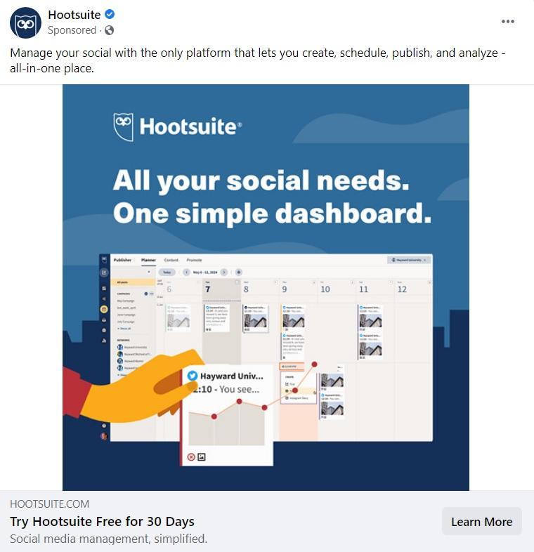
Why it works
- All the call to actions are focused at the bottom while benefits are at the top of the post
- The “Learn More” CTA button leaves any extra info for the landing page
Instagram Ad CTAs
Sure, “swipe up” is available on Instagram ads, but you can get more clever than that. Below are some creative call to action examples for your Insta campaigns.
5. Headspace
Headspace’s Instagram ad is the perfect example of a custom-made call to action. “Snuggle up to Headspace” evokes a cozy feeling in users and personalizes the brand. Words like “snuggle” fit into the category of sensory words.
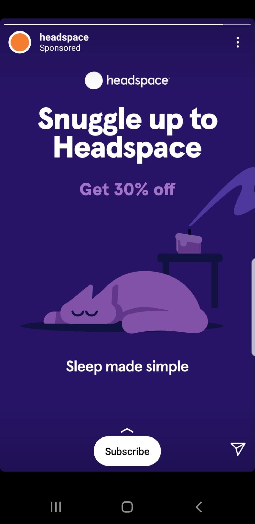
Why it works
- They (smartly) opt to draw attention to the custom-made CTA and leave the “Get 30% off” as a secondary CTA
- They use the CTA button “Subscribe” after that to make it clear how that snuggling up will happen
- Coupled with a sweet, serene image, the whole CTA experience feels more like a gentle nudge for meditation and less like an ad
6. Elementor
As an event-type ad, Elementor gets it right. It displays all the key information regarding the event (name, speakers, date, and time).

Why it works:
- The two most eye-catching elements on the ad are the headline and the call to action button. They both have the same contrasting colors that stand out against the dark background.
- Both call to action buttons (‘Save Your Seat’ and ‘Book now’) are very concise and direct
- The old-school flair of the ‘save’ icon next to the CTA button works well with the target audience (likely consisting of more technical people)
7. Nøie Skincare
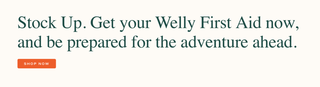
You have probably seen call to action examples like this in the advertising strategy of ecommerce brands. The main goal is to sell. At the same time, the ad focuses on the experience instead of rushing to take the user to a web page. In this case, “Shop Now” is the type of CTA that is direct, yet, the ad copy does most of the selling.
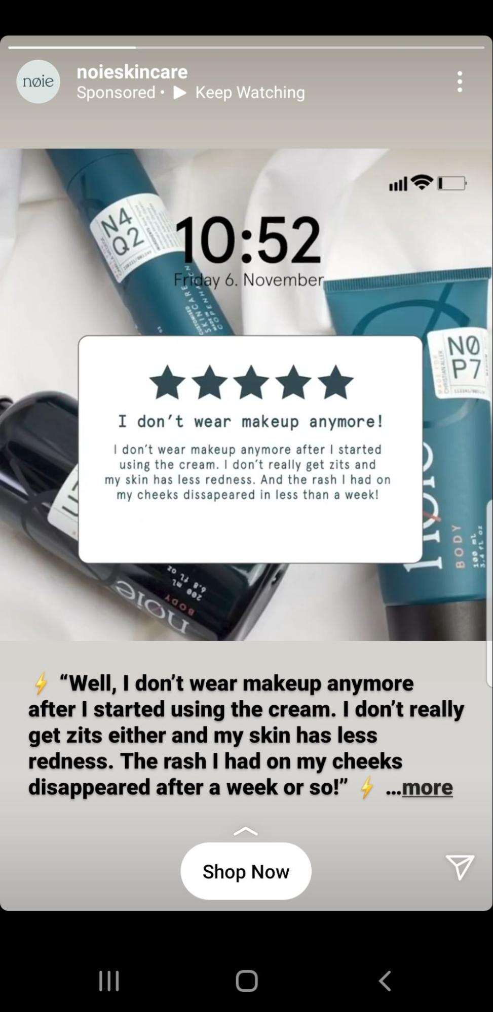
Why it works
- The emphasis is on the product experience, which makes having just one call to action sufficient
- “Shop Now” is direct and to the point. The prospective customers know where they will be taken from the post
8. VAI Course
Esther Inman’s VAI Course ad keeps it fresh with the colors and a simple call to action button.

Why it works
- The CTA text on the ad itself boasts about its main USP: the user gets a remote job pack every Friday
- The “See More” call to action button leaves the audience at ease knowing that they can still learn more about the product before signing up
Email CTAs
Email conversion rates can soar as high as 15%. Take a look at the following email call to action examples from some brands who are doing it right.
9. Black Illustrations
Design agency, Black Illustrations prefers to use multiple CTAs in their email marketing. You can run your own test on this strategy, but it makes sense to include a few secondary call to action buttons if you have a relatively long email. Black Illustrations also adds a hyperlinked CTA to further help guide users to take action.
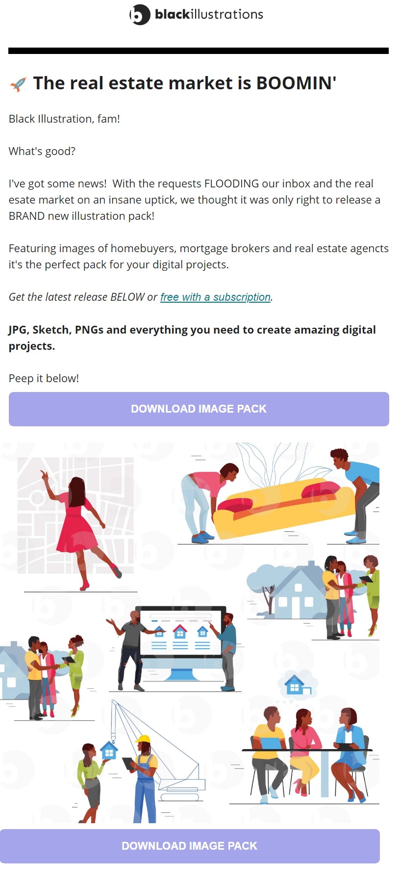
Why it works:
- Multiple CTA buttons (and hyperlinks) in a long email can increase your conversion rates.
- “Free with a subscription” stands out and keeps the main message clear for the user
- The color choice for the button works well with the brand yet still stands out
10. Audiense
The audience analysis tool, Audiense, prefers the long CTA route in their email marketing. Phrases like “show me…” or “take me to…” create a clear value proposition and helps the user feel in control.
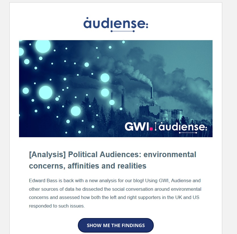
Why it works:
- Using multiple words and first-person phrasing in your call to action could increase your relatability and CTR
- Users get a better sense of the type of page that awaits them after clicking
- When using a long-form CTA, you get to test a wider variety of versions
Landing pages are great subjects to run a CTA test or two on. Below are some great call to action examples for your next campaign.
11. Tim Ferriss
Tim Ferriss’s email sign-up landing page is as minimalistic as it gets. No top menu, no links, or other distracting web components.
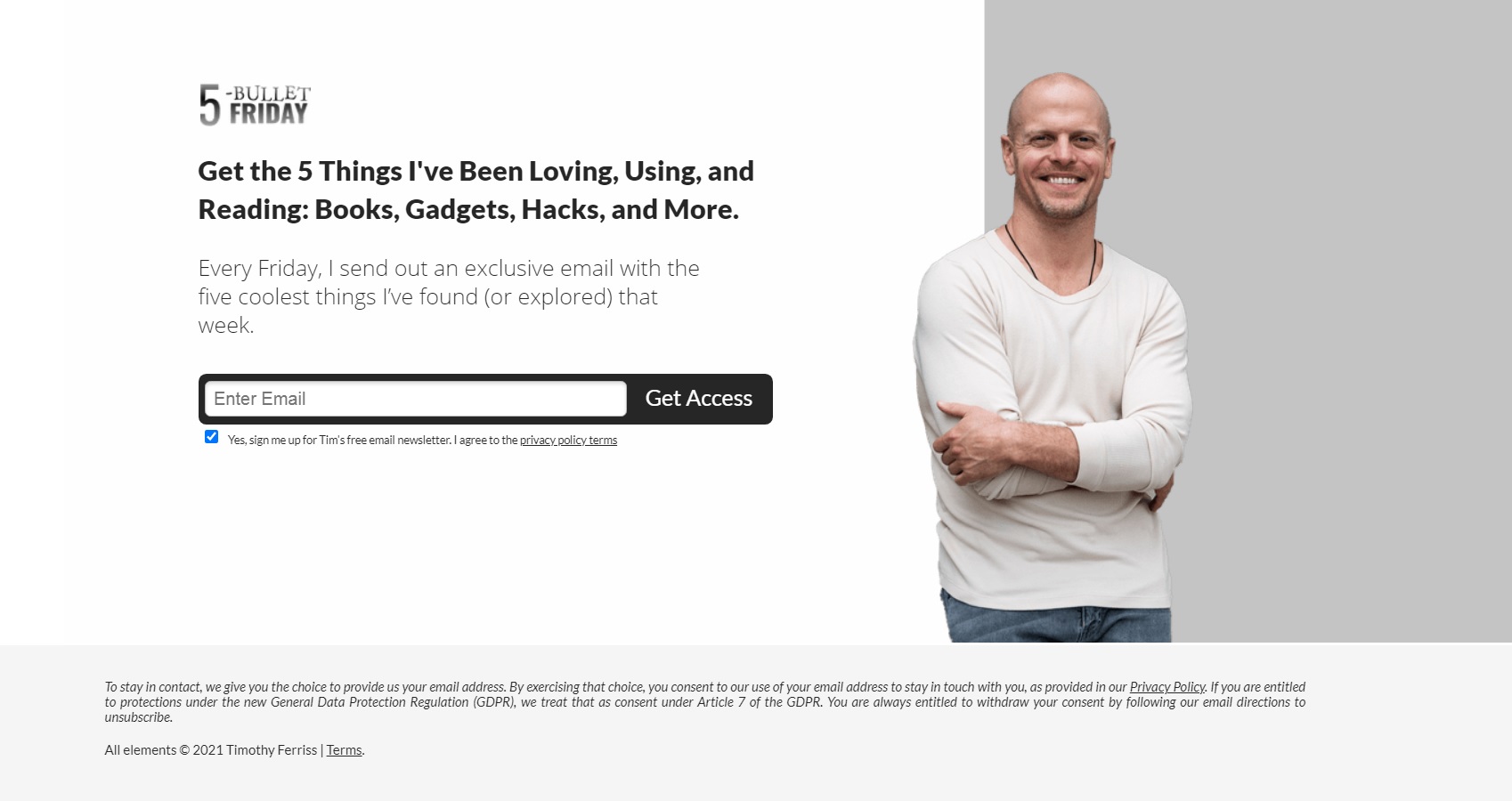
Why it works:
- The distraction-free page keeps the focus on the main CTA: to sign up for the newsletter
- The black headline and black CTA button provide a striking contrast to the white background
- “Get access” is a great call to action to use if you want to establish the feeling of receiving exclusive content in the user
12. Joy
Joy is a Canadian company that offers a razor subscription service for women. Their landing page is concise and fits all information to the visible area. The CTA button stands out as it’s the darkest element on the page.
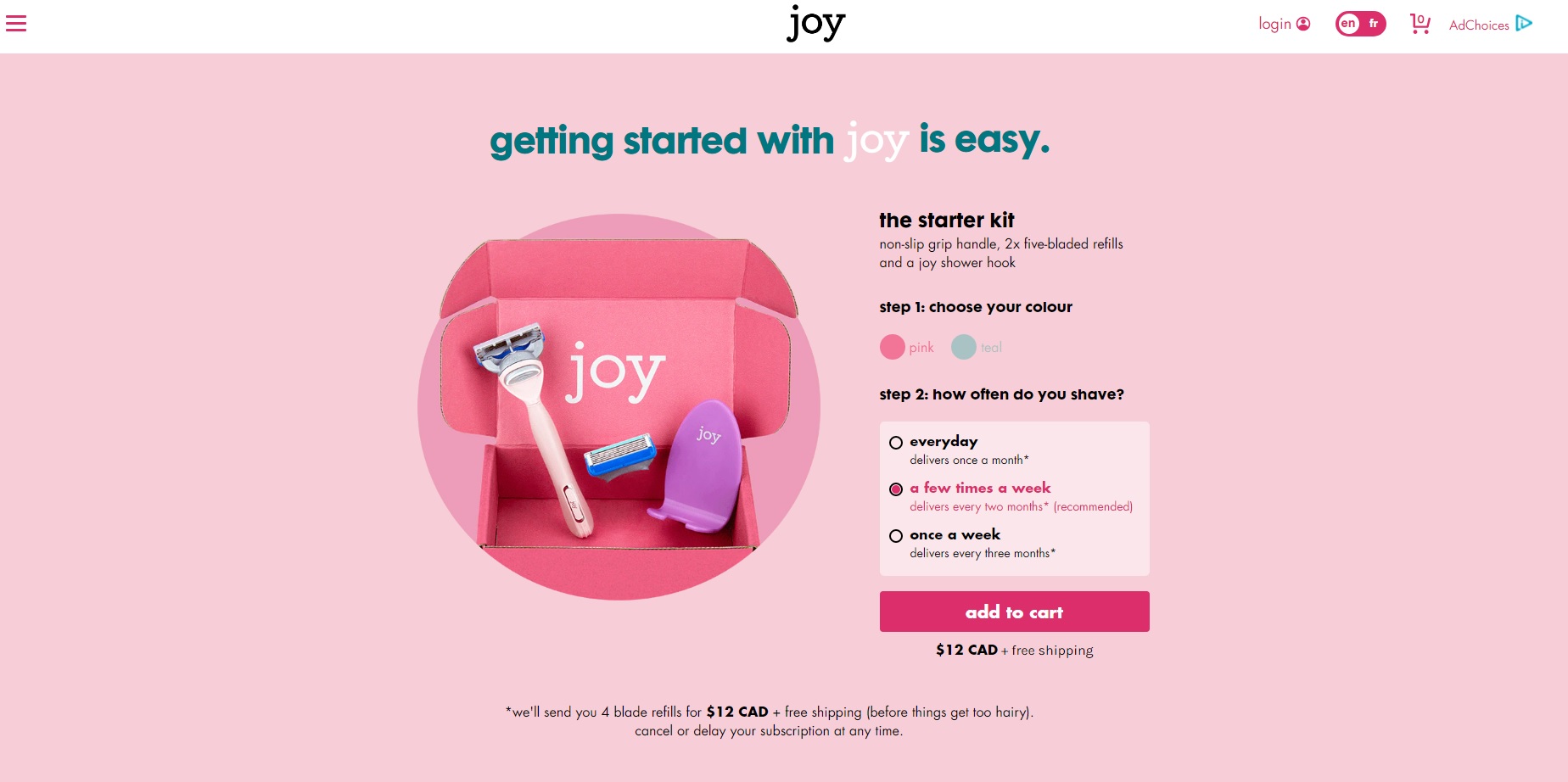
Why it works:
- The contrasting color of the button helps users easily navigate to the next step
- The CTA copy itself follows ecommerce best practices: “add to cart” is an easy-to-recognize button in the industry
- The small-cap lettering (which fits the brand) lends a unique look to an otherwise highly used CTA
13. Leadfeeder
Leadfeeder’s own lead-generation landing page is simple with a clear value proposition. On the left, you get a summary of the ebook. On the right, you will need to provide some basic info and then click “Get the Guide” to submit your request.
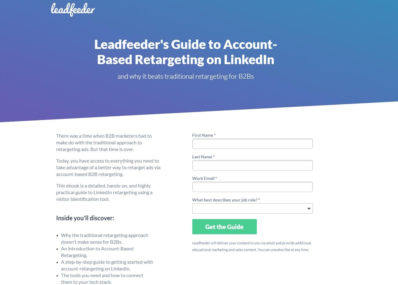
Why it works:
- The CTA button is the only green item on the page
- “Get the Guide” engages the users with a clear offer
Website CTAs
Your landing pages may be the focus of your ad strategy. Still, it’s necessary to create a homepage with just as much converting power. Meet a few thought-out CTA examples below for your website!
14. Touchland
Touchland is here to sanitize your hands without making a mess. The “checklist” on the left (keys, wallet, phone, touchland) is cheeky. It’s a clever storytelling technique to place visitors into a familiar scenario while introducing the product.
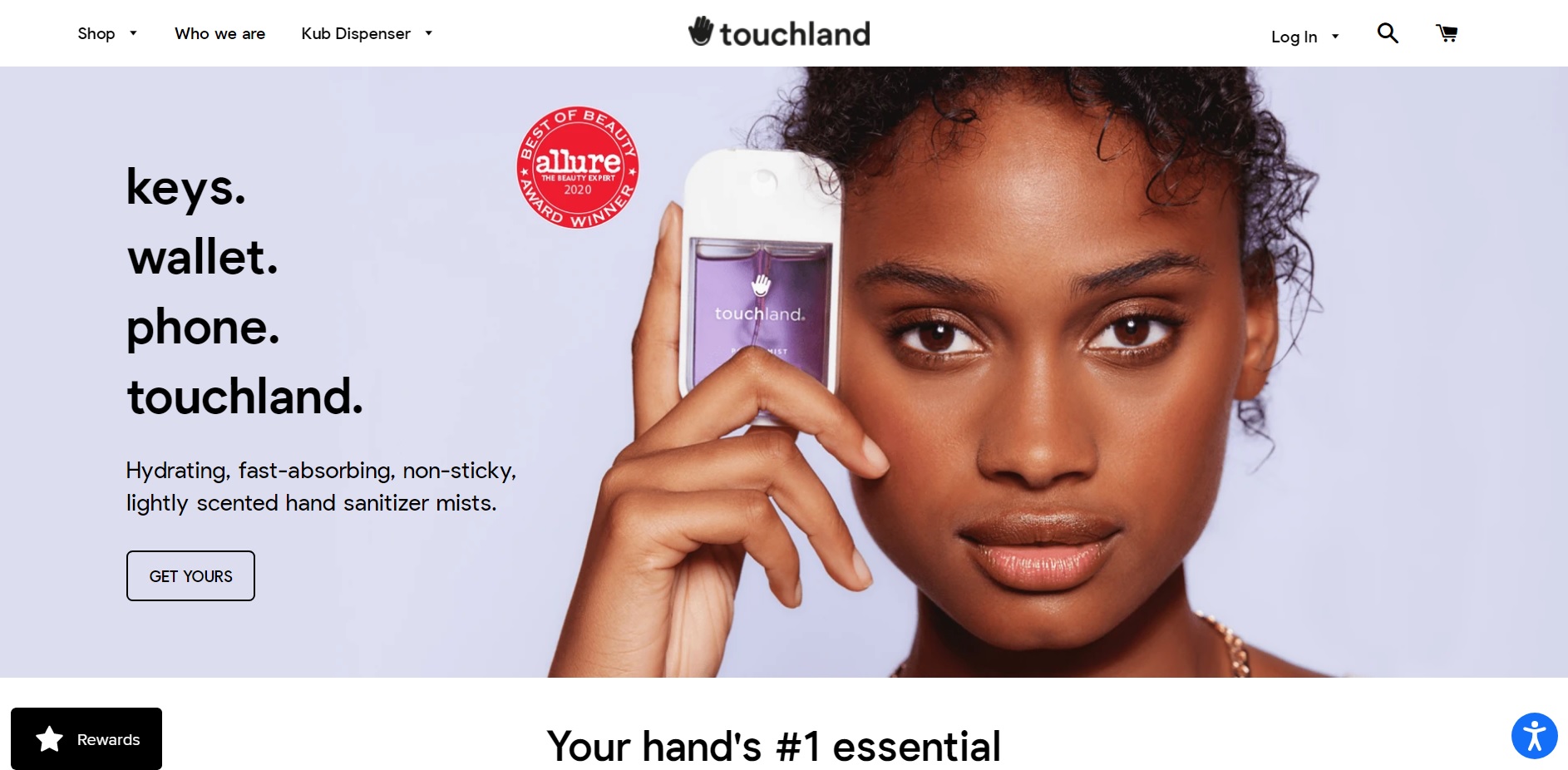
Why it works:
- “Get yours” implies that a lot of people already have one – you will only fit in if you get yours
- The transparent call to action button gives the website an airy feel to it, which is on track for a business that sells a mist
15. Airbnb
With COVID-19 restrictions coming and going, travel sites like Airbnb have to develop ways to stay top of mind. They achieve this by featuring a wishlist of outdoor spaces and a dreamy illustration on their website.
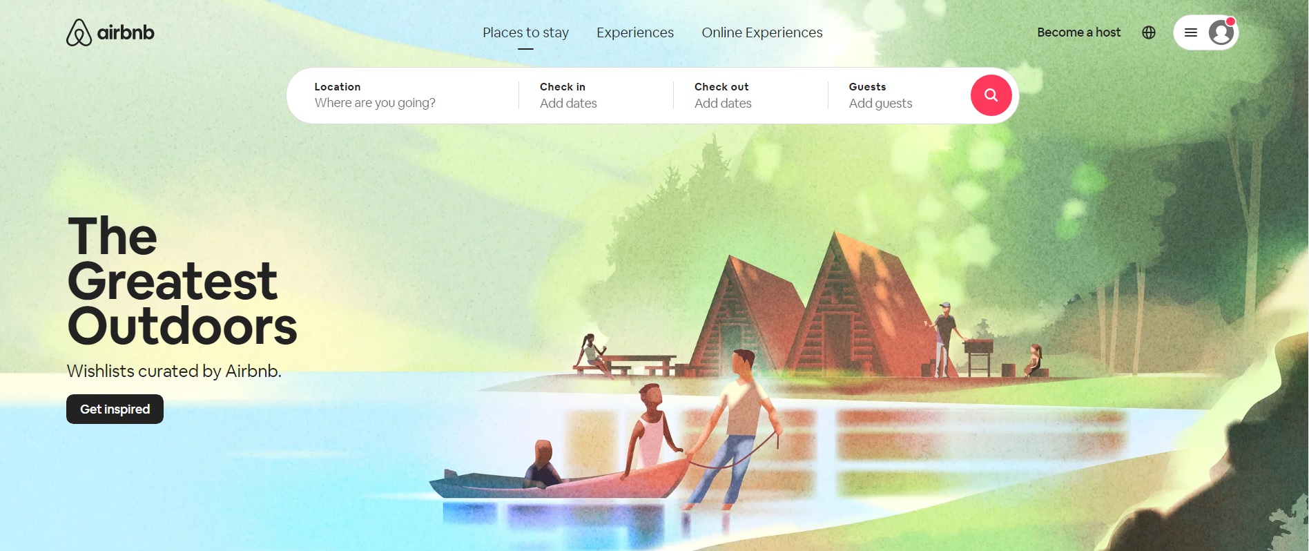
Why it works:
- “Get inspired” is a soft CTA that invites the user to explore ideas for future travel (and remarketing)
- The call to action button itself stands out against the pastel-colored background
16. Smartlook
Smartlook is a user behavior analysis tool. They closely follow website best practices by placing a “hero” section above the fold (tagline+description+CTA). The main goal of the site is to prompt visitors to sign up for a free trial.
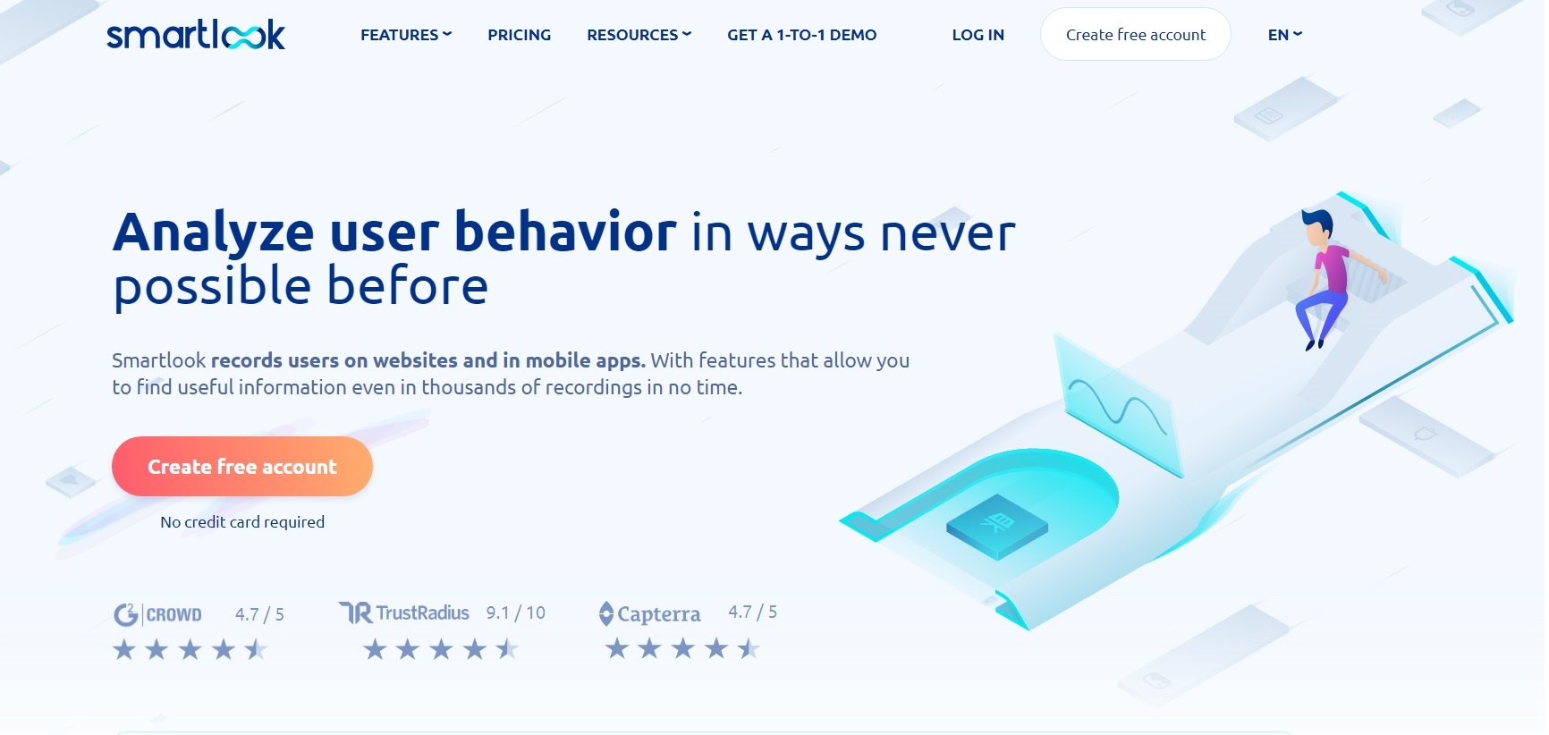
Why it works:
- The colorful call to action button provides a stark contrast against the grey and blue background – an immediate eye-catcher
- Using red and yellow colors on the button evokes a mixture of excitement and optimism in hesitant visitors
- The copy on the button says “Create free account” and the supporting text underneath is “No credit card required.” Both copies aim to overcome the subconscious objections of prospective users (Will it cost me anything? Will they charge my credit card?)
17. Ecom World
Ecom World is the website for “The World’s Largest Ecommerce Event.” They placed all of the most important info above the fold: what+when+where+the CTA.
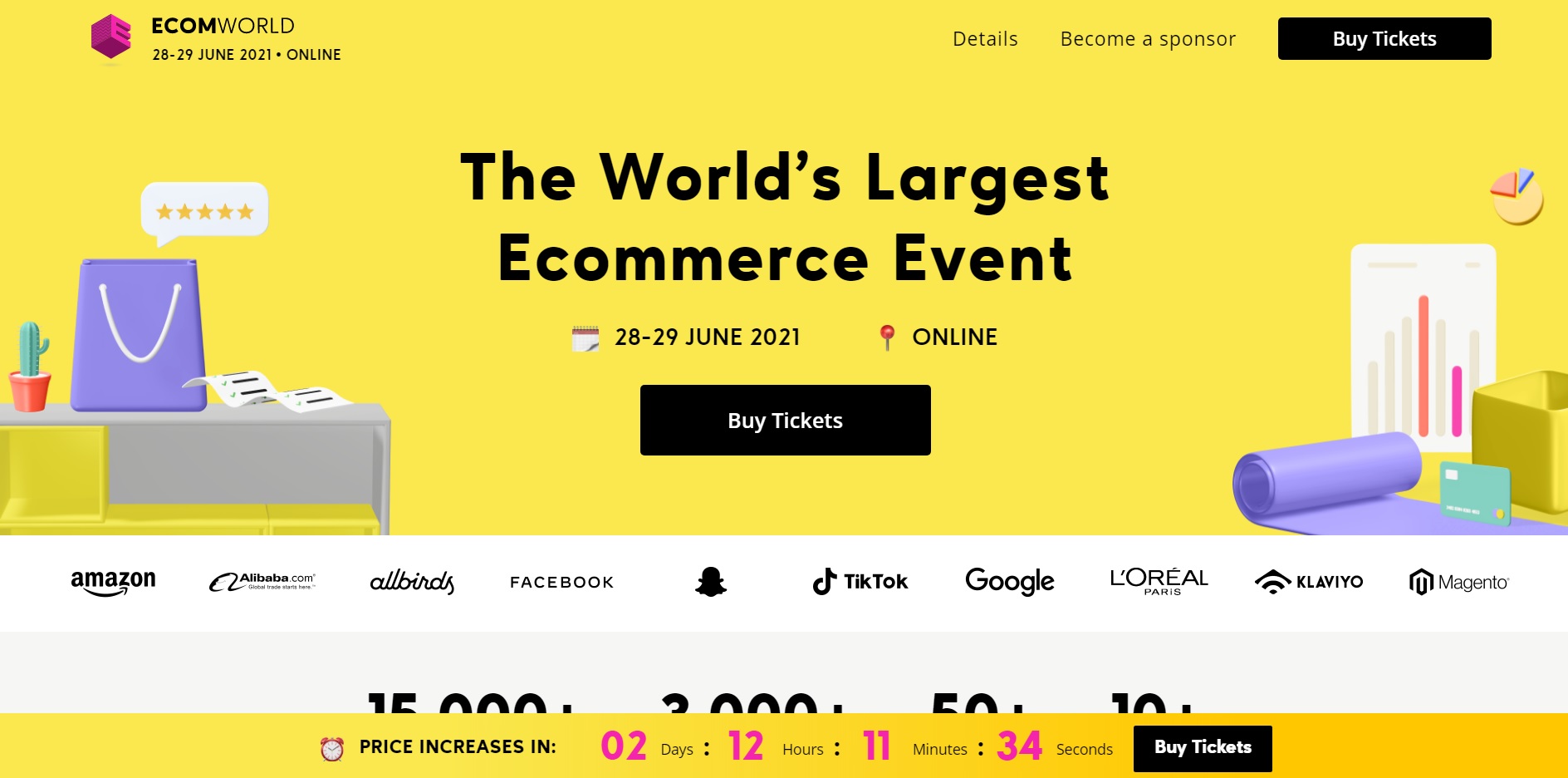
Why it works:
- The call to action button coordinates well with the rest of the design elements. Throughout the site, the most crucial info tends to be highlighted in black.
- Multiple CTAs could increase conversions. Here, the “Buy Tickets” CTA appears three times above the fold alone (main navigation, in the hero, and in the sticky nanobar)
CTA buttons: Why they matter & how to use them
You can — and should — use CTAs on all types of marketing materials and on every platform you’re marketing on. This includes PPC ads of course, but it also includes landing pages, websites, blogs, newsletters, emails, and more. Sometimes, this means that you just need to stick to a plain-text CTA that’s possibly hyperlinked.
In plenty of cases, though, there’s a good chance that you would benefit significantly from clickable CTA buttons.
That’s why even Facebook has short, clickable CTA buttons that you can add to every ad campaign, and why you’ll see so many landing pages with bright “Sign Up Now!” text in a big yellow button. Clickable CTA buttons specifically have been proven many times over to increase conversion rates significantly. One study found that adding a CTA button to their article templates increased conversions by 83%, and it boosted ecommerce conversions by 22%. Copyblogger found something similar; when their CTAs looked like buttons instead of plain text, they saw a conversion rate increase of 45%.
Let’s take a look at a few best practices for CTA buttons and how to use them in ads and on your site (including site pages, landing pages, and even your blog.
Facebook Ads
You know we had to start with Facebook Ads!
For a few years now, Facebook has had clickable CTA buttons built into the native interface. Button options include “Shop Now,” “Learn More,” “Download,” “Send Message,” and more. The idea is that you can use these CTA buttons to reinforce your ads, increasing the likelihood of conversion.

You should absolutely always include a CTA button on your ad campaigns in addition to using a CTA in the headline and/or description copy, too. Users intuitively are more likely to click when they see that button prompting them to take action without even realizing it.
Remember to tailor your CTA based on the ad that you’re running and the stage of the funnel that you’re targeting. Opting for “learn more” for users earlier in the funnel can feel lower-risk and less pressure than starting with a “Shop Now,” but this depends on the ad and the audience.
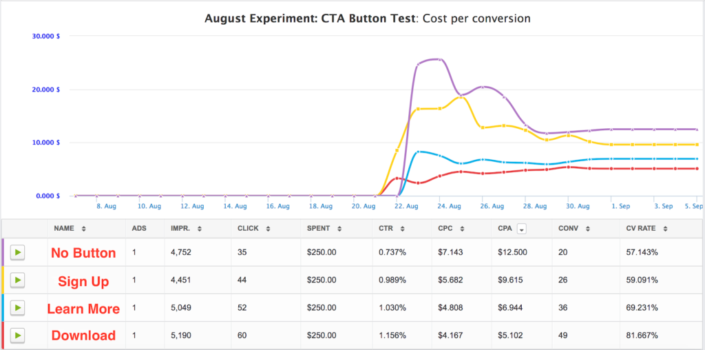
And if you’re wondering if these CTAs matter, know that they most definitely do. AdEspresso recently ran a $1000 experiment testing different types of CTA buttons on Facebook Ads to see what was most successful – and the result was astounding.
Overall, the top performer (Download) gained 49 conversions for $5.10 each, while the worst performing CTA (no button at all) achieved only 20 conversions at $12.50.
This means that you can end up paying more than twice as much for a conversion depending on the CTA you choose – something we would have never figured out without split testing.

We recommend testing out your CTA buttons using our internal split test engine to see which your audience responds to. This will allow you to test every possible combination of CTAs, and allow you to easily determine which is giving you the most conversions for the cheapest price.
AdEspresso can even automatically pause your underperforming combinations using our Automatic Optimization feature, taking the guesswork out of campaign management altogether.
Your Website & Landing Pages
It’s always a good idea to use clickable CTA buttons to help users navigate through your site and to take certain actions. This is important both for your general website and your landing pages, too.
You can use these buttons to prioritize certain actions or to take users through typical paths that users follow when they’re most likely to convert. (On my site, for example, Google Analytics has shown that people who visit my portfolio page first are 6x more likely to get in touch with me than those who just view my contact page first.)

On landing pages and the home page of your website, you’ll want to make sure that the CTA button meets the following criteria:
- It uses contrasting colors to jump out at the user.
- It’s clearly a clickable button designed to improve navigation.
- It utilizes brief copy on the button itself but is often surrounded by copy that adds context and makes it more persuasive (like the example above).
- It should appear above the fold on the page, meaning that users can see at least one CTA button before they’d need to scroll down to see more information on the page. Make sure you take this into account on both desktop and mobile sites.
When you’re creating landing pages and site pages, remember to test them. Most people don’t realize that you can test site pages just like you would PPC campaigns when you’re using tools like Unbounce. Test different types of CTA copy, different placements, or even different colored buttons. Look for what works best, and optimize your pages accordingly. You can learn more about how to do this by checking out our $1000 case study here.
SaveSaveSaveSave
SaveSaveSaveSave