
You’re scrolling through your feed and bam, you’re hit with an amateur Facebook ad design. The image is blurry, the copy isn’t clear, and you have no idea what they’re even selling.
It’s not easy to get started with Facebook ad design. There’s so much to take into consideration. It’s no surprise that brands and marketers alike feel stumped when it’s time to head to the drawing board for their next ad.
Ad design is important because it is how we visually communicate and present our brands to the public. You can have an amazing product and a great offer, but it will be hard to get traction if your ad is visually unappealing, confusing or just plain boring.
Great ad design:
- catches your readers’ attention
- educates them about who you are and what you are offering
- tells them what they should do to take that all-important next step toward conversion
After managing over $600 million of ad spend in Facebook ads worldwide, we still learn new, surprising things with every campaign we create. Today, we want to share with you what we have discovered in our 10 years of hard work: the 11 Facebook ad design secrets that will have you making ad campaigns designed for success.
Each of these secrets is important for old pros and new beginners alike. They will stop you from wasting your money on ads that readers scroll past and that fail to convert your target audience.


If you’re ready, let’s get started on learning the secrets behind expert ad design.
1. Consider your ad format in the design process
Before you begin jumping into the nitty-gritty details of how an ad will look, you first need to decide which ad format you will be using. Facebook currently has eight main ad formats plus several other variations, each designed for different marketing goals.
Facebook ad formats include:
- Photo: This is the most basic format where you have a single image with a short header for copy. Focus your efforts on creating a powerful visual story with your single image.
- Video: Video formats are similar to image formats, but you have a whole video to showcase your brand, product or service.
- Stories: Stories live outside of the feed and immerse viewers in a full-screen experience. Capture their undivided attention by using all of the room you can to make an impression.
- Messenger: These ads are sent to your customers through Messenger. Short sentences and singular-focus images are your best bet.
- Carousel: With a carousel, you can showcase up to 10 individual images or videos, each with its own link. You can use this space to show off your new products or creatively tell a story.
- Slideshow: Slideshows are the middle ground between photo ads and video ads. They allow you to easily put together an ad combining sound with a slideshow of multiple images, but they require less data usage than video ads. This makes them a better option in areas with a poor internet connection.
- Collection: Using this format, you can show off all of your products in a virtual display case. Use simple images that focus on whatever you are selling.
- Playables: These interactive ads let people play a game or use a program before downloading, which can work great in certain niches.
Before you start your design process, consider how each of these ad formats can be used to maximize the impact of your ads. For example, if you have a wide variety of goods to show off, carousel or collection ads could be a great fit. If your goal is to show how your product works, a video or story ad could give you the chance to do that.
In this example from Henge Docks, we see how Facebook ad design can be enhanced by the right ad format. Henge uses a carousel ad to cleverly show off their family of docking devices. Henge could have recycled two separate photo ads, but instead, they designed their ad specifically for the carousel, making the most out of their ad space.

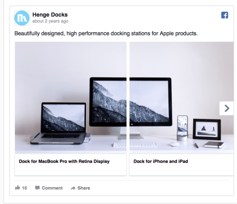
A carousel ad from Henge
When designing your ad, your first consideration should be what ad format will work best for your goals. Don’t forget that you can use a variety of ads, so there’s no need to choose just one!
2. Ad placement should inform design
Your Facebook ad placement can be just as important as the ad format. Ad placement determines the amount of space you have, and designing without ad specs in mind can be disastrous.
To choose the best ad placement for your objectives, you should know what your options are. Here’s a list of common ad placements and tips on how you can use them effectively:
- Desktop Newsfeed: Great for engagement and generating sales and leads. This format supports longer copy and link descriptions.
- Desktop Right Column: Less effective but cheaper. Images are smaller, and text is less readable. They work well for retargeting users who already know your brand. Use an image users will recognize to catch their eye.
- Mobile Newsfeed: Great for engagement and discovery. However, the copy here has to be shorter, so be concise.
- Marketplace: Users are already looking for something to purchase on Marketplace, so use your ad space to showcase your product as clearly as possible. No need for too much artistic flair.
- In-Stream Video: You can have your video ad play before or during high-visibility video content, much like in the case of advertising on YouTube. This essentially gives you a custom audience.
- Stories: Facebook stories need unique, full-screen, mobile-friendly creatives. Story videos can’t be longer than 15 seconds. The good news is that more than 500 million users everyday watch Facebook stories, so there is a significant upside to engaging with this kind of content.
- Audience Network: These ads are displayed outside of Facebook, in partner apps. While they don’t convert quite as well as other placements, they cost much less, so they can keep your acquisition and cost-per-click low.
If you want to learn more about Facebook ad placement, you can check out Facebook’s own resources on placement options as well as our complete guide on ad placements on Facebook.
3. Make your value proposition and call to action clear
According to Facebook, mobile users spend an average of 1.7 seconds browsing an individual post. Design your ad to grab their attention by building your value prop into your image and keeping your CTA clear and to the point.
We can see this strategy in play in this ad from Babbel, a language learning app.

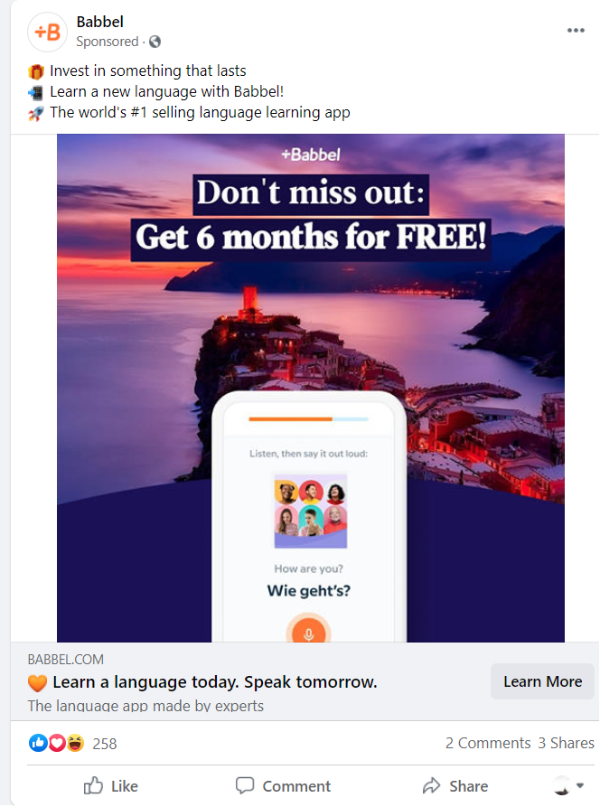
Babbel makes their value prop the focal point of their ad
Babbel uses color contrast and bold lettering, so the value prop of “Get 6 months for FREE!” immediately grabs your attention. They also keep their CTA brief (“Learn a language today. Speak tomorrow”) with a “Learn More” button directing traffic to their landing page.
This ad from Brooks Brothers uses the same tactic as Babbel: value prop in the image, clear and concise CTA in the description and headline.

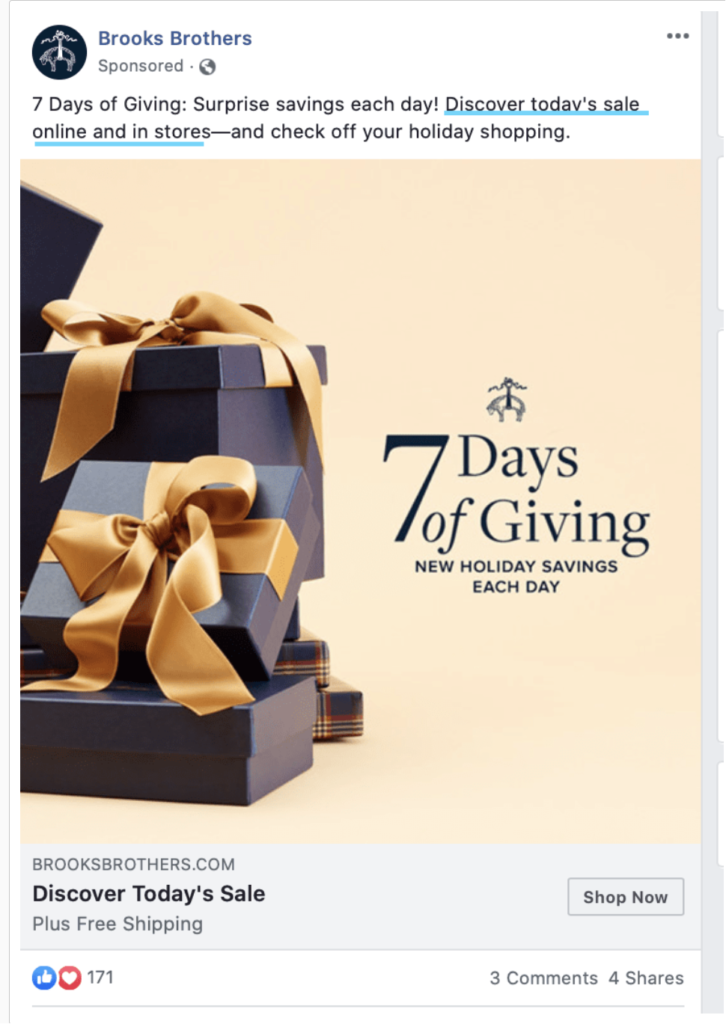
Brooks Brothers want you to notice their sale
In this case, readers are drawn to the text that tells us that there are “7 Days of Giving: New Holiday Savings Each Day.” The copy is even more brief, encouraging readers to “Discover Today’s Sale” and to “Shop Now.” The added “Plus Free Shipping” is a nice added-value prop to push users towards that next step — visiting the brand’s website.
When designing your ads, remember that people will only give your ad a moment to impress them. Use that time effectively by putting your value prop front and center while keeping your call to action clear and easily actionable.
4. Keep the landing page consistent with your ad
Ads are a promise to readers: click here and get this. If your Facebook ad design and landing page design aren’t visually in sync, high bounce rates can put your ROI at risk!
Let’s see how to do it right. This is an ad from Wix advertising their website builder that can be used to easily set up an online store.

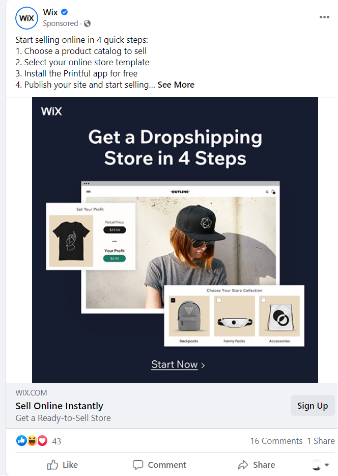
Wix makes sure that their ad and landing page work together

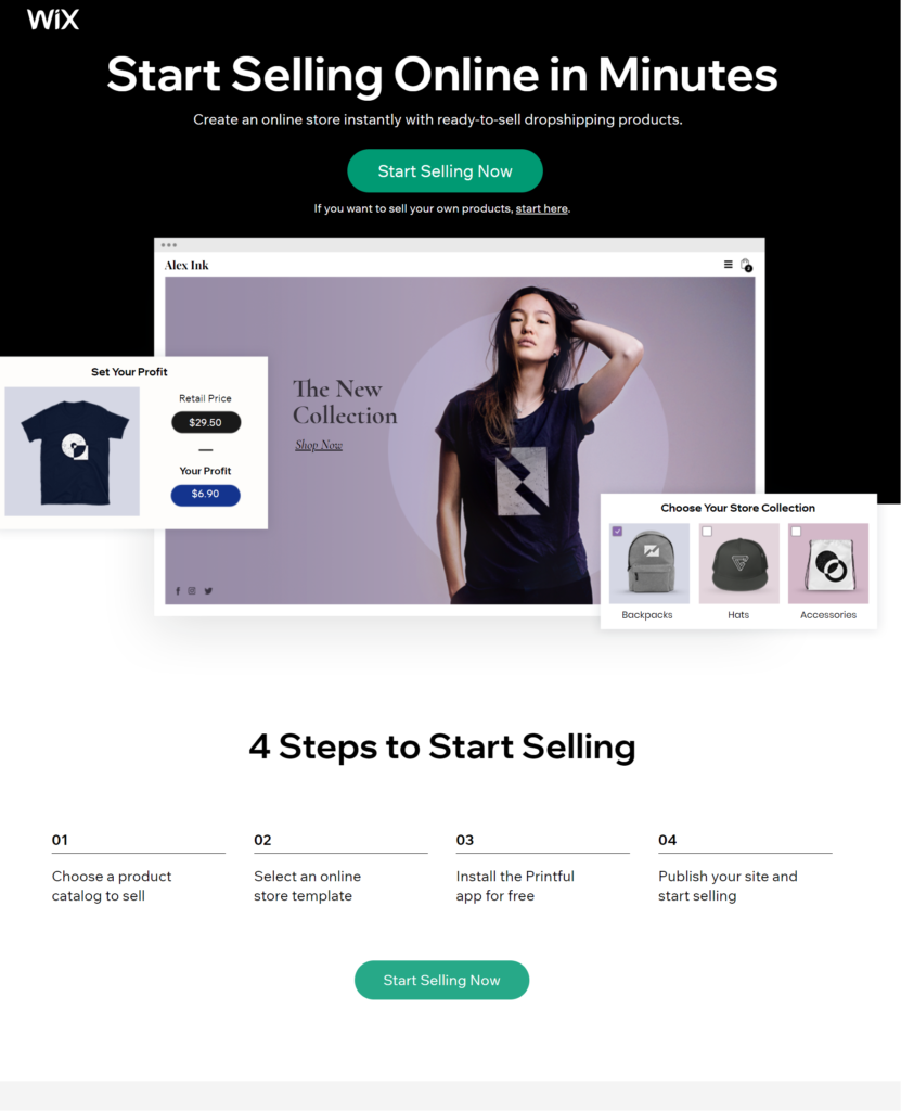
The ad and the landing page share common design elements, including the colors, fonts, and image arrangements. These similarities help readers feel like the landing page is a continuation of the ad they clicked on and not something new. Also, the content promised in the ad is included on the landing page and the CTA “Start Selling Now” stayed the same.
When designing your ad and landing page, make sure to design them with common elements so that readers can easily transition from Facebook to your own website and other resources. It’s hard enough to get readers to click on your ad. Don’t let your landing page let you down when you’re so close to success.
5. Get your image sizes right
Once you’ve started designing your ad, you need to make sure that your images or video are the correct size and aspect ratio. Poorly formatted images or videos can be distorted, grainy or difficult to see.
With the correct aspect ratio, you can fit in all the information you need and avoid wasted space or awkward margins. Take a look at this example from the University of Toronto.

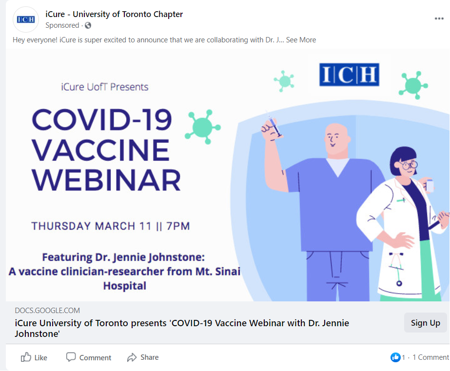
U of T gets their ad sizing right
If you need help keeping track of aspect ratios and recommended sizing on Facebook ads, bookmark our guide to Facebook ad sizes, so you never make such mistakes yourself.
6. Use the right images
The images you use in your ads represent you on Facebook, so it’s important that you are using carefully-selected (or custom-made) images that grab your readers’ attention and tell a story about your brand or product.
One of the best places to learn what makes a great image on a Facebook ad is Facebook’s resource center.
Their tips include:
- Using a high-quality image.
- Showcasing your product or service in the image.
- Avoiding too much text.
- Giving the image a clear focus.
This image is focused and clearly showcases the home decor items for sale at Crate & Barrel. It doesn’t mix objects in the foreground and background, or make it difficult to tell which item is for sale.


7. Anyone can make powerful images
Not everyone is a great photographer and graphic designer, and hiring specialists can be pricey. So what’s a small company to do? Luckily, there are affordable options available.
Two free resources worth checking out are Unsplash and Canva.
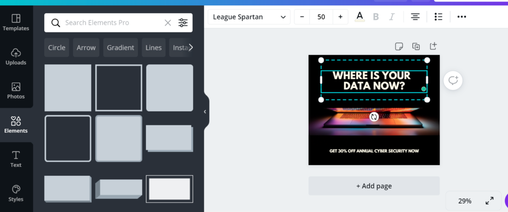
Although it’s usually best to use photos of your actual product or service, sometimes that simply isn’t possible. People selling T-shirts can take pictures of their stock, but if you sell a cyber-security service, things are more complicated. When original photography or design isn’t available, check out stock photos on Unsplash, a database of high-quality, royalty-free images.
Just type in a keyword, and you will be given a list of photos that you can download and use.

Unsplash has lots of images that you can use for free
Once you find the perfect photo, you might want to edit it. For that, you can use Canva, a free design platform. Sign in to your account, and pick one of their hundreds of templates to start designing your ad.

Choose from hundreds of templates on Canva
Upload your photo and get editing with their drag-and-drop editing system. You can add premade elements and text to make your visuals stand out. Canva has a limited free model and a more expensive premium plan that includes additional perks and elements for you to use.

Use their editor to create your ad creative
If you need more help creating your own visuals, Hootsuite has put together a guide on making engaging images for social media, which should help you get started.
8. Consider the psychology of color
When designing your Facebook ad, the colors you choose can be just as important as your images or text. In fact, according to a study in Management Decision, up to 90% of all snap judgments about products can be traced back to color.
Specifically, color can be used to:
- Grab the eyes of readers by using contrast.
- Define your brand identity (like Facebook’s shade of blue).
- Associate your products with certain emotions or feelings.
This last point can be crucial. According to science, different colors can have different psychological effects on various populations. For instance, older people have been found to like shorter wavelength colors like blue and purple, while younger people are more into brighter colors like red and orange.
When deciding on a color to use, think about the market you’re selling to, what they like, what they expect, and then you’ll be thinking along the right lines. For an example of how this works in the real world, we’ve taken that classic image of different brands organized by color and drawn some connections:

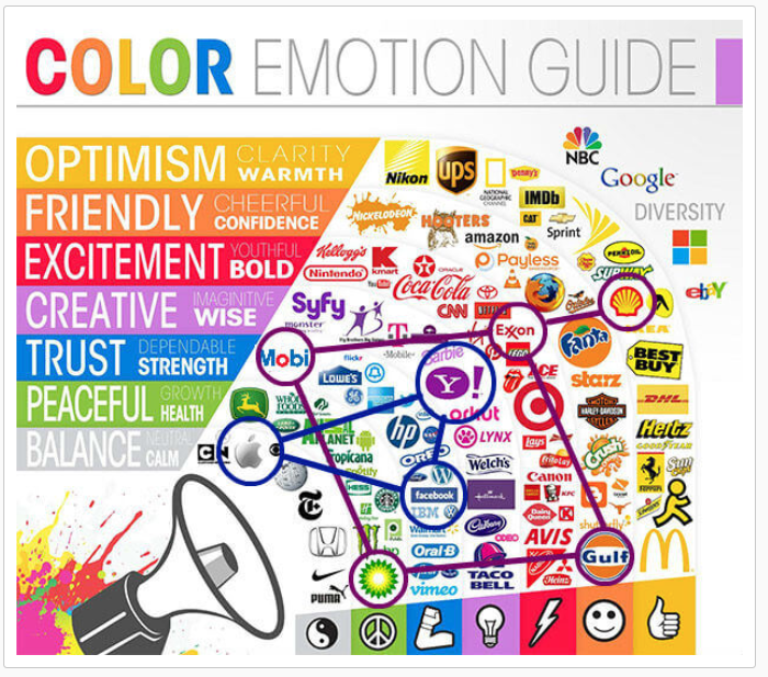
Colors are linked to human emotions
The gas companies here—BP, Shell, Gulf, Exxon, and Mobil—may produce an identical product for consumers. But these companies are heavily differentiated in the brains of consumers thanks to their incredibly distinctive brand colors. If you had to start an oil company today, I might say, “Go gray! Be the Apple of gas!”
The same kind of color psychology can be seen in the tech companies on the chart (outlined in blue). Apple represents neutral, calm, design sensibility. Yahoo represents wisdom, or at least they did, at one point—originally, Yahoo set out to organize all of the internet’s information into one home page, and they did a pretty good job.
Another best practice with color is to keep it simple. You want to try to stick to two to three colors in your ad to see the best results. Any more than that, and it can become overwhelming.
In this example from Xero, we can see how complementary shades of blue are used to make the photo in the center really pop. More colors might have made this ad less impactful as you wouldn’t know where to focus your attention.

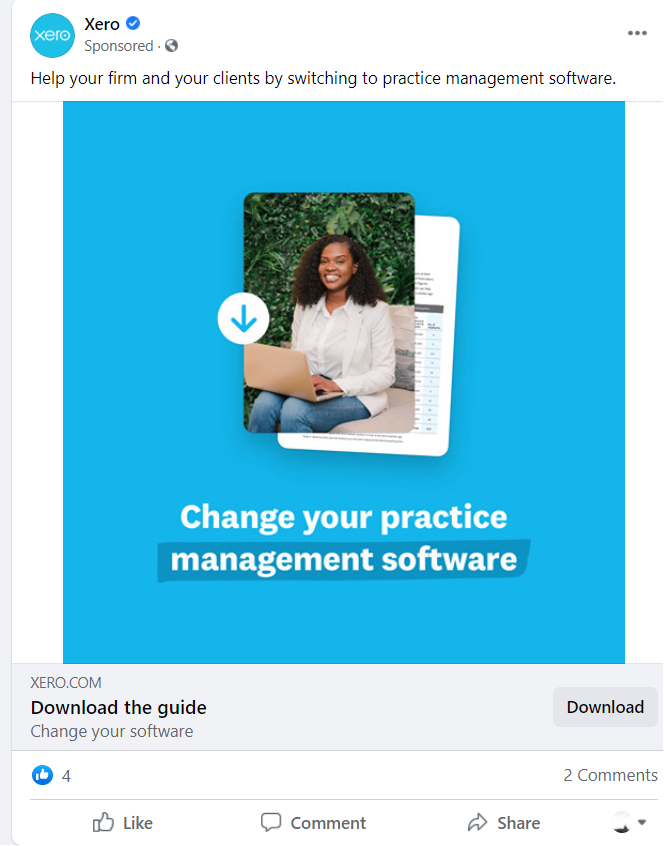
Xero uses shades of blue to draw your eyes to their image
Colors are one of the most important tools in an ad designer’s toolbox, so always be deliberate and thoughtful when using them. If you can do that and keep it simple, your ads will benefit a lot.
9. Use location-specific imagery
Facebook’s great advantage is that you don’t have to make each ad appeal to everyone. You can target specific demographics or regions. Your Facebook ad design can reflect this by using ad images and copy that speak to particular audiences.
However, it’s not just about showing a picture of a famous local landmark; it’s about demonstrating that you understand who the locals are. Anyone can throw up an image of the Golden Gate Bridge when targeting San Francisco. Häagen-Dazs took it a step further with this ad targeted at the Bay Area.

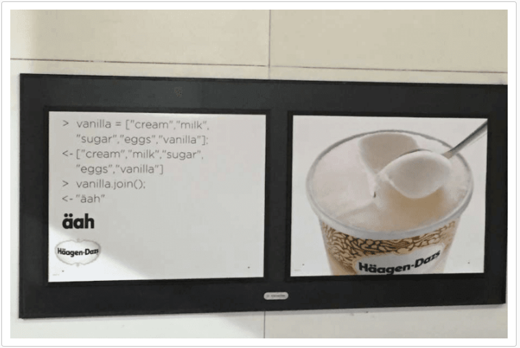
Ads can be more effective when targeting a specific location
The ad got a load of attention online because it spoke to how San Francisco locals see themselves. The coding language sticks out and appeals to the techies living there.
Targeted ads can also speak specifically to what locals might want. This ad from regional airline WestJet wants to get people to visit Calgary, not the world’s largest travel destination. But this image and design might speak to your desire for a quick weekend getaway to this outdoor adventure spot.

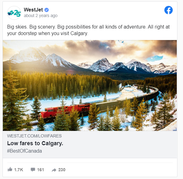
A local ad run by a regional carrier
These geo-targeting techniques can really inform how you design your ad, usually for the better. Learn more about how to take advantage of location-specific images with AdEspresso’s complete guide to geo-targeting on Facebook.
10. Design for mobile
In 2020, 79% of Facebook users only accessed Facebook from their mobile devices. Your Facebook ad design strategy needs to be mobile-first to see the best returns.
One of the easiest ways to think mobile-first is to start making your videos and images vertical, so they work better on phones.
In their mobile ads, Qantas use vertical videos to take full advantage of a typical phone screen. They also keep the text limited to let the videos speak for themselves.
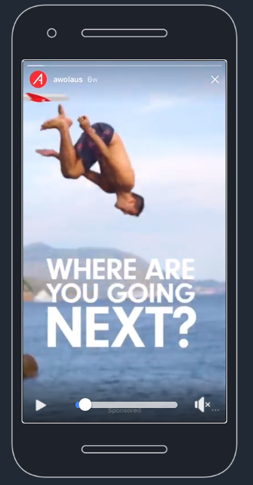

The ad opens with the question, “Where are you going next?” After that, it takes us across the world, letting the full-screen videos do the talking. This ad works because it keeps things simple and uses the immersive video to remind readers of the fun that is only a plane ticket away.
When designing for mobile, you can also take advantage of some neat ad types that you can’t use on desktop, e.g. the 360 vertical ad.
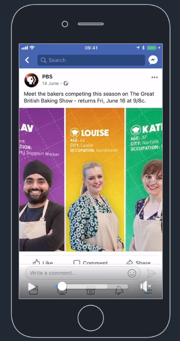

This ad from PBS introduces you to the new bakers on the next season of the Great British Baking Show. You can freely move around the image by tilting your phone, seeing the bakers’ faces, and reading their bios. It’s a cool trick that lets people take their time interacting with your ad, and it’s only doable on mobile.
With so many people using social media on mobile devices, it doesn’t make sense to recycle your desktop ads. Ideally, you should be optimizing each ad for its own format and placement, but if you have to narrow down your scope, consider going mobile-first and desktop-second.
11. Use split testing to find the right Facebook ad design
No matter how much you do and how much you learn, it’ll always be hard to predict how the public will react to an ad. Split testing helps advertisers see which version of an ad work best so that they can learn and optimize going forward.
There are many ways you can run a split test, but today we are going to look at two in particular: the A/B test function in Facebook Ads Manager and AdEspresso’s split test feature.
A/B testing on Facebook
Start by logging into your Facebook Ads Manager and selecting the campaign you want to test. Then, hit the “A/B Test” button.

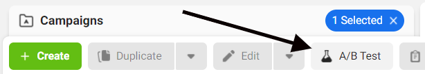
Click on A/B test to get started
Then, choose the variable that you want to test for. Possible variables include the audience, placement and creatives.
Next, choose whether you want to compare duplicate ad campaigns or two separate campaigns.

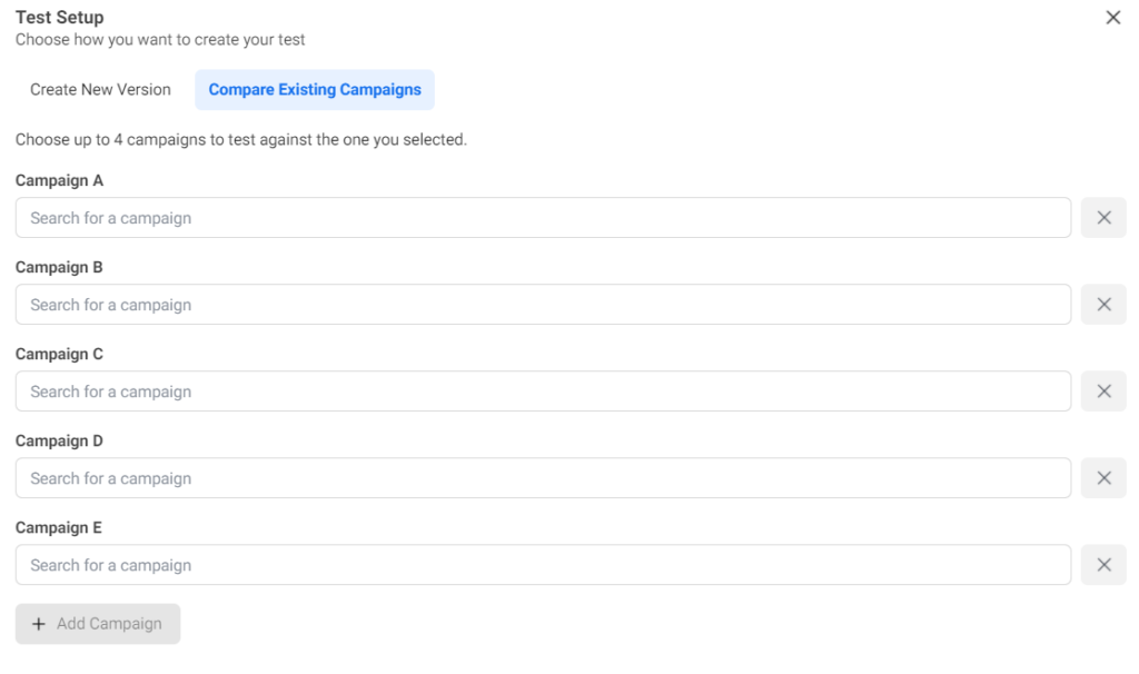
Choose which campaigns to test against
After that, you’ll need to fill in some basics like the test’s name and its schedule. Finally, choose how Facebook should determine the winner of your A/B test. Once this is all set, the test will run, and you will find out which ad outperformed the other.
If you are running lots of ads and want to A/B test many different variations of your ad, this process could become a headache. That’s why we came out with our own A/B testing tool for our AdEspresso members.
AdEspresso split testing
Log in to AdEspresso and start by clicking “New Campaign” in your dashboard.

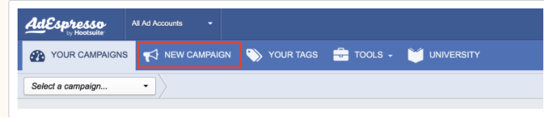
Click on New Campaign to start your A/B test
Next, fill in the campaign name, select standard campaign and choose the kind of promotion you want to run.

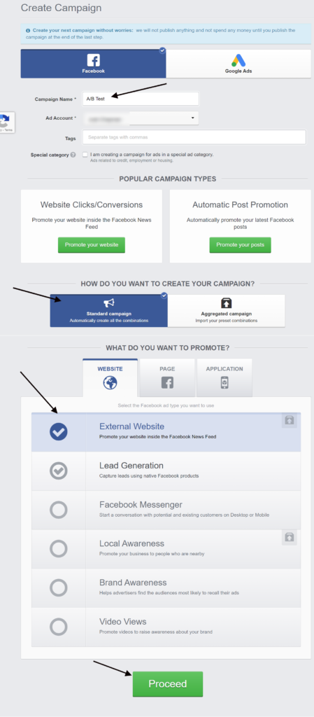
Fill in all of the details for the test
Next, you can play around with variations of your ad by filling in different headlines, ad texts, images and videos. AdEspresso will automatically mix and match these different options and then report back to you with the results.

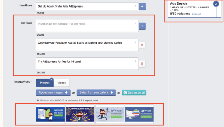
Choose the variations you want to run
These instructions are just a brief overview of all you can do with the A/B split testing tool in AdEspresso. To see what it can really do, take a look at our 101 Guide to A/B testing (or try it out for yourself!).
It’s up to you now to put it all together
A great Facebook ad design helps you attract attention and tell a story. Each of these tips can help you do that, but it’s your job to put them together in the best way possible for your product or service. If you want some inspiration, check out our free Facebook ad templates that can help you get started.
It’s important to remember that design is not the only element that makes an ad work. Great ads also require engaging copy and a solid overarching advertising strategy to really deliver results. If you want to see how the masters do it, take a look at our list of the ultimate Facebook ad examples to learn a thing or two from the best in the biz.
What do you consider when designing your Facebook ads? We would love to hear about your top tips in the comments below.