


The most important part of a Facebook ad is always the image or video. Users scroll through their newsfeed at speed, so you need engaging visuals to make them stop, then with any luck, they’ll read the headline and ad text.
Without an eye-catching image, it doesn’t matter how good your ad copy is, the chances are they won’t even register it as they scroll past.
And if that was not enough, until a few months ago, Facebook advertisers could only use landscape images for their ads, and this has been a real pain in the… 😤 has caused confusion and stress.

Then everything changed. Now Facebook allows us to use square images for Ads both on its platform and on Instagram.
But confusion and stress are still there, and now the question is:
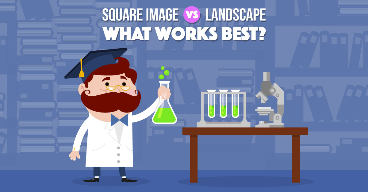
Square Image vs. Landscape – What Works Best for Your Facebook and Instagram Ads?
We didn’t have a bulletproof answer and, as usual, we decided to run an experiment and invested $1,200 (of our own advertising budget, so you don’t have to use yours) to find the “scientific” answer!
Curious to know which is the winning format? Keep on reading!
Everything started at the end of last year, when this notice from Facebook drew our attention:
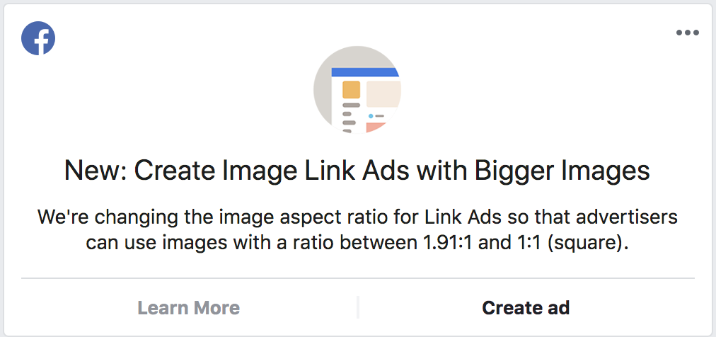

Facebook goes on to explain:
Starting on November 7th, we began to allow advertisers to create image link ads on Facebook with aspect ratio up to 1:1 (square).
This update takes into account feedback we’ve received from advertisers that the original 1.91:1 (landscape) image link ad aspect ratio is too restrictive. We updated the aspect ratio allowance to improve consistency across ad formats and platforms and to help advertisers like yourself have more creative flexibility and drive better performance.”
They add details:
From initial testing, we also saw that 1:1 image link ads showed significant improvement in click-through rateand conversion rate, when compared to the original 1.91:1 (landscape) aspect ratio.
Moving forward, we recommend that you leverage 1:1 (square) image creatives for your image link ads.
Now you will see new recommended image specs (1080 x 1080 pixels, 1:1 image ratio) in Ads Manager when you create an image link ad. There will also be a notification in the image cropping tool, which will default to 1:1 cropping.
And the wrap up is:
This should also provide you more flexibility to use the same creative across Facebook and Instagram placements.
We will continue to evolve our products based on your feedback so that we provide people with engaging ads experiences while helping you achieve your business goals.”
To explain further, when advertising in the Facebook newsfeed the ad images have always been cropped to a landscape 1.9:1 ratio, with a recommended size of 1200 x 628 pixels. This specification was decided upon years ago, when most Facebook usage was on desktop and users mainly uploaded landscape images from their standalone digital cameras.
Things have changed since then.
Over 90% of Facebook usage is now on mobile, most people upload photos in portrait orientation from their cell phone and everyone is used to square images on Instagram. Having to use landscape images for advertising has caused confusion for Facebook advertisers and graphic designers alike, for three main reasons:
- Organic page posts can use landscape, square or portrait images.
As well as using different image formats for page posts and ads it gets more confusing as page posts can be boosted. Therefore, you could create a square advert by boosting a post but not as a standalone ad. - Video can be used in a range of ratios with square videos being popular.
It didn’t make sense to allow square video but only landscape images. - Instagram Stories are gaining in popularity and these use a 9:16 ratio.
While images can usually be cropped to some extent to be customized for each particular platform, having to cover everything from 1.9:1 landscape to 9:16 portrait is tricky.
So, which format should you use?
Square Image vs. Landscape: Experiment Setup
The aim of this experiment was to get Facebook and Instagram users to click on the ad and download a Facebook Custom Audiences ebook from the landing page.
We had installed the Facebook pixel on the thank you page which was reached after registering to download the book and so we could measure cost per lead, in advertising terminology, this is our CPA.
We tested two creativities which were as identical as possible apart from their image orientation.
The ad text, headline, and call to action were kept constant and they were chosen based off of the results of previous $1,000 experiments.
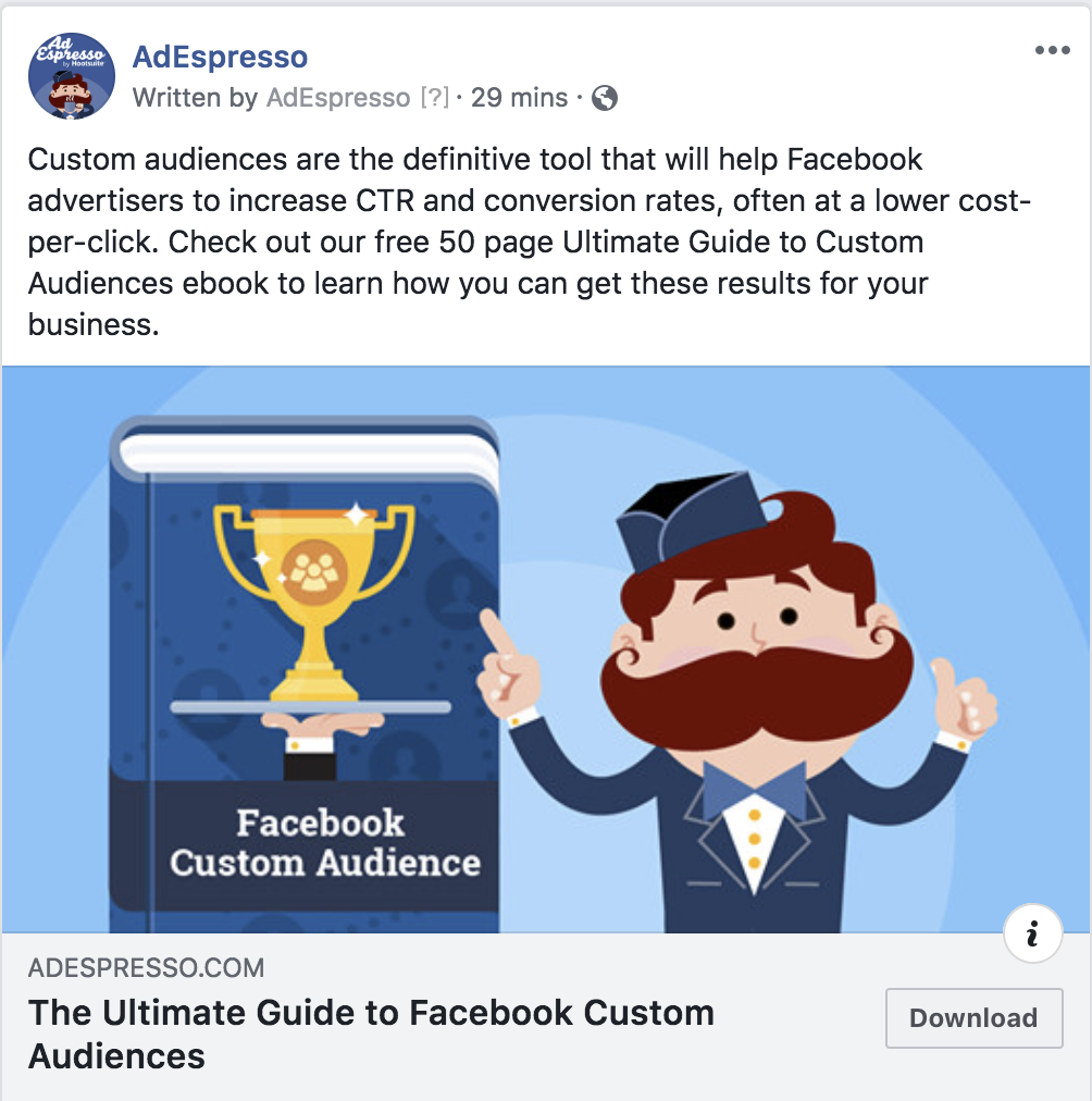
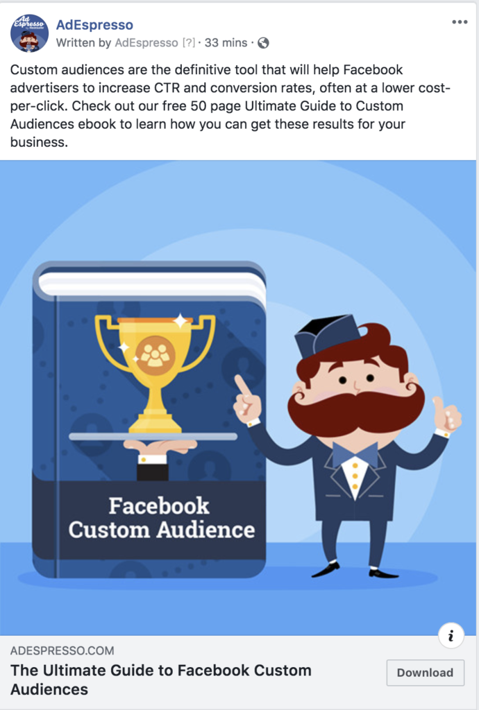
The ads we produced are shown below:
-
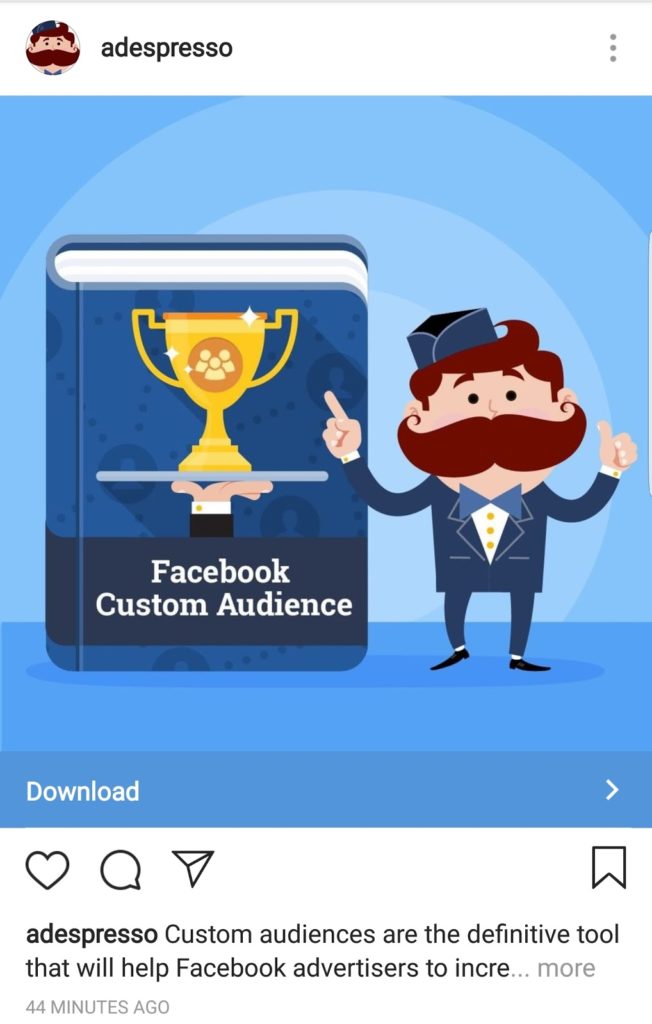
Landscape image, Facebook Newsfeed:
-
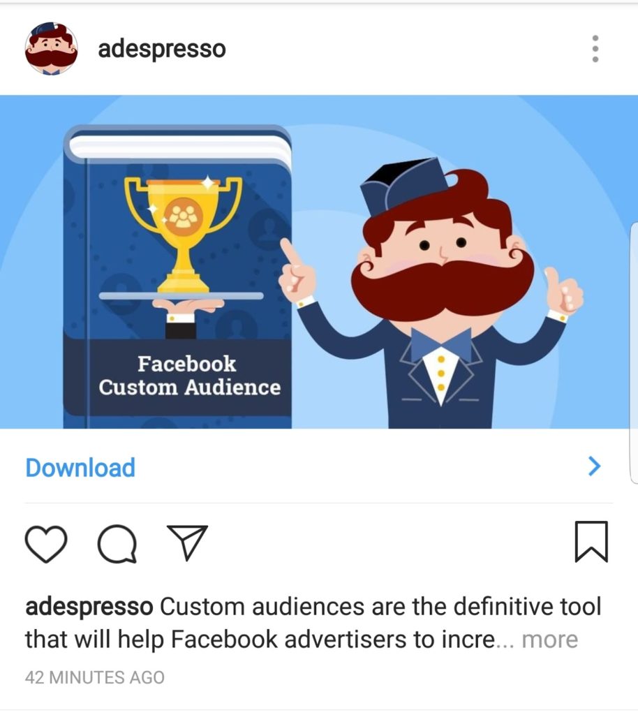
Square image, Facebook Newsfeed:
-
Landscape image, Instagram:
-
Square image, Instagram:


Placements:
We used Facebook desktop newsfeed, Facebook mobile newsfeed, and Instagram newsfeed. These were split into different adsets.
Campaign structure
There was one ad per adset, this allowed us to give exactly the same budget to each ad.
Overall there were six adsets: desktop placement with landscape image, desktop placement with square image, mobile placement with landscape image, and so on.
Audience & location:
We combined two lookalike audiences, a 1% LAL based on customers and a 1% LAL based on leads.
We targeted the US only and left the age range as the default 18-65+.
Budget:
We invested $1,200 spread across four days, giving $200 per adset.
Optimization:
We optimized for conversions based on the Lead pixel firing on the thank you page.
Square Image vs. Landscape: Experiment Hypothesis
Our assumption was that square would work better for two main reasons:
- The ad fills up more vertical space, while still taking up the same amount of horizontal space.
Overall this means the square advert is larger, and this is particularly noticeable on mobile where it fills up most of the screen. - Square is the modern format used for video and a lot of organic posts.
The Landscape format is mostly used for adverts which many people scroll past.
Based on this our hypothesis was:
Overall, square images would give the lowest CPA
We assumed that:
- Square images would give the best click-through rate (CTR) and therefore the lowest cost per click (CPC).
The larger image would be more engaging so we assumed it would also marginally increase the conversion rate.
The cost per thousand impressions (CPM) would be higher for square as it takes up more real estate. - Instagram would be strongly skewed towards square images giving the best CPA, as landscape format is rarely used on the platform apart from in ads.
Square Image vs. Landscape: Experiment Results
The aggregated results for all the ads together are as follows:
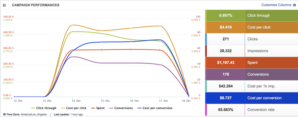

All of the main metrics were fairly consistent throughout the four days that the experiment ran.
Next, let’s have a look at the “Square vs. Landscape” split test, aggregated across all platforms:
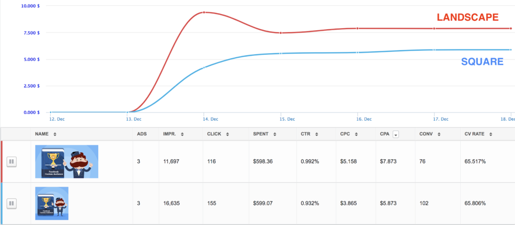

Square produced 102 leads at $5.87 each and landscape 76 leads at $7.87 apiece.
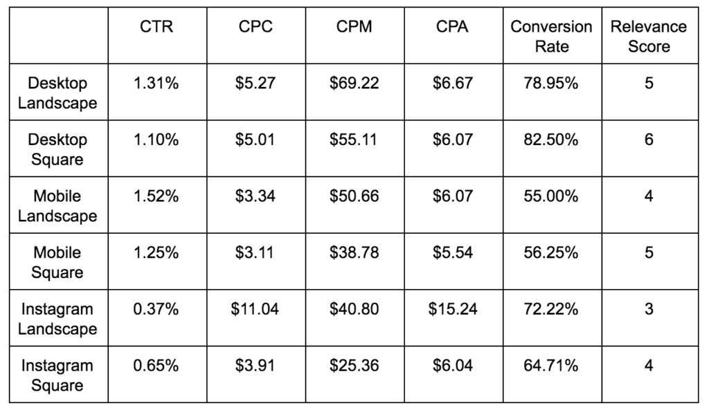
To really understand what’s working best we can split the results by placement.
Each ad had spent $198-200 over the course of the experiment:

Square Image vs. Landscape: Experiment Conclusions
There are two headline conclusions we can make:
-
Square images produce a lower CPA than landscape images
-
The largest difference was for Instagram where using a landscape image made the CPA 2.5 times higher than for square.
For desktop and mobile, the difference was much less at just under 10%.
This is to be expected, most organic content on Instagram uses square and when a landscape image appears in the feed, users assume it will be an advert and scroll right past it.
For Newsfeed, a mix of image ratios is used for organic content and so each post is scanned by the viewer before deciding whether to take action or move on.
The results created some surprises though.
We expected square images to produce more clicks as they take up a lot more screen space, resulting in a higher CTR and a lower CPC and possibly a higher conversion rate.
However, what we actually discovered was that for mobile and desktop the CTR was actually lower for square images.
Curiously, it was a lower CPM that made the most difference to the CPC and CPA for newsfeed ads.
Facebook is giving the new format priority in the ad auction, this could be intentional or it could be that the larger ads are more engaging and producing higher relevance scores which can help to lower CPM.
We often see a new ad format is given preference by Facebook, for example when video ads first came out and the same again when Facebook Live could first be boosted. It would be interesting to see the difference in CPM a year from now.
We disagree with Facebook’s statement that affirms:
From initial testing, we also saw that 1:1 image link ads showed significant improvement in click-through rate and conversion rate”.
This is not what we experienced in this test, although we do agree that square images are better for CPA.
Square Image vs. Landscape: Final Thoughts
Usually, we issue a caveat with our experimental results that performance may vary depending on whether you’re doing B2B or B2C campaigns, what the industry is, what countries you’re advertising in and so on.
This time, both the hypothesis and results agree that square images work better than landscape ones.
So while you should still test what works best for your business we’d suggest moving all campaigns to square images as soon as possible.
If you’ve been advertising for a while you may have built up a library of landscape images. It would be worth taking the time to convert anything that you intend to use again to square, and definitely convert anything you currently have running.
The good news is that going forward, the elimination of landscape should greatly help your design team.
As Instagram Stories are becoming more and more popular it has been getting increasingly difficult to produce content for newsfeed ads in 1.9:1 landscape at the same time as producing a 9:16 portrait version for Stories.
With this change, it’s easier to produce content in portrait format for Stories and then crop it to the square one.