


In 2015, we analyzed the text from 37,259 ads from our Facebook ad examples gallery to find out exactly how the best Facebook advertisers are piecing together their ads.
Today — nearly three years later — this has grown more than 20X: we analyzed 752,626 ads!
While some of our original results have remained constant (the most popular headline is still five words long), a lot has changed.

The information will help underpin the creation of even more targeted and valuable ads in 2018.
There is no better time to dig into the details of what makes a Facebook ad successful.
Read on for more insights from this massive data set!
If you’re here reading you know: AdEspresso is behind the hard-working fella and against the scaremongerers.
We have no gift of prophecy, but “in numbers we trust”, and numbers confirm the fact that Facebook continues to be the top platform for social media advertisers.
Look at this:
- Facebook is still the most popular social media platform by 1.5X.
- In addition, 68% of U.S. adults report that they are Facebook users, with roughly three-quarters being daily active users.
- More than other social media platforms, Facebook users are from a wide range of demographic groups.

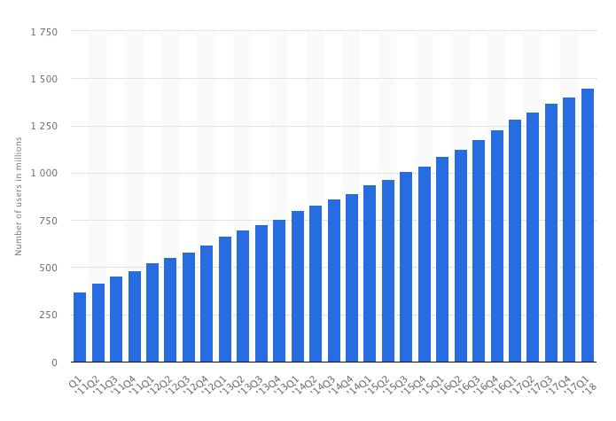
Statista data shows Facebook daily active users as of Q1 2018
While other platforms innovate in fits and spurts, Facebook continues its steady upward climb.
And Facebook ads are becoming more and more indispensable to grow any business.
For both our 2015 article and this updated version, we analyzed the text, headline, and news feed link description of the Facebook Ads collected in our ads gallery (less than 40 thousand examples in 2015, more than 750 thousand examples for this round), dissecting them for length, sentiment, and what type of words these ads were using.
We also looked at the Call-To-Action they used and the links in these ads, and how Facebook advertisers were using these to generate as much interest in their products as possible.
To jump to the results of the 2015 study, click here! If you are curious about what’s happening now, just keep on reading.
Important Components of Facebook Ads
Although they appear simple on the surface, Facebook ads have intricacies that marketers can optimize for better campaign results.
To start, you have three options for text fields: the headline, the main text, and the news-feed link description.
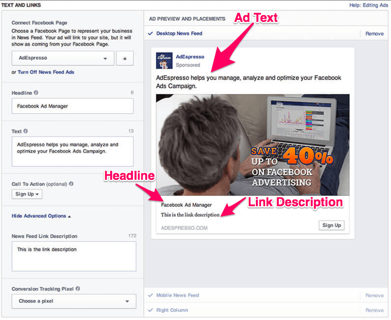

The right balance in their composition has a strong influence on whether viewers decide to read more, click through to your landing page, spend time exploring and considering your image, and even understand what your company is and what you’re selling.
For example, if your words run over the required length for their specific fields, as in the ad below, the entire post can become dense and frustrating.
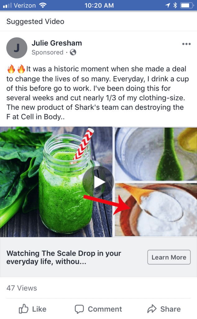

Here, the text is convoluted and missing important points that could guide the viewer to learn more. And we won’t mention the typos and errors -can you spot them?- which are always a No-No!
What could have been an enticing ad for a refreshing, healthful weight-loss product ends up being far less tasteful and effective (for both sales and weight loss, we might guess.)
Studying the subtle ways that brands’ tactics have evolved over the years can help marketers craft ads that are optimized for engagement.
The 5 Key Findings of Our 2018 Research:
- The length of ad text has increased.
- Link descriptions are shorter.
- There has been an uptick in brands that link to specific landing pages.
- The top five CTAs in 2018 and how brands’ usage of CTAs have increased.
- Companies are using a greater variety of Ad types.
The data below, from more than three years of our research, will help marketing teams of all sizes improve their ROI.
1) Headline Length Is Still 5 Words on Average, but Ad Text Has Increased
The message is tried and true: A five-word headline is the perfect length. What has shifted over time, however, is the amount of ad text:
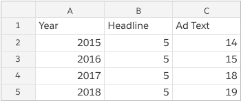

Inching up from 14 words on average in 2015 to 19 in 2018, brands have decided to squeeze more information into this initial field.
This tells us that marketers (1) believe viewers will read more up top and (2) that they’re homing in on content that best hooks viewers’ attention.
Who better to illustrate this than Facebook itself?
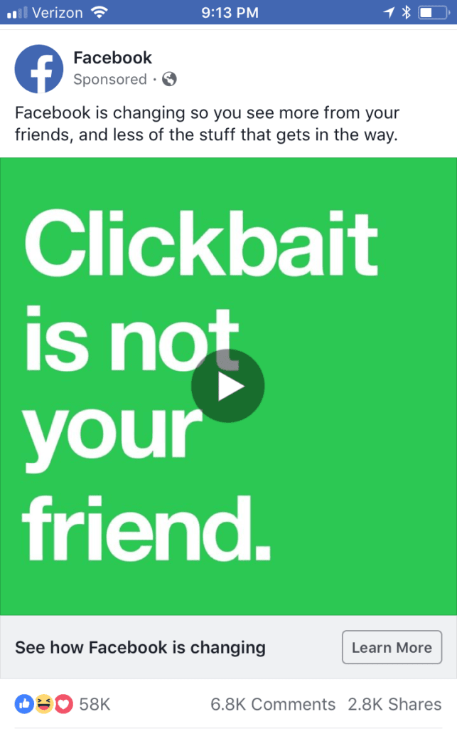

A clear, no-nonsense (and five-word) headline, “See how Facebook is changing,” paired with 20 words of ad text is the recipe for a perfect Sponsored Post.
In the text itself, we see Facebook doing away with regular punctuation and grammar rules — keeping it chill and relatable.
In a time of heightened security risks, particularly around consumer data, if, like Facebook, you store a lot of personal information, it’s absolutely critical to keep an open line of communication with all of your stakeholders — yes, even in your Sponsored Posts!
Although the average length for ad text has increased, it’s still important to find a sweet spot between a catchy description and staying concise.
The travel brand Away struggles with this:
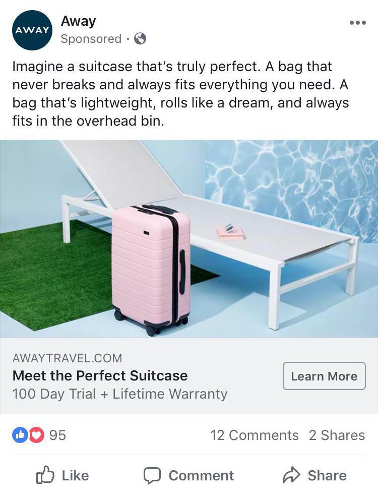

Although the company nails their “Meet the Perfect Suitcase” headline (again — nothing extra, four words, and in line with Facebook’s own recommendation of 25 characters), the ad text is repetitive and quickly becomes boring after the first sentence.
Sticking to the 19-word median will help you stay on point and choose your words carefully, making sure nothing escapes viewers’ notice.
Here are some additional proven tactics for crafting the best headlines:
- Use numbers at the beginning of your headline.
- Create a sense of urgency with limited-time offers.
- Be clear about your offer (avoid being too vague).
- Ask questions that people want to be answered.
Overall, remember to keep your text clear, concise, and relaxed. While ad text has expanded, the most successful posts are still direct and succinct.
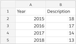
2) Link Descriptions Have Become Shorter
In 2015, the average link description was a whopping 18 words. Three years later, it has been whittled down to 13.

Why is this happening? To shed some light, let’s study an example of a link description that doesn’t work:
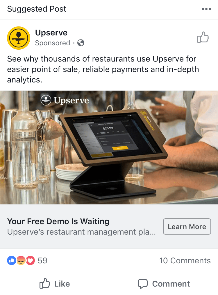

Well exceeding Facebook’s 30-character suggestion, the link description is too verbose and trails off without enough information to prompt the viewer to click the “Learn More” CTA.
Also, it doesn’t add any new information.
Upserve has already mentioned its restaurant management software in the ad text. The link description simply takes up space and makes the post feel crammed.
In contrast, WeWork nails it with a shorter link description that packs the most important information into the space provided.
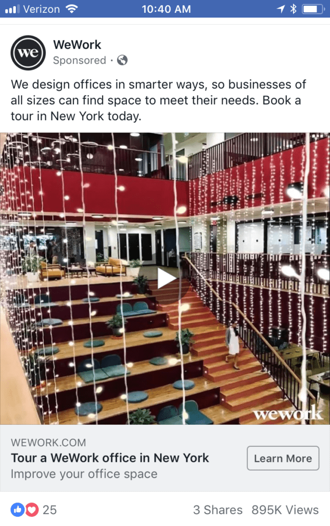

Although it is below the 13-word average, this four-word link description underscores how less is more.
Facebook has even come out and stated that the average human attention span is just over 8 seconds.

Take this to heart, and don’t push your viewers’ limits with run-on sentences.
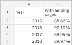
3) More Ads Are Using Specific Landing Pages
In 2015, marketers incorporated specific links for viewers in 88.7% of Facebook ads. While the result has fluctuated a bit in the past three years, the overall trend has been upward, with close to 90% of Facebook ads highlighting page links in 2018.

Including landing pages makes a post more direct and removes the effort of additional research for the viewer. Given the heightened attention to ad text in recent years (see Result #1), incorporating your link directly into this field is a great option!
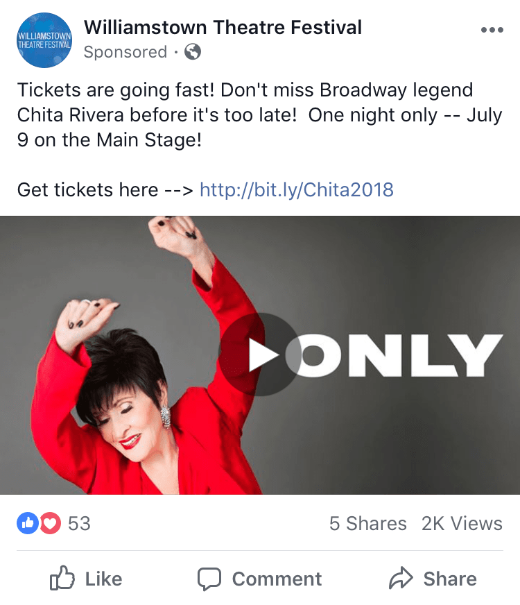

You don’t have to be a big corporation to adopt professional tactics. Above, a small nonprofit, the Williamstown Theatre Festival, displays expert aesthetics by placing its link description front and center.
Pro Tip: Using bitly.com will shorten a longer url into a bite-size piece to fit your word count.
While landing pages are almost always helpful, they’re critical if you’re running Facebook Ads with the objective of lead generation, video views, or conversions. You need to be sure your viewer doesn’t just absorb information from your post but actually takes action!
Back to top
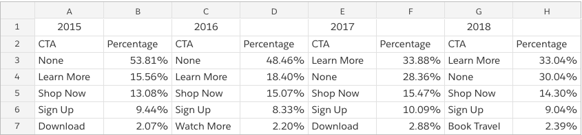
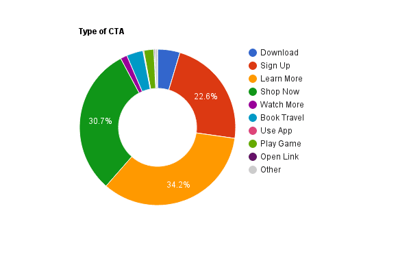
4) Top 5 CTAs: Learn More, None, Shop Now, Sign Up, Book Travel
Choosing the perfect CTA is more difficult than you’d imagine, which is a major reason why this category has seen so many changes over the years. Marketers have experimented with several different kinds of CTAs (including none at all). At the same time, Facebook constantly rolls out new options to test.

Facebook has three main types of ads that are aimed at increasing awareness, consideration, or conversion. Each of these has its own set of CTAs. While some, such as “Comment,” overlap among categories, others, like “Play Game,” are unique to a particular channel.
While the above CTAs are vetted to help drive success on the majority of Facebook ads, branching out and using CTAs that didn’t make the top-five list could set you apart in your viewers’ News Feeds.
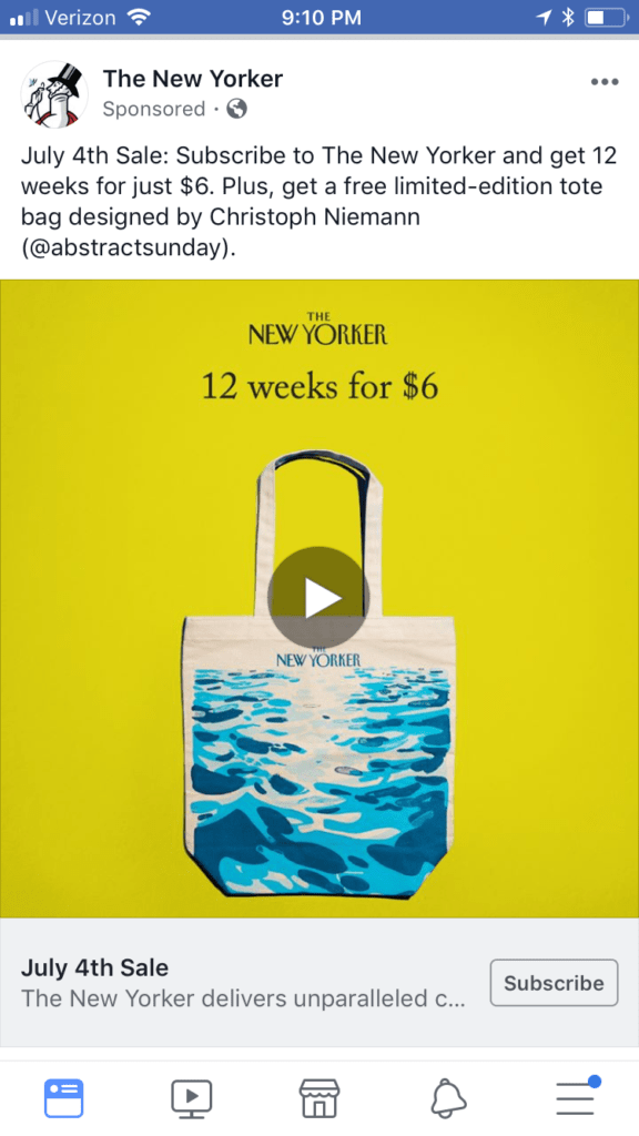

The New Yorker could have gone with a simple “Shop Now” or “Learn More” — but the “Subscribe” CTA is more specific to its objective and is unique among the majority of other offers. It adds an artistic flair to an already-creative brand.
There are more than 30 unique options for Facebook ad CTAs. Here are a few of the quirkier ones:
- Listen Now
- Get Directions
- Donate Now
- Send Message
- Image Click (where the image itself is the CTA)
Whether you go with a vetted approach or one that’s more daring will depend on your brand, your audience, and your ad budget — but having the correct data should always be your first step.
Bonus: Total CTA Count + Usage Per Year
Both the number of available CTAs and the brands’ usage of CTAs have increased 2016–18.
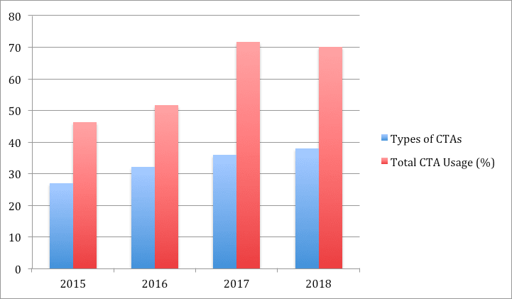

While it might appear that 2018 CTA usage has dropped 2017–18, this data is as of July 2018 (a little over halfway through the year). Given the 40% increase in CTA usage 2016–17, we are on track to see similar growth in this area in 2018. A full breakdown is below:
- 2015: 27 types (46.12% using CTA)
- 2016: 32 types (51.54% using CTA)
- 2017: 36 types (71.64% using CTA)
- 2018: 38 types (69.95% using CTA)
For brands looking for new ways to stay on the cutting edge and differentiate themselves, CTAs are a rapidly expanding opportunity that warrants attention!
Back to top
5) Companies Are Using a Greater Variety of Ad Types
Finally, more companies are deciding to get creative with the new ad offerings Facebook keeps rolling out.
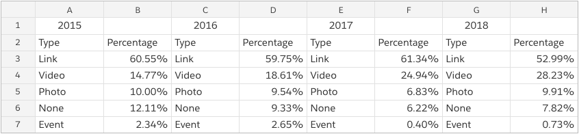

Clearly, video ads have soared in popularity, while links, photos, and events have remained relatively steady or declined.
For more visual learners, another way to view the breakdown of ad types is below:

While traditional links still represent the majority, they are no match for the rapid rise of the video format.
There are so many ways to get creative and stand out with your video ads. And now is clearly the perfect time.
A few ideas from the pros:
- Put the good stuff into the first 5–10 seconds.
- Work in primary colors (red, blue, yellow).
- Incorporate scrolling text.
While you should invest in learning the video format, don’t discount photo ads (particularly with all of the new image technology), which have remained a steady bet since 2015.
Back to the Drawing Board
Take some time, pull yourself an espresso (or two!), and consider how these findings could affect your latest campaign.
Should you increase your ad text?
Cut down your link descriptions?
Maybe it’s time to switch it up and try an underused CTA or take a video course for online marketers.
There are many ways to use this information.
We’re excited to see how you do!
We Analyzed 37,259 Facebook Ads and Here’s What We Learned (in 2015)

We’ve discussed plenty of times before what we think your Facebook ad should say, so we’ve analyzed the text from 37,259 ads from our Facebook ad examples gallery to find out exactly how the best Facebook ads are made.
The Most Popular Headline Is Just 5 Words Long
You have three text fields for the copy in your Facebook ads: The headline, the main text, and the news feed link description:
When you’re putting together the copy for your ad, we have one piece of advice: keep your copy short and extremely clear.
It seems Facebook advertisers have taken this to heart.
The median length for a headline is just 5 words long.
This means that their ad is immediately clear and to the point each time.
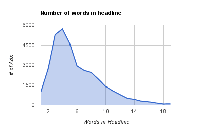

This example from Thinkful shows a great ad.
Not only is the headline nice and tight, but all the text is to the point. It gets your attention and then makes you want to click through to the site to find out more:


A few advertisers are making their headlines way longer than this and immediately losing the focus.
This ad from Video Game Testers & Designers puts too much information into the headline — information that should be in the text.
They even have an asterisk to explain more because they can’t fit it all in the headline:


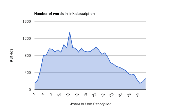
Post Text And Link Descriptions Are A Little Longer (But Not Much)
The median length for ad post text is just 14 words long, again keeping it short and to the point.
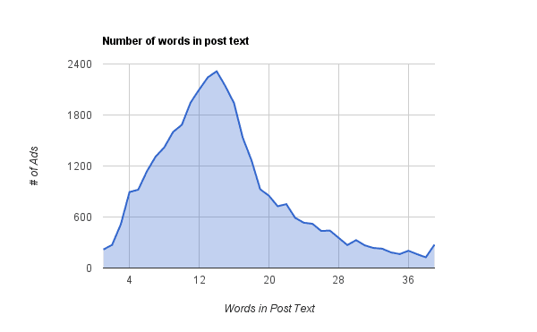

The link description is a little longer, at 18 words.
The post text for this ad from Gwynnie Bee has just the right amount of information in its 14 words:
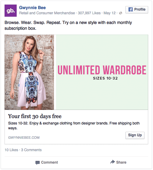

We strongly suggest you keep your text tight and to the point.
Facebook ads are expensive real
estate, and aren’t there to tell your life story. Instead, use clear and catchy text to attract people to the ad, and then let them click through to your site to learn more about your service.
The Most Popular Word: You
Looking at the ad examples dataset this was one of my favorite things. It seems that Facebook Advertisers really are on their game.
Recently I wrote about the best psychological tricks to make your ads unforgettable and included a list of the 5 words that you should always include in your ad if you want people to respond:
1) You
Why is a simple “you” so powerful? Because it makes you think of you.
If every ad could be hyper-personalized that would be even better, but in lieu of that, the word you will suffice. Our brain is activated specifically by hearing or thinking of our own name and ourselves.
2) Free
We value free highly. Free is the ultimate word for any viewer of an ad.
We are always on the lookout for free. Including it in an ad and it’s almost guaranteed to catch the eye.
3) Because
We want answers.
Humans are inquisitive souls. We are constantly questioning why? And because of that the word because means a lot to us.
4) Instantly
We love now. We discount things drastically into the future, so instantly nearly always seems like the better option.
This has been backed up by brain scans, showing that if you offer something instantly, our brains go crazy.
5) New
We are novelty-seeking animals, so using new is a great way to show you are something fresh, or re-invigorate an established brand and put it back into the customer’s mind.
Here is a word cloud of the text from these 37,259 ads, where the size of the word is proportional to how often it occurred in all the fields.
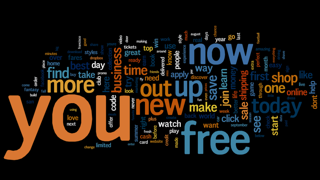

OK, so ‘because’ isn’t there, but ‘you’, ‘free’, ‘now’ (instead of ‘instantly’), and ‘new’ are the words that you find most frequently in these ads.
Well done guys!
Here are a couple of examples of advertisers using these words well.
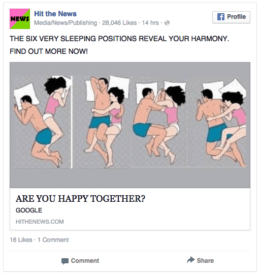
First Hit the News using ‘You’ in their ad, making readers wonder if you are happy together:

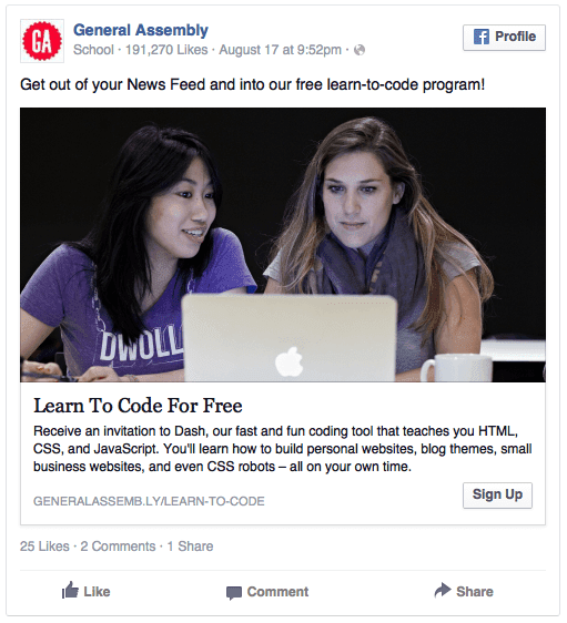
Then General Assembly using the awesome power of free to get people to learn to code:

These words work.
We are naturally drawn to these words as they signal something powerful to us. Using them in ads means you have a natural advantage over all other advertisers.
If You Want To Stand Out, Go Negative
Sentiment analysis is a way of analyzing text for how positive or negative it is. Certain words are assigned a valence score and you add up the scores for each word in a document to determine the text’s sentiment, either positive or negative.
Most ads are neutral, either because the words aren’t scored in the valence database (it only has scores for about 2000 words in the English language), or because positive and negative words in the ad have canceled each other out. Below you can see ads that were either positive or negative (0 scores have been removed).
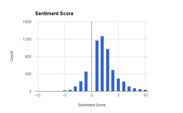
The graph is skewed towards positive valence, with most non-neutral ads showing a slightly positive tone. These ads might contain words like ‘capable’ (+1), ’top’ (+2), or ’yummy’ (+3).
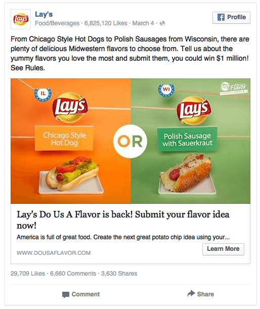
This ad for Lays scores highly because it has the word ‘yummy’ (+3), and ‘win’ (+4):

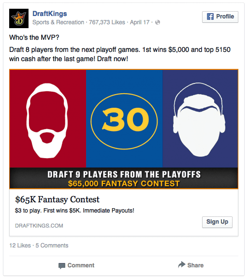
This DraftKings ad has high valence words such as ‘top’ and ‘win’ multiple times.

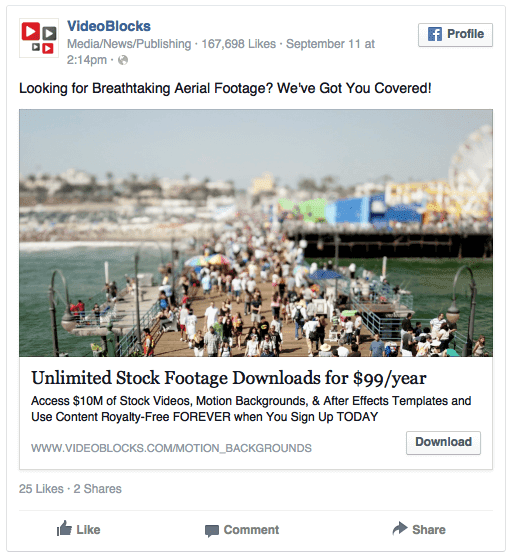
The ads that are really positive in tone, with a sentiment score of 5 or more can either be made up of a few of these slightly positive words (super-yummy or win-win-win), or might have extremely high valence words like ‘breathtaking’ (+5), as this VideoBlocks ad includes:

Not all the ads are positive though.
Ads for news items or charities are often slanted slightly negatively.
This Soi Dog ad contains the words ‘cruelty’ and ’torture’, scored as -3 and -4 respectively:
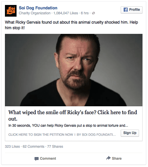

It will definitely grab a user’s attention, especially with the image of Ricky Gervais as well.
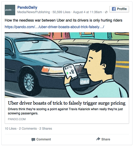
The PandoDaily ad below, scores slightly negatively because of the inclusion of the words ‘war’ and ‘hurting’:

Of course, looking at this data it seems there is one way you can get your ad to stand out from the rest – go negative.
If your ad is all the way off to the left of that chart, it will definitely stand out from the rest (though will people click on it?)
CTAs Aren’t Being Used Effectively
Including a call-to-action (CTA) button in your ad makes it easy for a user to click through to your site to learn more about your product, sign up to a service, or to download an eBook, app, or game.
From the possible CTAs available to Facebook advertisers, our analysis showed that only a few are really used extensively:
‘Learn More’, ‘Shop Now’, and ‘Sign Up’ are all used significantly more than any other call-to-action.
Below is a word cloud of the CTAs, with the size of the words proportional to how often they appeared in the ad example gallery.
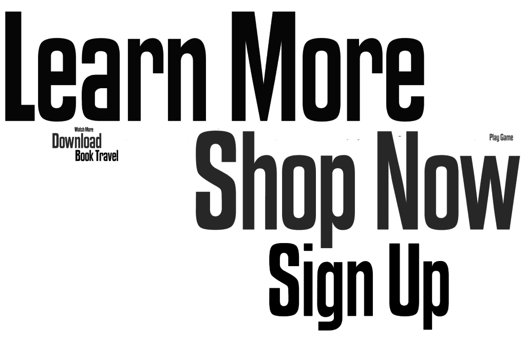

The less-used ones, such as ‘Open Link’, or ‘Use App’ can barely be seen (they are the ones that look like an Umlaut above the ‘p’ of Shop).
Using a CTA makes it easy for a user to find out more about your product, and shows them exactly where on the ad they should click to get the information.
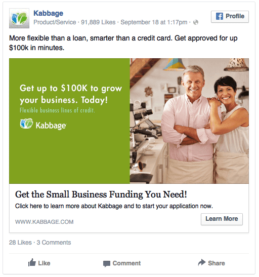
Kabbage uses the ‘Learn More’ CTA so you can find out about their small business funding:

Don’t be scared of using those lesser-used CTAs though, if they have relevance to your service.
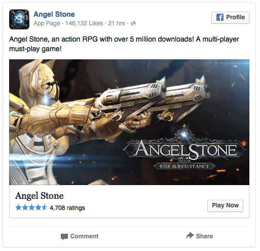
Here Angel Stone uses the ‘Play Now’ CTA exactly as it should be used — to get people to their gaming site:

In total, only 56% of ads included a CTA, so this is an area where Facebook advertisers could really up their game, making it easier for users to click through to their sites to Learn More, Sign Up, or Donate Now.
69% of Ads Link To A Landing Page
Basic Facebook ads rules:
- Your Facebook ad should be advertising something specific, rather than just your site or whole service.
- Your Facebook ads should be targeted towards a specific audience, and you should offer them something that is unique to them.
- Your link from the ad should be pointed to a specific landing page for your service.
This is what most advertisers are doing:
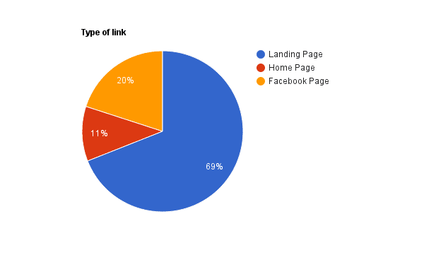
69% of Facebook ads point to a specific referral or landing page on the product site. 11% of ads miss out on this targeting by pointing to the home page instead, and a further 20% point to another page within Facebook instead of moving out of the site to a product or service.
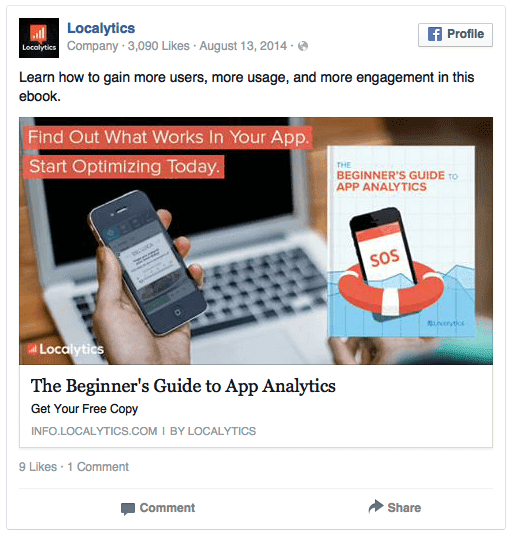
The Localytics ad below, does it right by sending the user to a specific landing page for their eBook:

Why do we suggest have a specific landing page for your click-throughs? Because this is a great way to use Facebook ads for Lead Generation.
You can then create a dedicated landing page for your lead magnet, using apps such as Welcome Mat from SumoMe, and capture information about your customers easily.
If you are going straight to your home page, or to another page in Facebook, you’ll lose this information and lose customers.
Most Companies Only Have 1 Ad, But The Best Have 100s
Our final task was to look at how many ads each advertiser had in our gallery.
Unfortunately, most advertisers had only 1 ad in the gallery.
This is a massive mistake.
It means they are only putting up 1 ad for their product. They’re not taking advantage of ways to optimize their campaigns, such as split testing different designs or text.
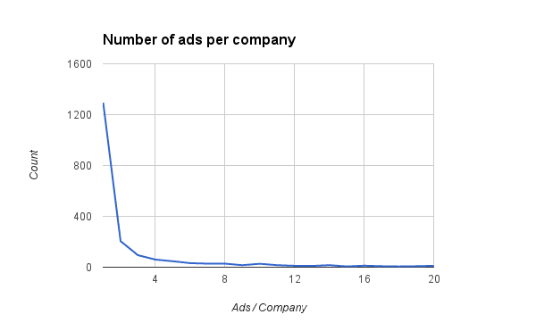
We did find a few companies that were doing to awesomely though.
Shopify has over 200 examples in the ad gallery, using different images and text in each, to attract a different type of user.
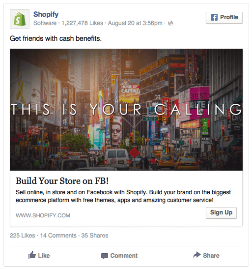

In the images above and below, you can see 3 different Shopify examples with the same headline, but different images and text for different personas:
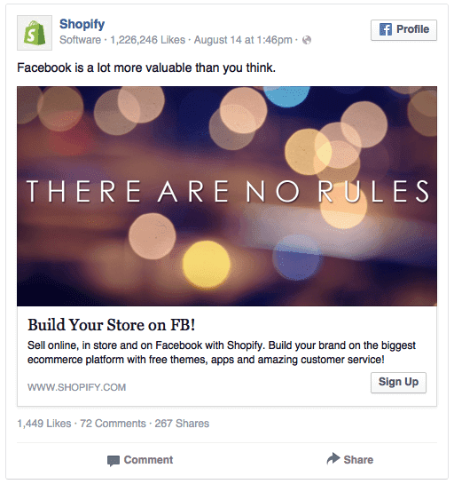

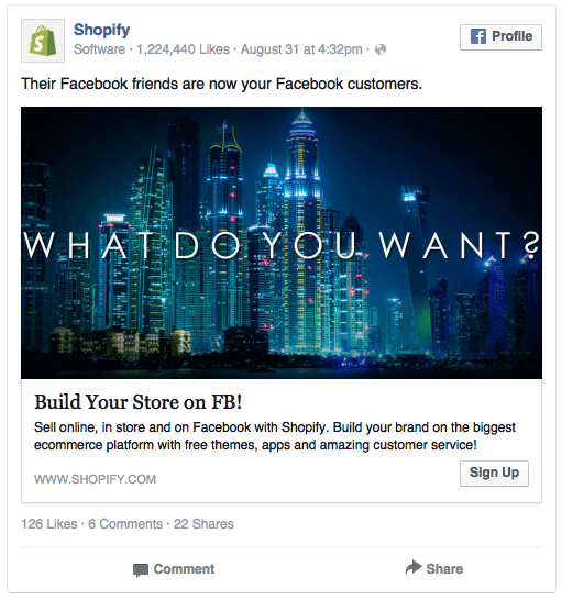

Awesome work, Shopify!
Wrapping It Up
It seems that most Facebook advertisers really hit the mark.
They keep the text nice and short, keep the ads positive, and even if they aren’t always using CTAs, they link to specific landing pages on their own sites so they can capture important user information.
Where they are letting themselves down is by not producing more ads, so they can’t optimize their campaigns effectively.
If they did this, I’d expect there to be even better data in the other categories.
Are you playing by these rules?
Or can you see ways of subverting these norms, such as going negative, to make your ads stand out even more?
We’d love to hear about your strategies to optimize your ads and to get them to stand out from the rest! Drop us a comment and let us know!