
Clickbait works. Whether we like it or not.
People hate the idea of clickbait. But used properly – for good! – it’s one of the most powerful ways to grab attention in this increasingly saturated world.
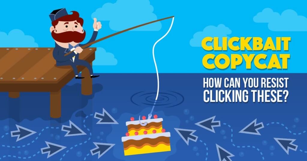

Here’s why clickbait works, along with 10 irresistible clickbait Facebook advertising examples to learn from, copy and steal.
Why Clickbait Works:
It’s no great mystery. It ain’t like Bigfoot or the Loch Ness monster. (Although BuzzFeed is kinda like the Bermuda Triangle of the internet.)
Clickbait works because it (a) appeals to your lizard brain and (b) tickles your innate desire for curiosity. (That’s the TL;DR version anyway.)
But if you’re curious as to why then read on… (Besides, I got a word count to hit.)
69,907 headlines can’t be wrong. That’s how many a few media outlets analyzed in 2014 to identify what the most successful had in common.
Unsurprisingly, the headlines that performed best just so happened to also be the most polarizing. (Turns out, Abercrombie and Fitch are right for hating fat people.)
Clicks correlated with extreme sentiments – both positive and negative ones. Hyperbole alone, however, isn’t all.
The ‘cliffhanger’ or curiosity gap is one of the most powerful headline formulas for a reason. It uses pattern interruption to shock or surprise us, forcing us to click to uncover the reason.
It turns out we’re hardwired for this stuff, as George Loewenstein’s proved in the ‘90s with his “information-gap” theory. As reported by Wired:
Such information gaps produce the feeling of deprivation labeled curiosity. The curious individual is motivated to obtain the missing information to reduce or eliminate the feeling of deprivation.”
Another common technique for powerful lists and ‘how-to’ headlines are to promise a simple, step-by-step solution that acts like a lighthouse on a foggy night for our overworked, overstressed minds.
All we gotta do is click for instant gratification. No thinking required.
Interesting stuff, right?
Well, wait until you see how these 10 companies employ clickbait on the regular.
You won’t believe #5!
(Corny, meta clickbait joke FTW.)
10 Good Clickbait Examples: “They Laughed When I Sat Down at the Computer, But When I Started to Type…”
Clickbait, when done correctly, cuts through the noise. Here are a few examples to emulate.
1. Blocks
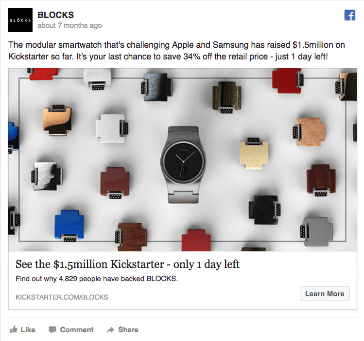

From the very first word in the headline, Blocks has you.
“See” is a perfect opener to create the aforementioned information gap; alluding to something interesting or irresistible that people can’t afford to miss. The BIG (odd) number creates further intrigue. And it’s followed up by an urgency-creating, specific deadline.
They even follow it up with two more uses of specific numbers, further increasing credibility with the opportunity to save 34% sale along with the 4,829 other backers.
2. One Smart Penny
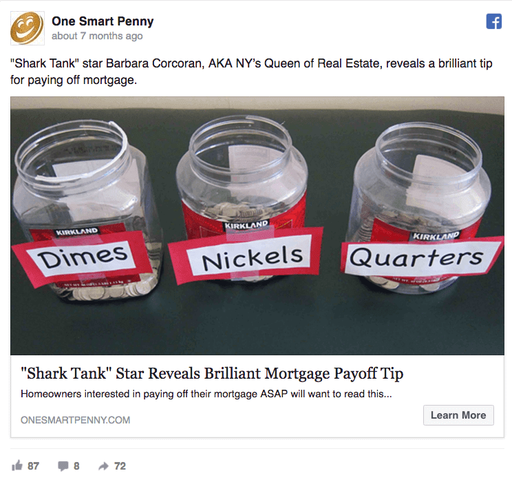

Piggybacking on a successful brand or person can help grab attention. But it only works if you follow it up with something interesting or compelling.
One Smart Penny executes brilliantly here, following up with an expert solution or tip to a difficult problem (paying off your mortgage).
That message, combined with the odd yet relevant image, stands out. It makes you pause, giving you a chance to make the split decision to click through.
3. E-commerce Simplified
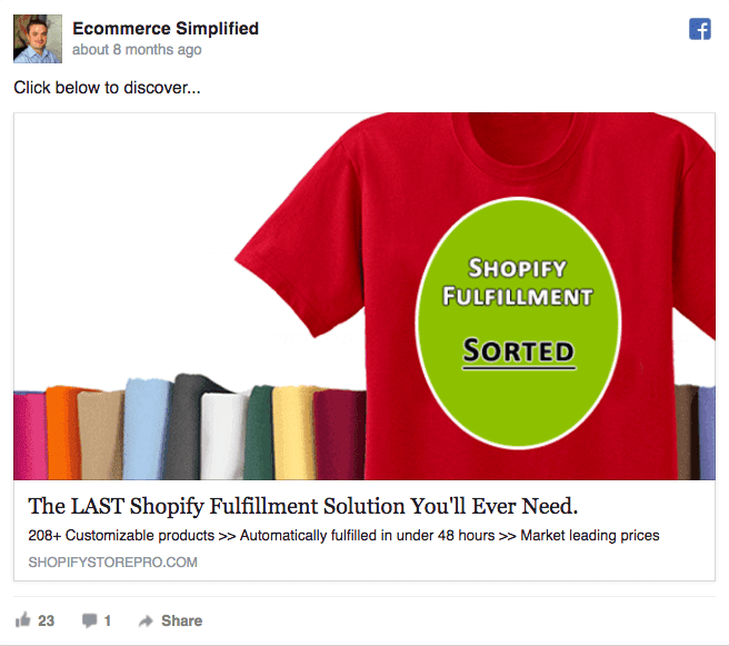

In the previous article of bad clickbait examples, Ecommerce Simplified was one of the worst offenders. This one, while still very clickbaity, doesn’t miss the mark as badly.
Product fulfillment is one of (if not the biggest) problems to starting or growing an eCommerce shop. Shopify makes many things easy for customers, but this is one that still commonly plagues most shop owners.
On first blush, this headline comes on a little too clickbaity, however, the supporting description saves it with specificity.
208+ products added in 48 hours now makes me a (belieber) believer, enticing me to click in hopes of a solution to this problem.
4. Live on Kickstarter
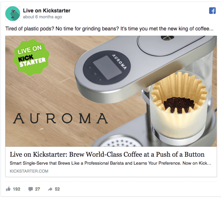

Home-brewed coffee never tastes as good as the real thing you buy down the street at the local hipster joint. It’s another of the world’s greatest mysteries, forever unsolved* (*That’s not true.)
The Keurig, which pops up at every single person’s office or home, produces a uniformly crappy cup.
And that’s why this headline from Live on Kickstarter jumps out at you. Because it’s a pattern interruption at it’s finest.
It takes something you commonly expect (like single-serve brewers tasting like cardboard) and flips it on its head. It’s a little surprising, not what you thought you’d see, and click-inducing.
5. Matt Davies Team
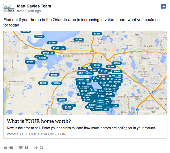

Speaking of things you’ve come to expect, here comes a lame, hyperbolic realtor ad. Except this, one’s a little different.
Sure, it’s got the same hyperbolic language you’re used to seeing. However, the personalized image is what caught my eye first.
Images are an extremely persuasive way to enhance context and believability in what you have to offer, which results in better click-throughs or conversions. (However they also have the power to destroy credibility if you’re not careful too.)
This one, personalized to the area mentioned (Orlando), combined with real example dollar values, delivers on the former.
6. My Snoring Solution
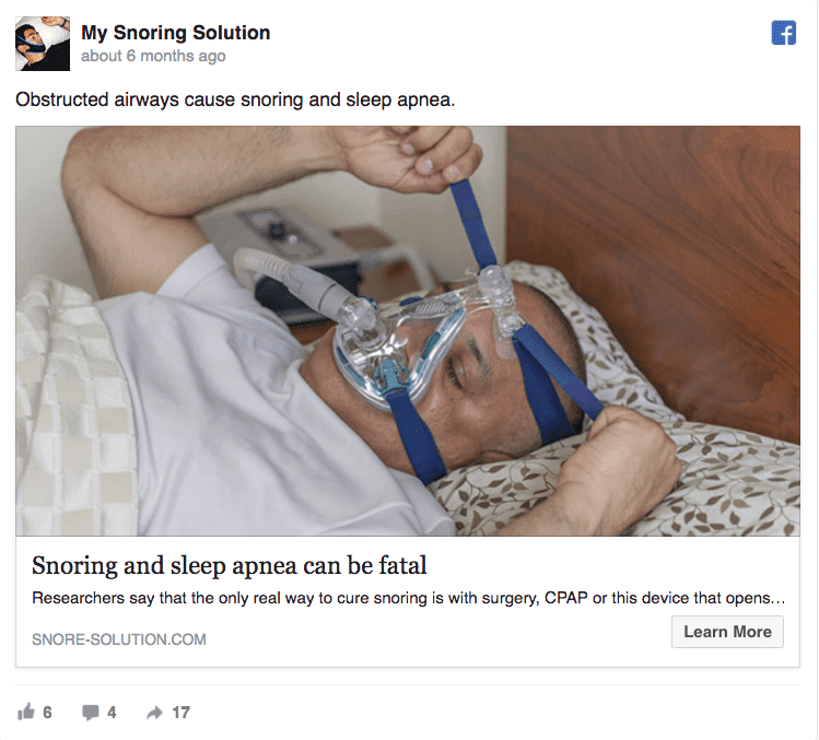

My Snoring Solution also appeared on the last list. However, this time, they’re redeeming themselves a little bit (minus the truncated ad text).
Here in the very first line, they’re setting the context behind the awkward looking image and extreme-ism headline.
Why is that guy wearing that thing? And why is something as common as snoring fatal?
It’s a sign of obstructed airways. Oh. Now it makes sense. And it resonates.
7. Puppies Way
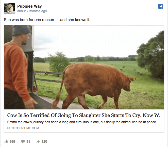

Another repeat offender from the previous article makes a few of the same mistakes. Specifically, the headline and ad text get cut off. But it starts so promisingly!
The opening line is a little clever but does enough to create intrigue to get you to read the headline.
And the first part of the headline doesn’t disappoint. In just a few words, it paints a vivid picture that would give even the most dedicated carnivores second thoughts.
(Why they didn’t stop there is beyond me. Truncated ads make me want to throw my computer against a wall.)
8. Collage.com
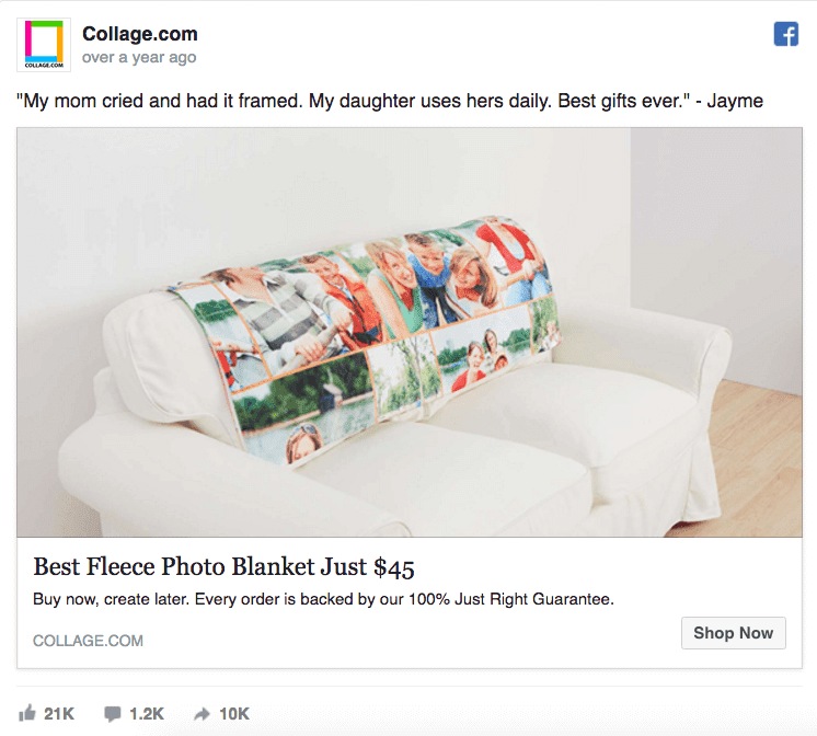

Using words directly from your customers isn’t just a convenient excuse to cut out some work. It’s effective, too.
There are numerous studies that support testimonial-driven promotions, including a 24.5% conversion increase for Laura Roeder and this one from Basecamp that showed a 102% conversion increase.
This gives you pretty much everything you need to know, also highlighting occasion-based marketing.
The headline is relatively direct and straightforward then, showcasing the low starting price along with a risk-reversing money back guarantee.
9. Inman News
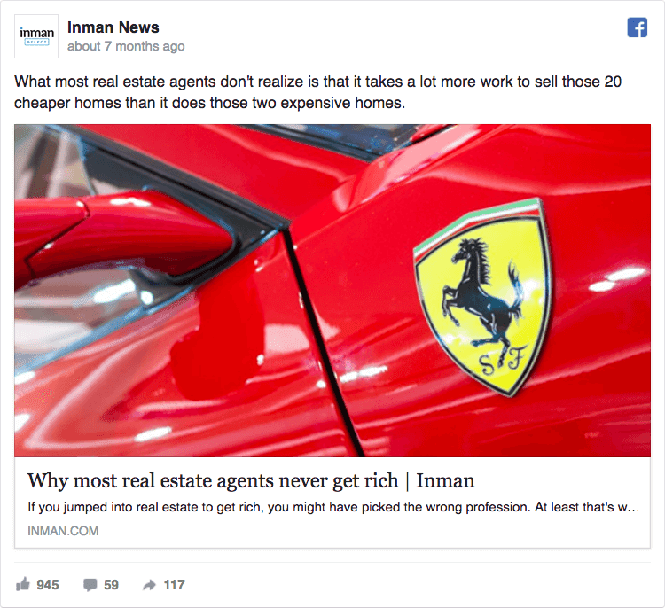

Salespeople are driven by money. That’s only natural when your compensation is tied directly to performance.
Here, Inman News does an excellent job playing on that singular, underlying motivation by ‘exposing a myth’ or ‘lie’.
The headline is bold and moderately controversial. While the opening introductory sentence reveals a little about the reason ‘why.’ It’s a textbook example of clickbait that gets you to take action (even when you know exactly what they’re doing).
10. Hear.com
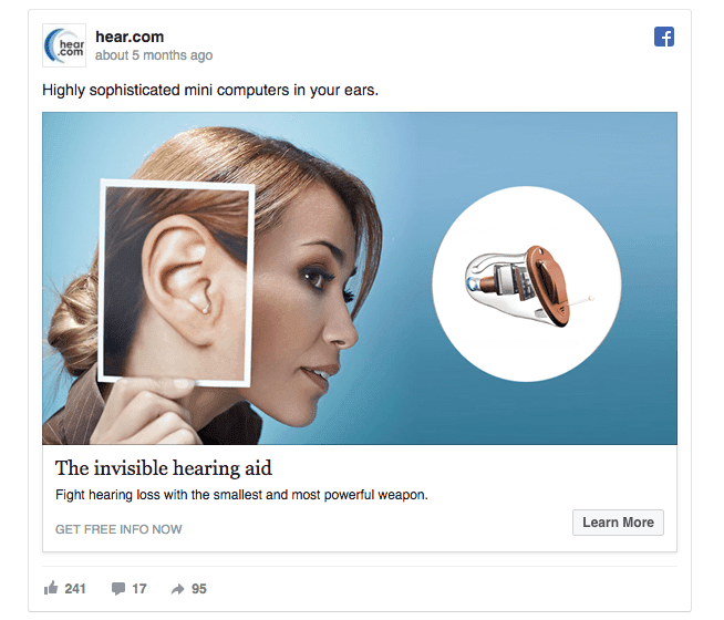

Perhaps the most subtle of the bunch, this one from hear.com brings together a few key elements to produce one good ad.
The first thing that grabs your eye is the image, which displays the product and then showcases it in use so people can understand how it looks while working.
The headline uses the perfect visual word to describe one of the product’s primary value proposition. The ad text explains the end result or outcome someone can expect (e.g. “fight hearing loss”. While the introductory text uses the phrase ‘mini computers’ to make sure that the reader knows quality hasn’t been sacrificed (which often happens with tiny devices).
A good ad all around that showcases just enough clickbaity elements to create interest to get people to click.
Conclusion
Clickbait gets a bad rap. Often, that’s deserved.
People go too far, making exaggerative claims that can’t possibly be true. The end result annoys readers, which can backfire and erode brand credibility.
However, clickbait doesn’t have to suck.
If you understand why clickbait works in the first place and use those qualities for good, it’s one of the best ways to get attention to your message and cut through the noise in a crowded marketplace.
Reviewing these 10 ads is a good place to start, as they all achieve that difficult balancing act of incorporating clickbait without looking like pure spam.
Because at the end of the day, clickbait is simply a way to craft a message that better appeals to our innate hardwiring. And there’s nothing manipulative about that.