Great designers are hard to find. Ones who get it… who understand conversion principles and business objectives and can translate that into something beautiful that also works.
Great designers are also vastly underpaid. Mistreated. And subjected to the most inane direction from clients and bosses imaginable.
It takes 0.05 seconds for someone to have a first impression of your site. Of whether they’re going to listen to what you say, eventually trust you, and perhaps, one day, purchase.
And ALL of that comes down to design.
Yet, designers are forced by the people cutting the checks to work with garbage. Which inevitably leads to, garbage.
Here’s why, kicking off with a bang.
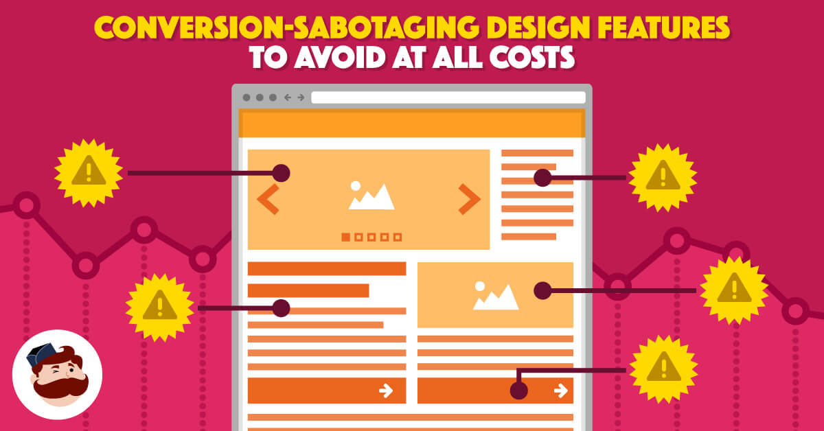
Conversion Killer #1. Homepage Carousel Sliders
There must be some unwritten rule somewhere.
An unspoken law, that every single ugly B2B website, MUST feature a homepage carousel.
You know the drill.
There are, like three to five slides, each with a slightly different ‘aim’. All of which, are kinda pointless. Uninspiring, to say the least.
You can see how these come to fruition, too.
The heads of each department within a company all sitting around the table with their web designer.
The first VP of something pipes up – doesn’t matter which one – and tosses in his two cents for what NEEDS to be on the homepage. Never mind this dude is well past middle age, has absolutely no experience with web design or usability, and therefore, no clue what he’s talking about. Conversion design theories? Fat chance.
The second VP of something vouches for his idea. They go around the table until the web designer wants to strangle someone, and then they all agree – unanimously by committee – to just throw all that shit on the homepage with clever slides that simply cycle forever.
Here’s the problem with that.
Homepage. Carousels. Suck.
Don’t take my word for this.
They’re one of the few rare design elements that are universally panned as awful.
They mess with usability, causing problems on mobile as well as SEO with duplicate content and headers. They mess with conversions, lowering them in almost all studies ever done. And they mess with speed or page loading times, which also drastically affects, you know, usability, SEO and conversions, too.
If homepage carousel sliders were in a movie, they would get a resounding 0% on Rotten Tomatoes.
Oh wait, I almost forgot. LESS THAN 1% OF PEOPLE ACTUALLY CLICK ON THE DAMN THINGS ANYWAY.
Again, don’t take my word for it. Thankfully, the people of Search Engine Land are on the case, with Harrison Jones doing some in-depth analysis on just how many clicks homepage sliders actually receive:

These blasted things take up arguably the most important real estate on a website, and yet they receive 0.16% of the interactions.
Do yourself (and everyone in your company) a favor.
Next time even the slightest whisper of a homepage carousel slider happens, send people to this website: Should I Use a Carousel?
(The answer of course, is no.)
Conversion Killer #2. Stock Images
It’s going to sound like we’re picking on B2B websites.
And that’s because, well, we are.
There’s a good reason though. Because most of them… aren’t any good.
Take photos.
It’s only natural that someone, say a prospect or customer, would want to know who they might do business with. That’s how humans work after all, according to centuries of evolution.
That’s why you always get roped into so many face-to-face meetings, despite the fact that you could just as easily discuss that stuff over phone or email (probably more effectively and in less time, too).
And yet when it comes to websites, most old, jaded business people – who’ve long since lost any real inspiration for their vocation – almost go out of their way to not spend any money on real images.
Here’s why that’s bad.
Images increase user engagement by 94%. Which makes sense, considering people process images in only 13 milliseconds.
And online, images are one of the most powerful ways to increase (or, decrease) conversions.
Visual Website Optimizer ran a test to see how stock images vs. real images compared when trying to drive people from a CTA to a registration page (and then finally, convert).

The results?
First, there was a 161% lift in the number of people who clicked on the CTA to be sent to the registration page. Second, there was a 38.4% lift in registrations, too. Both at 98% confidence.
Not even close then. Real images, even semi-amateurish looking ones, outperformed the ‘professional’ stock ones.
We can even take this further though.
In another study from Visual Website Optimizer, they looked at how images of paintings stacked up against the artist’s of those paintings.

You’d think the above painting’s variation would perform well, seeing as that’s what people eventually looking to buy. That whole Hero-image thing, you know?!
But…
Let’s see how that compares when the artist’s faces are used.

The results? A 95%+ conversion (click) lift, from 8.8% to 17.2%.
Again… despite the fact that those images aren’t even cropped the same sizes, no professional lighting or backdrops, etc. etc.
Hey – insurance company. Travel company. Whatev. Put your damn faces on your About page already. Listen to your poor, neglected web designer. Your lead count and revenue will thank them later.
Ok. Phew. Got that out of our system. The next few should be less egregious from here on out.
Conversion Killer #3. Too Much Complexity & Difficulty
One day in Menlo Park, CA, someone setup a booth in a grocery store.
They set out 24 different varieties of jam. They also set out only six jars.
They then began to record the number of people who (1) came over to the booth and (2) purchased something, when those two different options were presented.
Initially, the 24 varieties of jam brought over the most people. The large number and wide varieties caught their eye.
However, despite the fact that the six jars didn’t grab as much initial attention, more than six times as many people purchased when fewer options were presented.
The now infamous ‘Jam Study’, performed by Sheena Iyengar from Columbia University, has become kinda a thing (at least, it does when discussed in the Harvard Business Review).
Turns out, thinking is hard. ‘Specially when we’re already distractedly browsing online.
The antidote, is simplicity and clarity on a website. One that make it easy for brain-dead people (literally – multitasking makes us “scatterbrained”)
Simplifying both the length and complexity can help increase the amount of people who actually complete the damn thing, according to MarketingExperiments.
What’s wrong with this pic?

In a way, this kinda looks like a cross section for the ocean. At the top, you get the bright, crystal-clear water teeming with coral and other wildlife. It’s like a party.
But as you move down ‘below the fold’, you start entering the deep, dark, blue abyss.
Did you know that we, humans, have only explored a measly 5% of the oceans?!
Coincidentally, that’s about the percentage of people who’ve also scrolled down this page to reach the bottom, too.
That’s an issue, because it says this page isn’t doing it’s job. Another way to see this, is to look at how ‘click distribution’ stacks up on a page.
In an ideal world, the page elements that get the most clicks on your site also just so happen to coincide with your primary and secondary calls to action. In this case, monopolies are good.
A BAD example, would be an equal distribution of clicks with no real focus. Causing people to hit the Back button, swipe left, or go back to your navigation.

These are like leading indicators though. They can clue you into when something’s not working (higher up in the metaphorical funnel of your site).
Let’s take a conversion event though, like a checkout process.
That means reducing the length of the entire process, the number of fields, etc. And also simplifying the formatting of pages and the design of important page elements.
MarketingExperiments was even kind enough to put together a little “Do This, Not That”-style infographic. For example, streamlining the format of your pages can reduce complexity, and therefore, “conversion-friction”.

The idea, like the classic says, is to not make people think.
Conversion Killer #4. Equally Weighted CTAs
Recently while browsing around the interwebs, this happened:
![]()
Admittedly, I ain’t that smart. If you’ve read this far, you probably surmised that fact long ago.
But here, presented with these two equally-weighted options, I froze. Didn’t know what to do next.
Turns out, I ain’t alone.
“People need to be led,” according to MarketingExperiments, “They need to know where they can get the most value. So, point them in a clear and decisive direction to a main call-to-action.”
As in the last section, the simplest way to accomplish this is by reducing the options presented if possible:

Presenting people with options that look the same and sound the same… come across the same to people (who don’t have the same understanding as you of what each entails).
Another MarketingExperiments study found that by just simplifying the formatting of a call to action resulted in a 64% conversion increase in one case.

CTA’s should visually leap off a page. Even when the page is zoomed out, backing up your browser to 25%, it should be immediately obvious what page elements are CTA’s, and which aren’t. You can even combine them to better focus attention, like a phone number + button in this Johnson Attorneys Group example below.

But what if just reducing the number of options isn’t possible? What if you need to have several different ones on the same page?
Use shapes, sizing, and colors to visually offset them; helping visitors quickly understand which option is prioritized based on visual appearance.
For example, pricing pages. Here, people are trying to quickly understand the difference between a set of options (that initially, don’t look all that different at all).

When presenting multiple options (like on a pricing page), emphasizing one helps to separate it from the others visually, calling more attention, and getting more people to click. Data that’s been backed up by ConversionXL’s own original research.
Conversion Killer #5. Muddled Messages
Over the last few points we’ve looked at simplifying formatting, page layout, and call to action options.
But simplicity and clarity should extend to messaging, too.
This point was driven home to me years ago, when Folyo / Workshop owner Robert Williams told me that copywriting is more important than design. And he’s a designer by trade!
The reason, which was further validated by the excellent designer, Aaron Dodson, is because a page’s copy should inform the design.
Without it – without a clear understanding of what a page is about, what the objective is, and where the messaging should be placed – you’re just designing in a vacuum. In other words, art. Not design.
In most website projects, the client is responsible for copy. (Which is why it’s always late. Another topic for another day.)
But the design is done beforehand. Before the designer even knows what the page is about or what’s going to be on it. Instead, they slap in some Lorem Ipsum and call it a day. When it gets to the client, they’re not quite sure what they’re looking at because the initial design comps don’t make a whole lotta sense.
(As a result, my company has flipped our process to work on client copy at the beginning of a project – before it goes to design – so that each page will have a clear message, designers know what the hell they’re suppose to do, and clients immediately see the tangible end-product when presented with comps.)
Once again, data backs all this conjecture up.
Here’s a relatively simple, yet muddled, message.

You can kinda, sorta, understand what’s going on when reading this page. But it ain’t super clear. Or, super urgent (to get you click, opt-in, buy, or take any other action).
Here’s the new variation, that does a better job communicating a clear, focused page objective:

Ah. Now it makes sense. And you understand, as a viewer, what you’re supposed to do on this page and why you’re supposed to do it.
The results?

A lead rate increase of 154%. No biggie.
When a designer knows what they’re supposed to be doing on a page, and they have something to work with, they can make magic.
Conclusion
It’s not their faults.
The people you’re tasking to create that thing of beauty that converts like a machine… need help.
Designers are creative beasts. But they’re not miracle workers.
There’s only so much they can do with every department head wants their own slice of the homepage pie. When they’re being told that a checkout process needs to take six pages and require a social security number. And when they have no context for what a page is supposed to be doing.
Help them, help you.
Leave a Reply